How to Zoom a Hero Image on Scroll with CSS
Put the image in a clipped container and animate its transform: scale() with a scroll-driven animation: animation-timeline: scroll(root) ties the animation’s progress to the page’s scroll position. That is about ten lines of CSS and no scroll listener.
The original version of this tutorial used jQuery to read scrollTop on every scroll event and rewrite the image width. That ran on the main thread, forced layout on every event and tended to stutter. The version below is shorter, smoother and easy to switch off for people who ask for less motion.
What the finished effect does
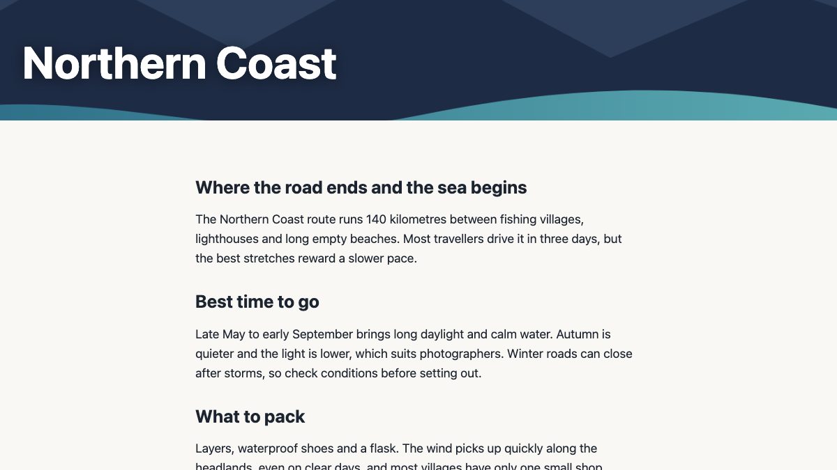
The hero is a fixed-height box with overflow: hidden. As you scroll the first 70% of the viewport height, the image inside grows from its normal size to 135%, so it feels like you are slowly moving into the photo. The heading stays put on top.

1. The markup
Use a real <img> rather than a CSS background. You get alt text when the image carries meaning, srcset and loading control, and object-fit for cropping. If the photo is purely decorative, leave alt="".
<header class="hero">
  <img src="coast.avif" width="1600" height="900" alt="">
  <h1>Northern Coast</h1>
</header>
Keep the hero image eager-loaded (the default) and consider fetchpriority="high", since it is usually your largest contentful paint element. Do not lazy-load it.
2. The layout CSS
The old padding-bottom percentage trick is no longer needed. Give the hero a height, clip it, and make the image fill it with object-fit: cover.
.hero {
  position: relative;
  height: 70vh;
  min-height: 420px;
  overflow: hidden;
  display: grid;
  place-items: end start;
  background: #12202f; /* shows while the image loads */
}

.hero img {
  position: absolute;
  inset: 0;
  width: 100%;
  height: 100%;
  object-fit: cover;
}

.hero h1 {
  position: relative; /* stacks above the image */
  margin: 0;
  padding: 2rem;
  color: #fff;
}
Because the container clips the overflow, scaling the image never creates horizontal scrolling or pushes the layout around. Scaling with transform also avoids layout and paint work that changing width or background-size would trigger.
3. Drive the zoom from scroll
Define the keyframe, then attach it to a scroll timeline instead of to time:
@keyframes hero-zoom {
  to { transform: scale(1.35); }
}

@media (prefers-reduced-motion: no-preference) {
  .hero img {
    animation: hero-zoom linear both;
    animation-timeline: scroll(root block);
    animation-range: 0 70vh;
  }
}
Three things are doing the work:
animation-timeline: scroll(root block)uses the root scroller’s vertical scroll progress as the clock.animation-range: 0 70vhsays the animation starts at the top of the page and finishes after 70vh of scrolling, which matches the hero height, so the zoom completes as the hero leaves the screen.lineareasing keeps the zoom proportional to how far the person has scrolled. An eased curve would make it feel disconnected from their finger or wheel.
Note that the shorthand animation must come before animation-timeline, because the shorthand resets the timeline.
Variation: zoom relative to the element, not the page
If the hero is not at the top of the page, such as a banner midway down an article, use a view() timeline, which tracks the element’s own position in the viewport:
.banner img {
  animation: hero-zoom linear both;
  animation-timeline: view();
  animation-range: entry 0% exit 100%;
}
Now the zoom starts when the banner first peeks in at the bottom edge and ends when it has fully left at the top. You can also reverse the effect by animating from scale(1.35) down to scale(1) for a “settle into place” feel.
Browser support and a fallback
Scroll-driven animations have shipped in Chrome and Edge since version 115 and in Safari since 26 (see MDN’s animation-timeline page and the Chrome documentation). MDN’s compatibility data lists Firefox 159 as the first version with support, and that release is only just arriving as I write this (late October 2026). MDN and the web-platform status data therefore still mark the feature as limited availability rather than Baseline, so plan for some visitors, especially on older Firefox versions, to get no zoom.
The effect is decoration, so the right strategy is progressive enhancement. In an unsupported browser the declaration is ignored and the image simply stays at its normal size, which is a perfectly good hero. If you want the zoom everywhere, wrap the CSS in a feature query and add a small script for the rest:
.hero img {
  transform: scale(calc(1 + var(--zoom, 0) * 0.35));
}

@supports (animation-timeline: scroll()) {
  @media (prefers-reduced-motion: no-preference) {
    .hero img {
      transform: none;
      animation: hero-zoom linear both;
      animation-timeline: scroll(root block);
      animation-range: 0 70vh;
    }
  }
}
const hero = document.querySelector('.hero');
const canDrive = CSS.supports('animation-timeline', 'scroll()');
const reduce = matchMedia('(prefers-reduced-motion: reduce)').matches;
if (hero && !canDrive && !reduce) {
let queued = false;
const update = () => {
queued = false;
const progress = Math.min(Math.max(scrollY / (innerHeight * 0.7), 0), 1);
hero.style.setProperty('--zoom', progress);
};
addEventListener('scroll', () => {
if (!queued) { queued = true; requestAnimationFrame(update); }
}, { passive: true });
update();
}The script only runs where the CSS timeline is missing, uses a passive listener and batches work with requestAnimationFrame, and writes one custom property that the same transform reads. I tested the CSS path in Chromium with an 800px-tall window, where 70vh is 560px: the computed scale was 1 at the top and 1.25 after 400px of scrolling, which is what 1 + 0.35 × 400 / 560 predicts.
Accessibility and performance checklist
- Respect reduced motion. The
prefers-reduced-motion: no-preferencewrapper means people who ask their system for less motion get a still image. The script does the same check. - Keep the text readable at every scale. The heading is a separate element above the image, so it does not scale. Make sure its contrast holds across the whole photo, using a darker overlay or text shadow if needed.
- Keep the zoom modest and the source sharp. A scale between 1.1 and 1.4 reads as depth; beyond that it feels gimmicky and can bother some visitors. At 135% a 1600px-wide image is stretched on large screens, so serve a 2400px AVIF through
srcsetandsizes. - Animate only
transform. It can run on the compositor, so the effect stays smooth even when the main thread is busy.
Where to go next
If you are comfortable with the pieces above, these Web Designer Wall tutorials fill in the rest of the toolkit: Easy CSS Animation Using @keyframes covers the keyframe syntax, and Easy CSS Animation With Transition & Transforms explains the transforms used here. For a ready-made hero to try the effect on, see the Bootstrap 5 hero header with search bar or the hero search box with image background. Once you have the zoom working, the 9 simple CSS image filters are an easy way to add a matching tint or blur, and the category image cards with zoom hover show the same idea on hover instead of scroll.


Appears to be not responsive. Am viewing it on an iPhone 6s.
Hi Don!
The first method will be more responsive than the second (as background fills are not inherently responsive and may need more care). You can see in the codepen window vs full screen that it works at various widths. Please also note that these are intended as instructional tools, not project drop-ins, so may not include things like a full set of media queries. I do see folks struggle with responsive backgrounds often, so we’ll see about writing up a tutorial on that in the near future!
If you care about performance, you should use translate and scale to perform the transformation of the image in example 1: http://codepen.io/knusperpixel/pen/VmpKpm
This is another great way to handle the scaling in the Javascript snippet! The method to use depends most on the implementation and any restrictions in place. In general, I agree that your method is more fluid. Thank you for sharing!
Hi. This is great, thanks for the tip. How do I make the the image zoom less for a more subtle effect?
Hi Dan,
If you look at the codepen, the zoom is controlled by the scale level. Check out the scale spec to learn more about how it works: https://developer.mozilla.org/en-US/docs/Web/CSS/Reference/Values/transform-function/scale
Two things:
1. Hero Images may be “aesthetically pleasing” to the designer – but they get in the way of the Visitor accessing the real content – or doing real work, by making the Visitor do extra work (i.e. scroll) .
How can I make my browser block “hero images” ?
2. ANY animation is distracting / annoying.
Quite the opposite of “engaging”, zoom on scroll makes me want to go elsewhere.
Again, how can I make my browser block these unwanted intrusions.
Thanks