Minimal Website Design: 10 Examples and the CSS Behind Them
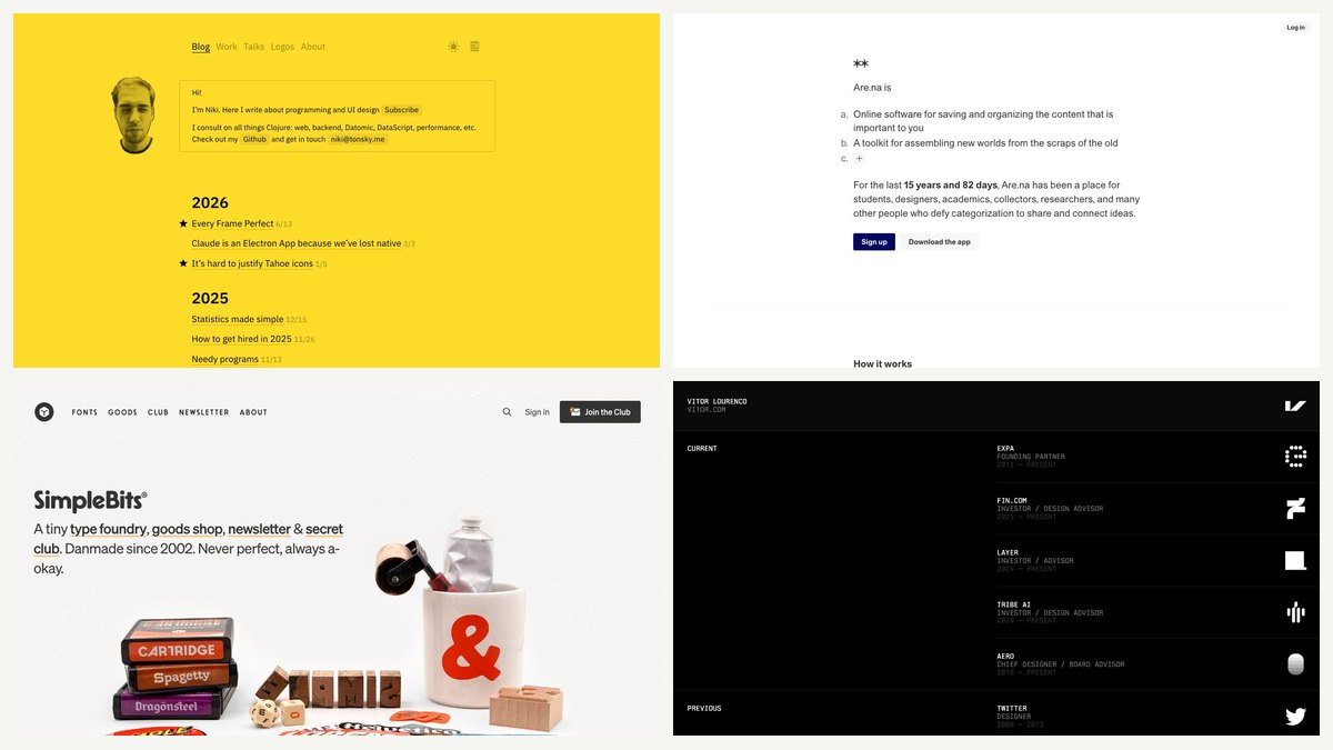
A minimal website uses few elements, one or two typefaces, a restrained palette and plenty of empty space, so the content gets all the attention. Below are ten live minimal sites, from portfolios and blogs to product pages, a shop and a gallery. Each has my own screenshot, a tag for what it is best for, and one technique you can copy, linked to the matching CSS in a short demo.
The first version of this list, from 2009, featured 50 sites. Many of those studios have since disappeared or been redesigned, and the techniques have changed too: minimalism no longer depends on a 960px grid and sliced images, but on fluid type, modern colour and layout that adapts to any screen. For related reading, see Landing Pages Inspiration and 30 Great Interactive Sites, which sit at the opposite end of the spectrum.
What makes a site minimal
Minimal does not mean empty. It means every element has a job, and anything that does not support that job has been removed. In practice you will see the same few traits on most of the sites below:
- A narrow text measure. Body text is held to roughly 45 to 75 characters per line, which is comfortable to read.
- Strong typographic hierarchy. One oversized headline or a single dimmed paragraph replaces boxes, borders and icons.
- Few colours, used with intent. One background, one text colour and, at most, one accent.
- Space as structure. Margins and gaps group content, so rules and cards are not needed.
- Obvious links and controls. Underlines and clear focus states stay, because removing them hurts usability.
10 minimal websites worth studying
Half of these are personal portfolios and blogs, because that is where minimalism is easiest. The rest, from Workflowy to SimpleBits, show it working for a product, a shop and a gallery. Each tag says what the layout suits best.
Wilson Miner
Best for: portfolio. Type: personal portfolio.
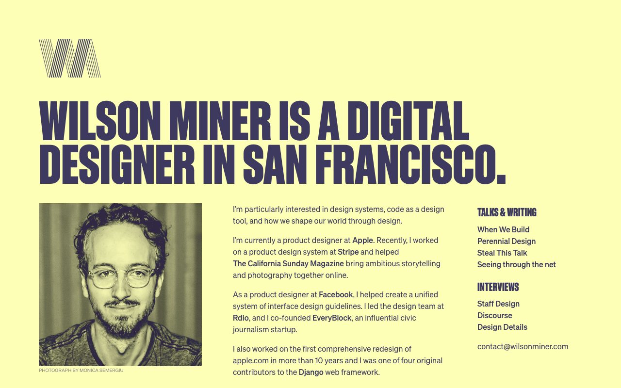
A pale yellow page with a huge condensed all-caps headline in a single dark indigo. Below it, a three-part row holds a duotone portrait, a narrow column of body text and a short list of links, each with a small condensed heading.
Copy this: Set the headline in one oversized, tightly leaded size and let everything else stay at body size. There is no middle tier, so the hierarchy reads at a glance. See the fluid headline rules in the demo.
Niki Tonsky
Best for: blog. Type: personal blog.
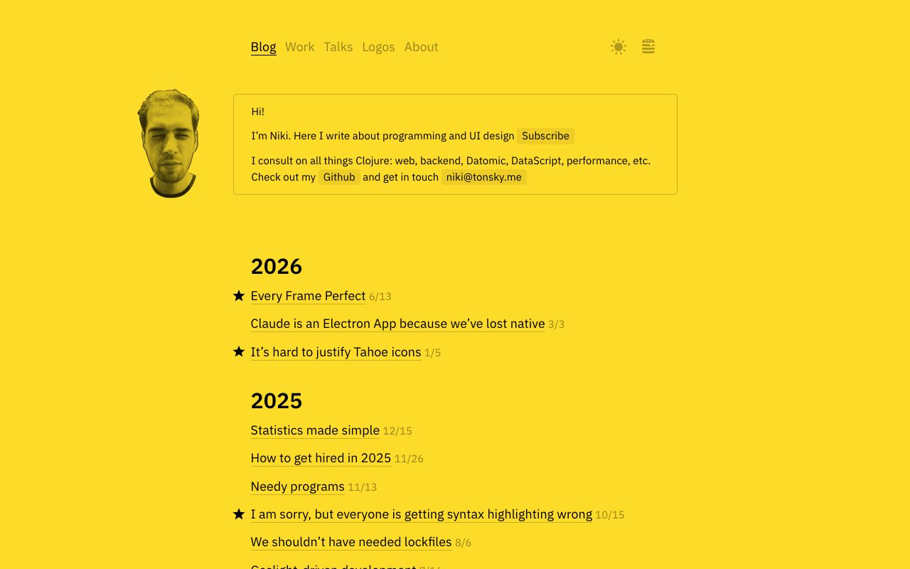
A saturated yellow page with a boxed introduction, then a plain chronological list of posts grouped under a bold year heading. There are no thumbnails or categories, and stars in the left margin mark the favourites.
Copy this: Put the date after the title in a smaller, lighter tone so the title carries the line. It is the dimmed-secondary-text pattern from the colour tokens in the demo. See the muted colour token in the demo.
Paco Coursey
Best for: portfolio. Type: personal portfolio.
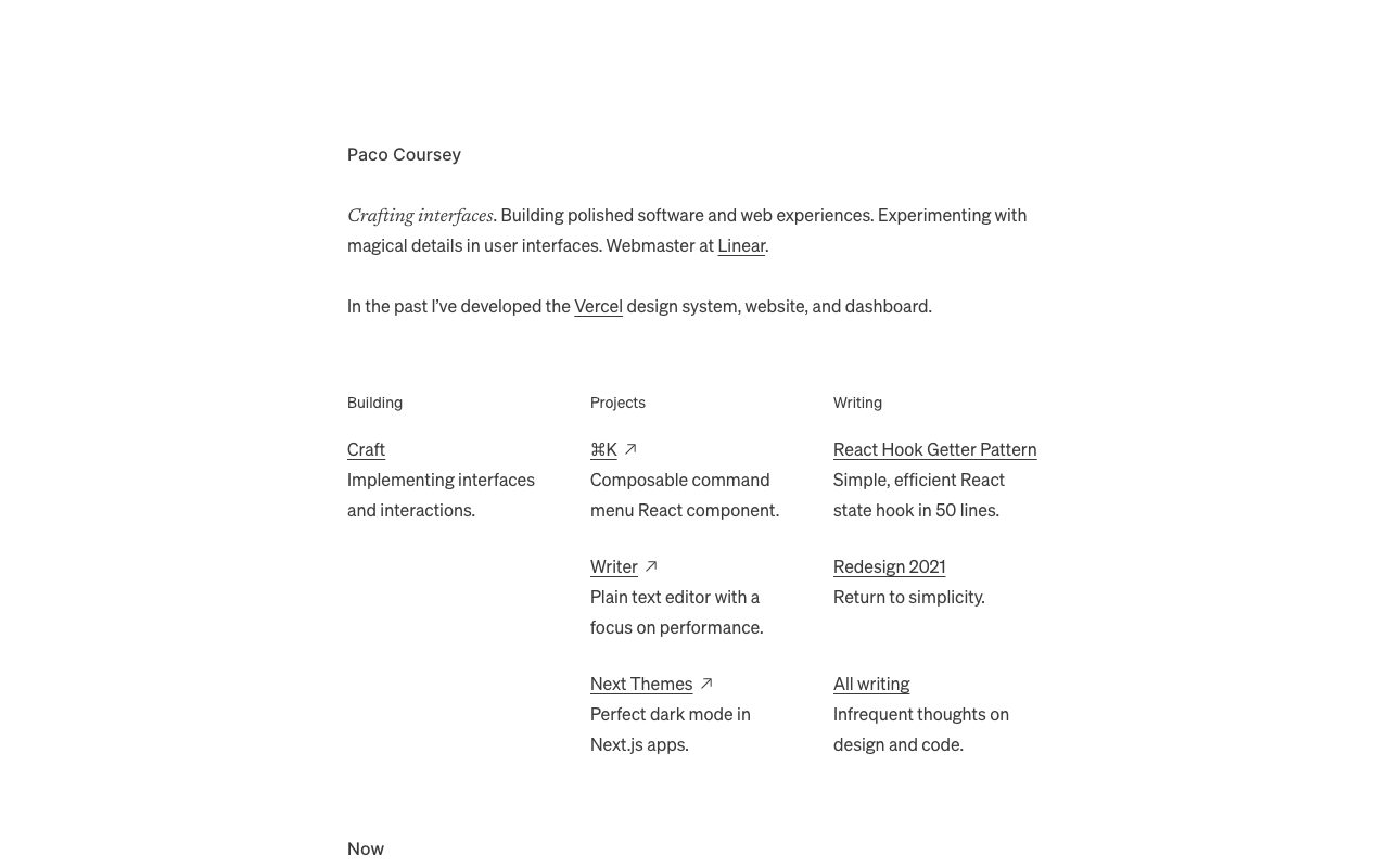
A single centred column of small dark-grey text on white. A short italic tagline leads into three columns labelled Building, Projects and Writing, each item being an underlined link with a one-line description beneath it.
Copy this: Use a tiny label above each column and a link plus one muted line per item. The structure comes from alignment and spacing, with no cards or borders. See the muted colour token in the demo.
iA Writer
Best for: product page. Type: product page.
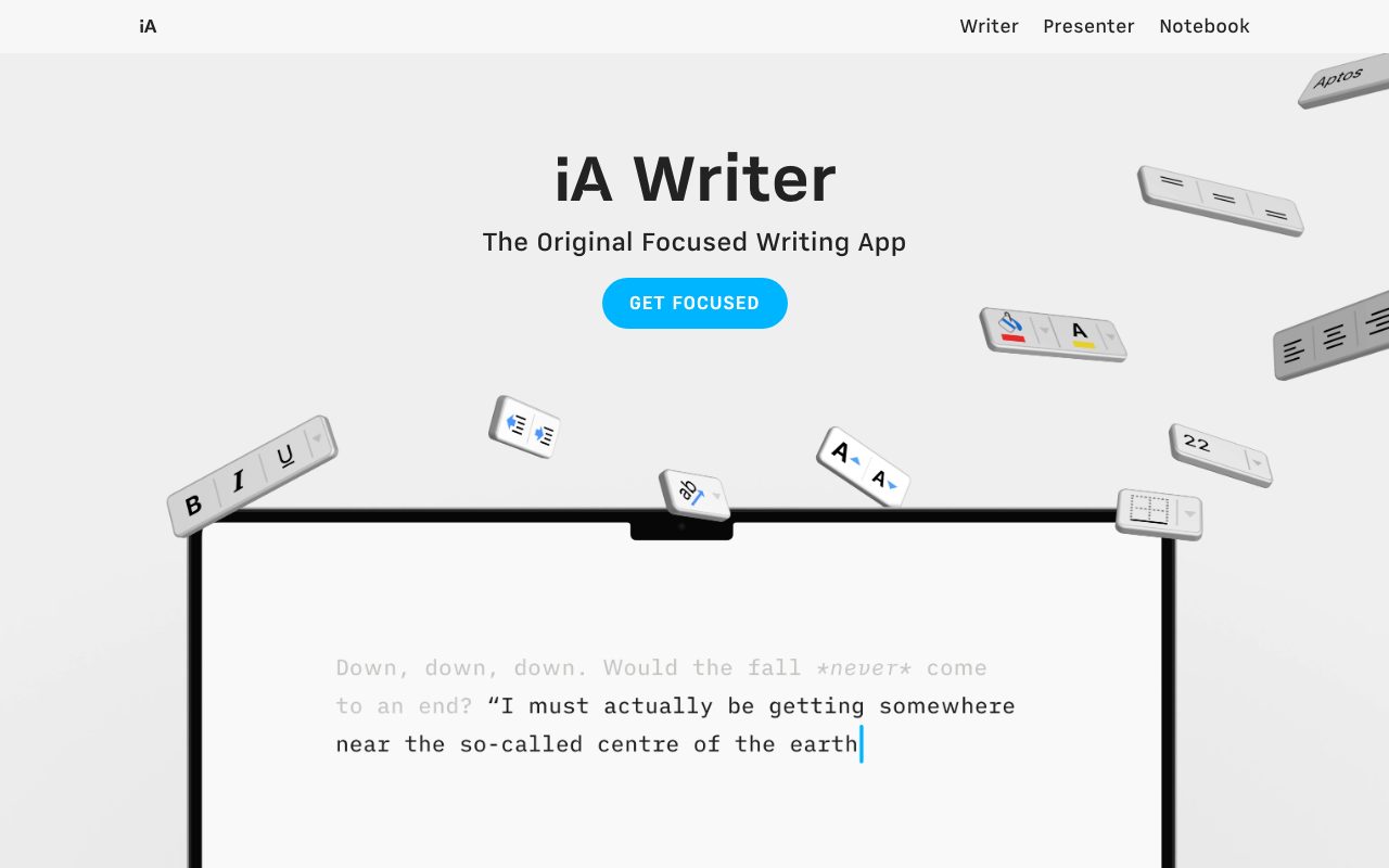
A grey page with a centred product name, one line of positioning and a single pill button. Floating toolbar keys are the only decoration, and a monospaced sample paragraph with its earlier text faded shows the product instead of describing it.
Copy this: Centre one short column, give it a single primary action and let the product demonstrate itself. The column rules in the demo give you the same narrow, centred measure. See the centred column grid in the demo.
Workflowy
Best for: product page. Type: saas product.
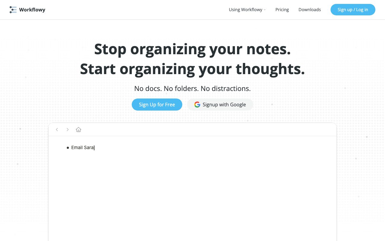
A white header, a two-line bold headline, a short line of three “No” statements and two buttons, followed straight away by the real app with one bullet on screen. The page promises simplicity and then shows it.
Copy this: Balance the headline so both lines break evenly, then keep the supporting copy to one short line. That is text-wrap: balance on the heading. See the fluid headline rules in the demo.
Are.na
Best for: product page. Type: product and community.
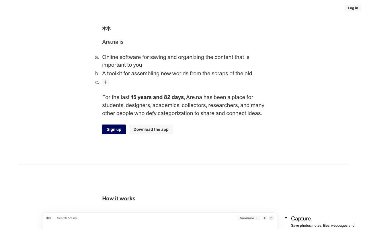
The hero is a single narrow column that describes the product as a lettered list (a, b, c) in plain text, with one dark button and one light button beneath it. A thin rule separates it from the first demo below.
Copy this: Treat the intro as typography, not graphics: one centred column, a grey list marker and generous line spacing. The same 60ch cap keeps the lines short. See the centred column grid in the demo.
SimpleBits
Best for: studio and shop. Type: studio, type foundry and shop.
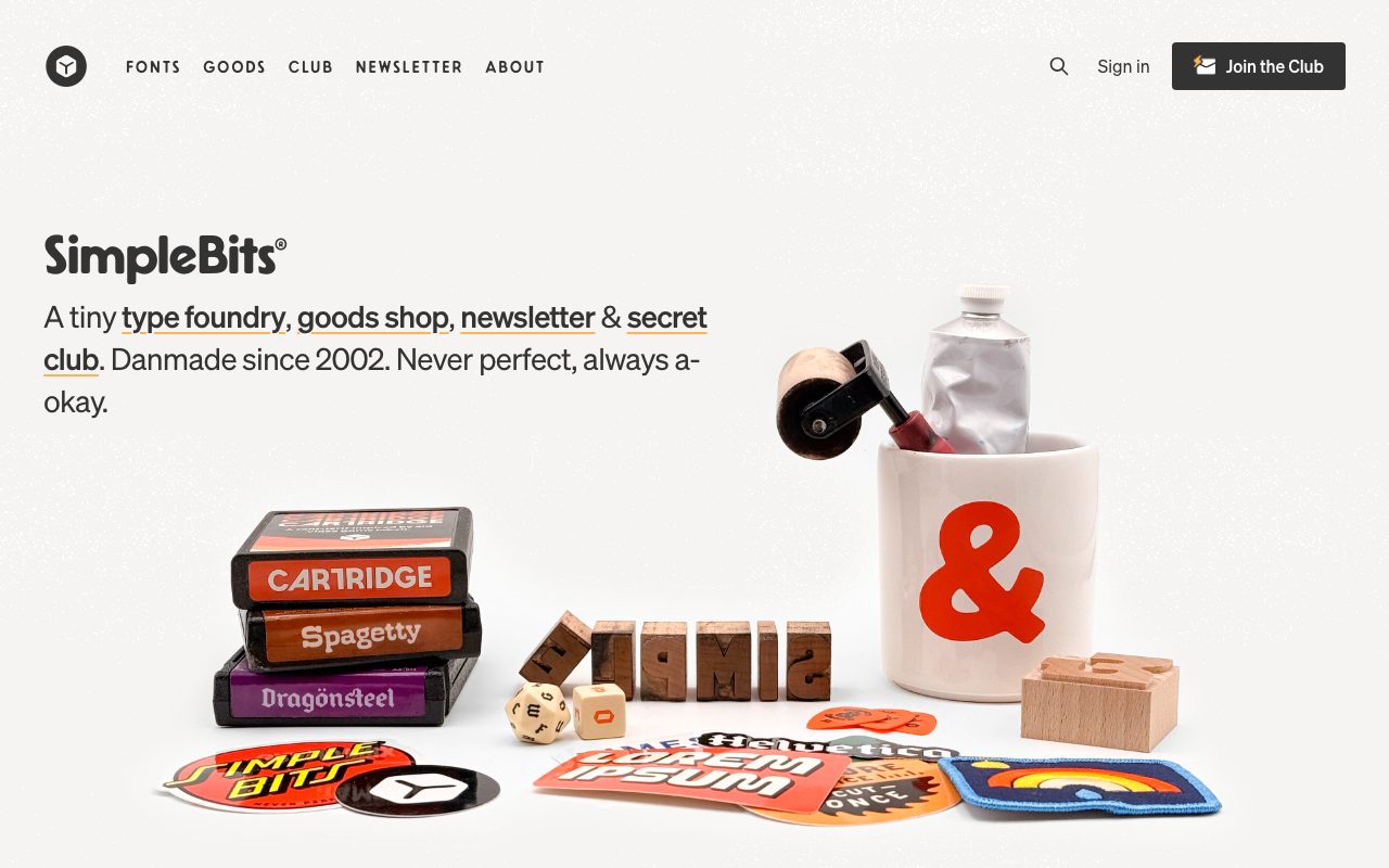
A warm off-white page with a short pitch, a small menu in spaced capitals and one photograph of the shop’s goods. The pitch is the navigation too: its key words are bold links with an amber underline.
Copy this: Style links with a thin, offset, coloured underline instead of the browser default. It looks designed and remains obviously clickable. See the link and button rules in the demo.
Minimalissimo
Best for: catalogue. Type: curated gallery.
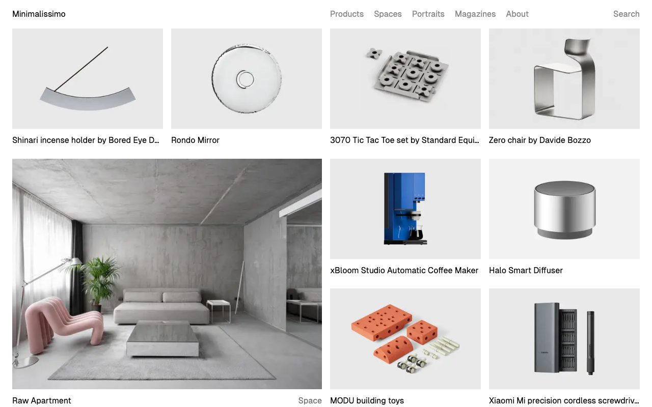
A magazine for minimal design that uses its own medium: a tight grid of product and interior photographs on pale grey, each with a one-line caption below and a quiet text menu. The grid has no borders or shadows.
Copy this: Let gaps do the separating. A grid of equal tracks with a small gap, as in the optional .gallery rule in the demo CSS, replaces card chrome. See the centred column grid in the demo.
Andy Rutledge
Best for: portfolio. Type: personal portfolio.
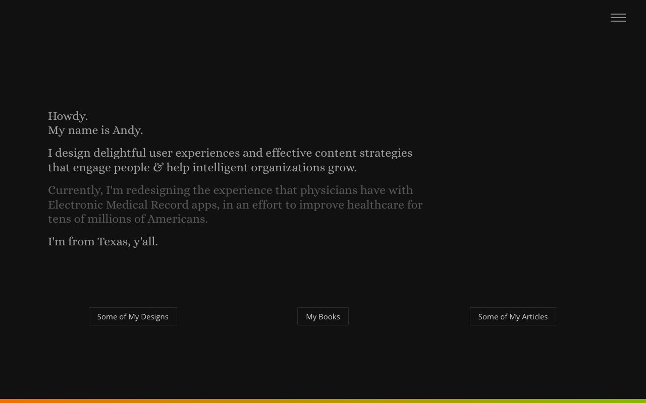
A near-black page with a short introduction in a serif face and a hamburger icon in the corner. Three outlined, rectangular buttons (designs, books, articles) sit in a row near the bottom, with a thin coloured stripe along the edge.
Copy this: Drop the filled button for a one-pixel outline with generous padding. It reads as a control without competing with the text. The dimmed second paragraph is a hierarchy trick, but see the contrast note below. See the link and button rules in the demo.
Vitor Lourenco
Best for: portfolio. Type: personal portfolio.
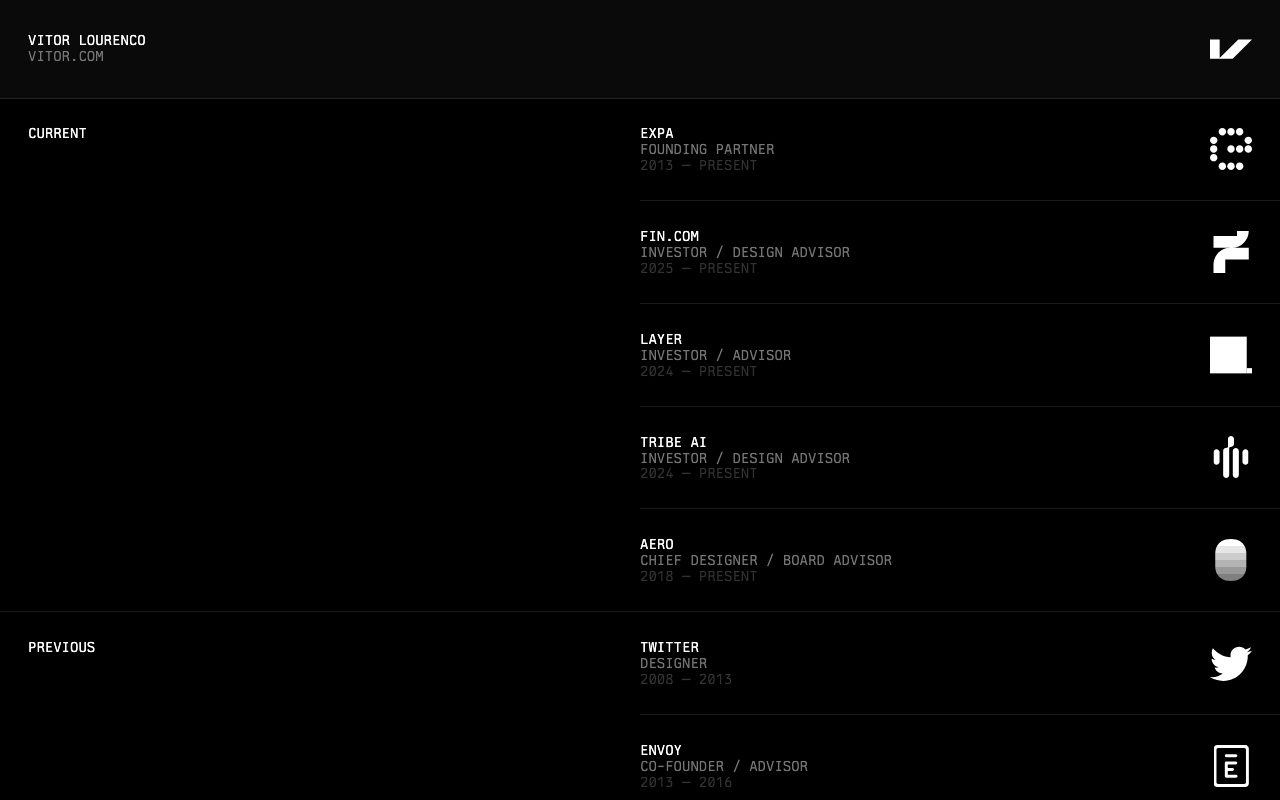
A black page in a monospaced face. Roles are stacked as rows, each with a name, a title, a date range and a logo aligned to the right, separated by a one-pixel line. Uppercase group labels sit in a left column.
Copy this: Build a list as a table of rows with hairline dividers and a two-column grid, so a long list stays scannable without any boxes. The dates here are very dim, so see the contrast note below. See the hairline row list in the demo.
A contrast note on the dimmed text
Dimmed secondary text is the most copied trick on this list, and also the easiest to get wrong. Sampling the pixels in my screenshots, Andy Rutledge’s grey paragraph on near-black comes out at roughly 3.5:1, and the date lines on vitor.com are closer to 2:1. Tonsky’s dates on yellow are about 3:1. These are approximate readings from a screenshot, not measurements of the CSS, but all three fall below the WCAG 4.5:1 minimum for body text. They work as decoration for sighted readers on a good screen. Do not copy the grey values: copy the idea, and pick a muted colour that still passes.
Build the same look with modern CSS
You do not need a framework to build a page like these. The demo below combines a fluid type scale, a readable column, a hairline row list, perceptually even colour and automatic dark mode in about fifty lines of CSS. Each block is labelled, so the “Copy this” links above jump straight to the part that matters.
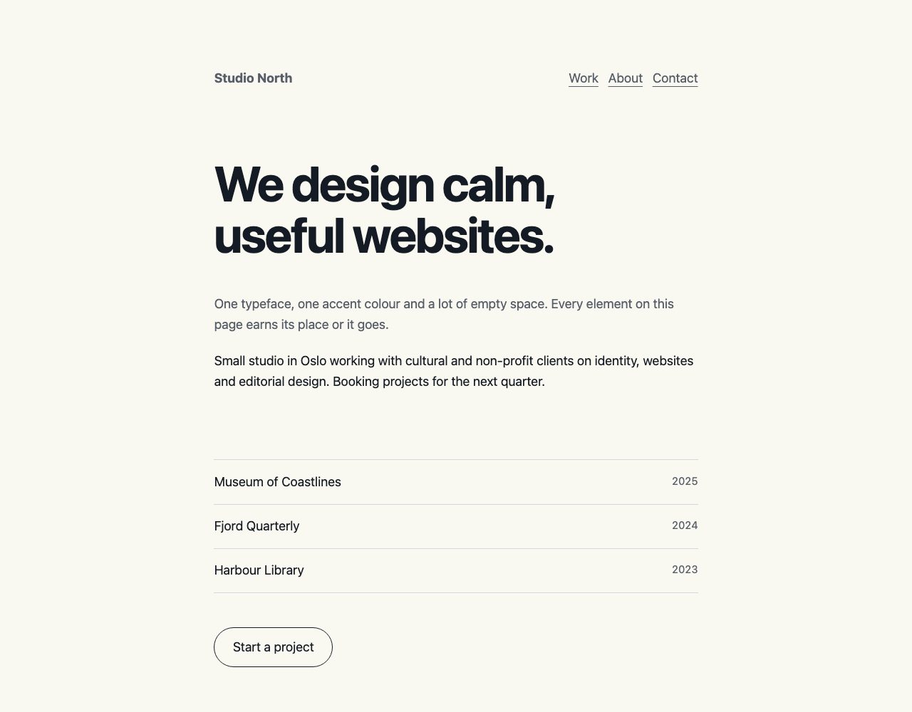
Colour tokens and the muted text colour
Four colour tokens and one hairline colour are the whole palette. --muted is the dimmed tone for dates, labels and lead paragraphs. In this palette it measures about 6.2:1 on the light background and about 7:1 on the dark one, so it keeps the dimmed look and still passes.
:root {
  --bg: oklch(98% .01 95);
  --ink: oklch(22% .02 260);
  --muted: oklch(48% .02 260);
  --accent: oklch(55% .2 30);
  --rule: oklch(88% .01 260);
  color-scheme: light dark;
}
@media (prefers-color-scheme: dark) {
  :root {
    --bg: oklch(18% .01 260);
    --ink: oklch(94% .01 95);
    --muted: oklch(70% .02 260);
    --accent: oklch(75% .15 30);
    --rule: oklch(30% .01 260);
  }
}
.lede, small { color: var(--muted); }
Centred column grid
The three-column grid centres everything in a column capped at 60ch, about sixty characters. The side tracks never shrink below --space, so it replaces wrapper divs and breakpoint padding. The optional .gallery rule is not used in the demo page. It shows the gap-only grid from Minimalissimo.
:root { --space: clamp(1.25rem, 4vw, 3rem); }
.page {
  display: grid;
  grid-template-columns:
    minmax(var(--space), 1fr)
    minmax(0, 60ch)
    minmax(var(--space), 1fr);
}
.page > * { grid-column: 2; }

.gallery {
  display: grid;
  grid-template-columns: repeat(auto-fill, minmax(14rem, 1fr));
  gap: 1rem;
}
Fluid headline rules
clamp() gives the headline a minimum, a fluid middle and a maximum, so it scales without media queries. Keep a rem term in the middle value so it still responds when users change their browser font size.
:root {
  --step-0: clamp(1rem, .95rem + .25vw, 1.125rem);
  --step-4: clamp(2.25rem, 1.5rem + 3.5vw, 4.5rem);
}
h1 {
  font-size: var(--step-4);
  line-height: 1.05;
  letter-spacing: -.03em;
  text-wrap: balance;
}
p { text-wrap: pretty; }
Hairline row list
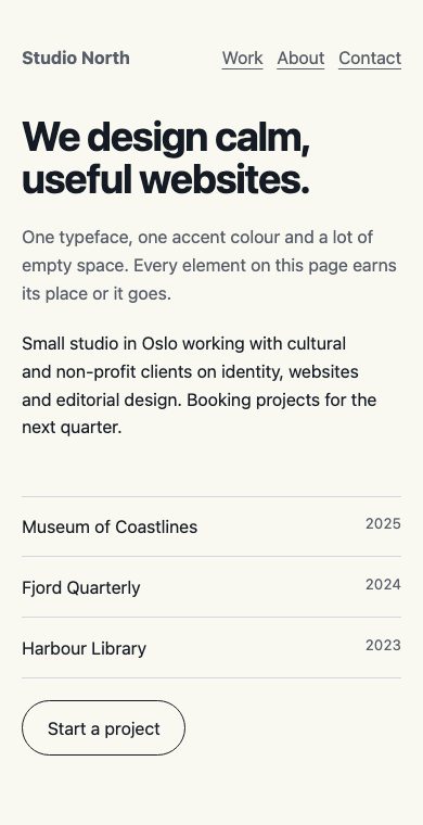
Each row is a two-column grid, with the title on the left and a tabular-number date on the right. A single one-pixel border between rows replaces cards, and tabular-nums keeps the dates aligned.
.rows { list-style: none; padding: 0; border-block-start: 1px solid var(--rule); }
.rows li {
  display: grid;
  grid-template-columns: 1fr auto;
  gap: .25em 1em;
  padding-block: .9em;
  border-block-end: 1px solid var(--rule);
}
.rows small { font-variant-numeric: tabular-nums; }
Link and button rules
Links keep a thin underline, offset from the text. The button is a plain outline that inverts on hover. Add :focus-visible so keyboard users get a ring without any ring on mouse clicks.
a {
  color: inherit;
  text-underline-offset: .25em;
  text-decoration-thickness: 1px;
}
a:hover { color: var(--accent); }
a:focus-visible { outline: 2px solid var(--accent); outline-offset: 3px; }

.btn {
  display: inline-block;
  padding: .7em 1.4em;
  border: 1px solid var(--ink);
  border-radius: 999px;
  text-decoration: none;
}
.btn:hover { background: var(--ink); color: var(--bg); }
On a phone the same CSS collapses to a single padded column with no extra rules.
Browser support and fallbacks
oklch()is Baseline widely available, in all major browsers since May 2023 according to MDN. This CSS does not need a fallback for current browsers. If you must support older ones, declare a hex value first and theoklch()value on the next line. A browser that does not understand the second declaration discards it and keeps the first.text-wrap: balancesits undertext-wrap-style, which MDN marks as Baseline 2024, newly available.text-wrap: prettyis narrower: MDN’s compatibility data lists it in Chromium browsers and Safari 26, but not in Firefox. Both are progressive enhancements, so unsupported browsers simply wrap text normally and nothing breaks.clamp(),color-scheme, grid and:focus-visibleare widely available, so the demo has no other fallbacks.
Mistakes that make minimal pages fail
- Low contrast. Pale grey text on white, or dim grey on black, looks refined and is hard to read. Check body text against the WCAG 2.2 minimum of 4.5:1, as in the contrast note above.
- Hidden navigation. If visitors cannot tell where to go, the page is not minimal, it is confusing. Keep the main links visible on desktop.
- No hierarchy. A plain list of links with only dates for structure works for readers who already know what they want. Most businesses need at least one clear headline and one clear action.
- Tiny type. Keep body text at 16px or larger and size it in
rem. - Motion for its own sake. If you animate, wrap it in
@media (prefers-reduced-motion: no-preference).
For more on fluid layouts, read 5 Useful CSS Tricks for Responsive Design and Responsive Design with CSS3 Media Queries. If you are choosing fonts for a text-led design, the CSS3 @font-face Design Guide covers loading custom typefaces, and Master CSS Flexbox in 5 Simple Steps is a good companion for layout.
Frequently asked questions
Is minimalist design good for SEO?
It can be, because lightweight pages load quickly and keep content easy to crawl. Search engines still need descriptive headings and text, so do not strip out copy to look minimal.
How many fonts should a minimal site use?
One family is usually enough. Use weight, size and colour for hierarchy before adding a second typeface.
Can minimal design suit an online shop or SaaS product?
Yes, as long as the product information and checkout controls stay clear. Workflowy and Are.na show it for software, and SimpleBits for a shop. Keep the decoration minimal and make prices, buttons and form labels as obvious as possible.
Is minimal = white? I’m just wondering because lots of minimal concept will use white (and some use black). Me? I use white.
I love how simple the sites’ designs are, but they leave a lasting impression. I’m growing to love simple designs now. Sometimes, having too much graphics and ads are really overwhelming. Thanks for this post!
Great collection! A lot of sites on this list that I hadn’t seen before =) Thanks
P.S. I’ve shared this on creatinginspiration.net =)
I’m trying to use this approach too but it always ends up with non-minimal. lol
Another simple + minimal:
http://www.gatafunho.com
cheers!
A!
Hi! Some very nice designs. If you are looking for free and minimalistic themes to download, check Modula out.
I would call a lot of them white rather than minimal, Andy Rutledge’s for instance. But a good list nonetheless.
while i like the post’s topic, the majority of the listed sites can all be found on http://www.minimalsites.com. I would have hoped this list contain many other minimal sites than just ones that are found on a minimal css gallery site.
Great designs!!!
How about Manojsachwani.com – any reviews? critiques are welcome :D
Good collection…but a couple of the comps have “orphans.” Isn’t that a big no-no, esp. when the lead in becomes the center of attention?
This is awesome. Minimalism is by far the best way to design in my opinion. It’s the easiest way to get your point across and not have a bunch of distractions in the way of what you’re really trying to say. All you need is a hook to sell a product, everything else is just extra baggage.
jangle.net: ’tis the gift to be simple
So how about this one, also very minimalistic ….
Great idea, but really disappointed in this list.
1. Too many common sites that everyone knows about. C’mon, don’t post well-know Web Standard people’s blogs.
2. Then the uncommon ones, well, they aren’t very inspiring.
3. Minimal != white. This post needs better variety.
Allow me to preface my comment with the fact that I am a minimalist at heart. That said, unfortunately the first thing that I do when I go to half of these sites is leave. Some of them are even great aides for catching some zzz’s at the office. Websites this minimal just aren’t very engaging!
I like that fact that the typography appears to be a focal point on quite a few of these sites, but it’s going to take a lot more than that to rope me in. Most consumers want big, pretty pictures to look at and graphical CTA’s to click on. There is a fine line between short, sweet and to the point and just short… minimal shouldn’t feel lacking. This is still a great list and I appreciate the time you put in to it.
Submit Css is a great site I found with a lot of minimalistic sites. I’d check it out…
I like the first 14 or so, but at that point a lot of them start to look like generic, unpersonalized blog themes. When you’re aiming to have very little, it’s very important that what you have makes a real statement.
Maybe you forgot Google. That’s a minimalistic design as well. =)
Honestly, I would have liked to see my site in the list too, but well, I guess it’s not that popular yet.
Peace out.
@Tedel
Yea, that’s what I said. It would be funny to unexpectedly see your own site in a list like this. I was sad to not see mine as well lol.
And I actually put up a list of minimal sites a few weeks ago on my blog. So if you want more to look at, check it out.
createandadapt.blogspot.com
“Less is more” – very important principle, especially on white background.
I love a minimal clean look of a website. I think hands down it looks much better but it is always important to still include copy so search engines can read it.
Pretty nice set of great inspirations, but some could be even simpler. ;)
Oh no! WDW is turning into SmashingMag. Flee!
this is a webpage from a minimalistic architecture studio in austria – like the way the present the projects
Very nice designs. I would welcome a feature on well designed corporate sites as well. Maybe something for a future article?
What do you think about this one, Plootu?
I Love the minimal designs, very easy on the eye and some great effects using line heights.
Sometimes it can be very easy to over design a site! (More is less!!)
Interesting how 90% of them are white background based
Keep an eye out for this website: pikatzu It will be on here pretty soon.
…ahem, but — they’re all designer portfolio sites designed to be viewed by other designers.
How about showcasing “real world” minimal designs whose target audience is the paying public? As Hrundi V. Bakshi would say: “That is the art”
@ A Reader
i’m sry dude but I think it kinda sucks :p
Estupenda reseña, el minimalismo siempre sera mi estilo favorito. Muchas gracias
I like this approach too … maybe because I did it :P
Nice inspirational collection. I’m really drawn to Hot Meteor’s Typography, absolutely perfect and breathtaking, love Andy Rutlege’s softness, and the others whose simplicity is very brave. It’s not what is there, but what they have done without. Very zen. The ones that look like templates leave me cold, but there standouts are: Hot Meteor and Rodrigez Galinez with their typographic beauty. I would love to have that sensibility, but designwise I like a little clutter. I do admire the bravery in others though.
Fantastic…a good ideas and resources for a nice work! Clean and simple! thank’s! ;)
Some wonderous web designs here. Less is more or less more. Or something.
Indeed a great collection, Would be of great help to all designers.Keep up the good work.
Thanks..
Anna
Gorgeous list of inspiring sites, it’s so hard to find sites like these for inspiration when you actually need inspiration!! I will bookmark and never lose again. Thank you.
ps. your site is just fab.
Yeah most of the mim == > White …
White space plays and important role to get this effect. You can make the page look stuffy with darker shades.
Yet another interesting list. Minimalist these designs are for sure. But, to be honest, these designs look better in your list compared to the websites.
Really like the Vesess design. A lot of designs should follow this trend.
The “We Are Sofa”-design gave me a wow-moment while I didn’t really feel like having it, if you know what I mean >.<
It just goes to show that the simpler the design the more effective it can be. I think it can be just as hard to create something that has little design and still have a great effect as it to have a page full of colour and images, if not a little more difficult.
Has anybody else got any other designs like these?
Simple is usually better.. while the artsy eye candy may catch ones attention.. the simple sites tend to be easier to follow content on.. but that’s my personal opinion.
I notice that so many (nearly all?) of these are portfolio sites for artists, designers and similar disciplines.
Do you know of any such bold designs used for more work-a-day companies such as builders or car repair shops? I would love to see how that would work!
Great post. I love clean and simple designs. I think this trend is emerging as a sign of the times. I think the recession is causing individuals and companies to rethink how they present themselves, and no one wants to be perceived as disrespectful because they are overly ornate. I think this will continue to be a trend for quite a while.
Thank you for the list. These have inspired me a lot. Have ideas pouring down my head now. =)
MInimalism is so cool. And I think is also hard to do, because it is easier to use few big colorful photos and make heavy site, but to make something minimal and focus on typo and color is next level of design.
I think Minimal, is putting in the essentials and nothing further! leaving the cr4p out… I tried to do the same with my own site, it’s not specifically minimal but I used only what was needed.
I also think Minimal sites leave more space to be Typographic… a new trend in Webdesign that hopefully will stay and grow!
Gr Edgar
Wonderful collection. Minimalist pages remind me of someone who sings “a capella” (without any instruments or music playing, and often singing alone). You can’t run, you can’t hide- everything is plain to see/hear. But on the other hand, things are so uncluttered that the message has tremedous effect and impact.
(…and the best part of these sites: no “animated flames”!!)
–Bill
Isolated, strong image elements surrounded by white space…love it. You just can’t beat it for impact – some great sites!
Peter, it looks great! Could you just tell me what is it about? :-) The home page URL http://www.chipbracelet.com doesn’t tell me much..
Great choices, thanks. I love minimal style web designs. Perhaps you’d be so good as to feature mine in yourr next article like this? I’m a Freelance Web Designer so I’d be glad of it (creep, creep).
Great work, love your site (:
I demand to be minimal too: animaux.de :)
Thanks Thanks What’s the problem here? Google could bury the meager profit number from even the biggest media conglomerates.
What do you think about http://www.BalticBG.com ?
Simplicity and minimalism is a double sword edge only enjoyed by proclaimed and famous. Us mortals would be called lazy.
“trust me I can design…I only choose to make my site look like b&w newspaper add” – is very hard pitch to have unless you enjoy the statue or have an amazing portfolio behind it. :)
Great list, some amazing examples of minimalism in website design there. Thanks for your hard work .
Minimal designs can be very hard to pull off, and even harder to get signed off when doing client work.
Strange how many people view white space ans wasted space, when in fact it can really set off a great design.
In web designing, graphics play very important role. Sometimes a graphic or image says many things which we are not able to express in words. I must say that here in minimal sites graphics is used in very nice manner.
Web Design LA
Me and my friend were arguing about an issue similar to this! Now I know that I was right. lol! Thanks for the information you post.
un peu froid tout de meme…c’est à la lilmite du foutage de gueule
Great selection. I love designs that say more with less. These examples of minimalist websites exemplify the timelessness of simple, funtional design. I just found another that’s not on the list but ought to be: http://www.alancaseydesign.com. To my mind, flash-free sites like this allow the design to speak more clearly.
As iphone 4 white 3GS has something of non-update to the iPhone range, but there are finally decent alternatives in the smartphone market, with the HTC Desire and Samsung Galaxy S leading the Android fight right to Apple’s door.
No wonder, with white iphone 4 in your hand will make you be the focus of the crowd! You won’t miss it!
This is a good site to spent time on .I just stumbled upon your informative blog and wanted to say that I have really enjoyed reading your blog posts. I will be your frequent visitor, that’s for sure.
Oh no! WDW is turning into SmashingMag. Flee!
The list of minimal site is excellent. As Web designing is the most important element of any website one needs to be creative while doing it. This will be a great resource to many designers.
Florida Web Design
All whitening formulation is applied by dentists with quality features, powerful, secure, and very reasonable prices, as well as the missing handbag is a unique product design, fashion styling you will not ..
Minimal is more if you know how to do it.
It’s been a high time to get the iphone 4 white; or we may lost the fashion trend..
Splendid work. Thank you so much for this post. Interesting content.
The catchy blog with the interesting contents. You give the nice information that many people don’t know before. most of your contents are make me have more knowledge. it is very different. I was impressed with your blog. Never be bored to visit your website again. Have the nice day. Keep enjoyed your blogging.
Thank you for any other informative site. The place else could I get that kind of info written in such a perfect means? I’ve a venture that I am just now operating on, and I have been at the glance out for such info.
Thank you for any other informative site. The place else could I get that kind of info written in such a perfect means? I’ve a venture that I am just now operating on, and I have been at the glance out for such info.
Youre so cool! I dont suppose Ive learn something like this before. So nice to search out any individual with some authentic ideas on this subject. realy thank you for beginning this up. this web site is something thats needed on the web, someone with a bit of originality. useful job for bringing something new to the web!
Decorating ideas for establishing your home design. News and style trends from the world most popular shows.
Decorating ideas for establishing your home design. News and style trends from the world most popular shows.
Our firm specializes for over 10 years in laser scission and manifacture of hand made fragments from rust-proof. The company has a strong background in the production of high grade details, welded structure and metal pieces made of rustfree steel.
I’ve been exploring for a little for any high quality articles or blog posts on this sort of house . Exploring in Yahoo I eventually stumbled upon this website. Studying this info So i am happy to show that I’ve a very just right uncanny feeling I discovered exactly what I needed. I most for sure will make certain to don’t put out of your mind this site and give it a glance regularly.