This is another template for a web form with animated navigational tabs, designed using CSS and HTML. The buttons take both a fill effect in hover and clicked events. Bootstrap styles have been imported to the code. The Li element of lists has been used to display the buttons in a list and the element tab panel has been used to avoid styling more than one tab at a time. The tabs are initially given the styles of padding as 15px 25px, font size as 17px, font-weight as 800, font color as #000, text-transform as uppercase to automatically transform it to uppercase, and position as relative. It is also given a background color of #f1e9de and a skew value of skewX(15deg) to arrange it in a tilted way. In a clicked or a hover event, the tab gets filled with #e94b35 color and a border in the color of #000 is also added. The tab content section is given the styles of padding as 20px 30px, font size as 15px, letter-spacing as 1px, line-height as 27px, background color as #b59972, and also a skew value of ewX(-5deg)to tilt it.
Tab style 8
4.3.1

This is another example of a web form with animated navigational tabs, designed using CSS and HTML. The buttons take both a fill effect and a border effect in hover and clicked events. Bootstrap styles have been imported to the code. The Li element of lists has been used to display the buttons in a list and the element tab panel has been used to avoid styling more than one tab at a time. The tabs are initially given the styles of padding as 10px 20px, font size as 17px, font-weight as 600, font color as #fff, background color as #f8333c, border top and bottom as 3px solid #f8333c to highlight the corners, and text-transform as uppercase to automatically transform it to uppercase, and position as relative. The tab content section is given the styles of padding as 20px 30px, font size as 17px, letter-spacing as 1px, line-height as 30px, background color as #384d48, and border top and bottom as 3px solid #384d48. The tabs get filled with white color and its text change to red color with a transition of all 0.3s ease 0s0f4c5c, in clicked and hover events.
Tab style 7
4.3.1
This is another template for a web form with animated navigational tabs, designed using CSS and HTML. The buttons take both a fill effect and an expanding effect in hover and clicked events. Bootstrap styles have been imported to the code. The Li element of lists has been used to display the buttons in a list and the element tab panel has been used to avoid styling more than one tab at a time. The tabs are initially given the styles of padding as 12px 20px, font size as 18px, font-weight as 700, font color as #4f000b, background color as #fff, text-transform as uppercase to automatically transform it to uppercase, and position as relative. The tab content section is given the styles of padding as 20px 35px, font size as 15px, letter-spacing as 1px, line-height as 25px, background color as #da7635, and text color as #fff. The tabs get filled with white color (#fff) and take a transformation effect of scale(1.2) and a transition of all 0.5s ease 0s in clicked and hover events.
Tab style 6
4.3.1

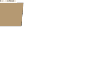
This is another template for a web form with animated navigational tabs, designed using CSS and HTML. The buttons take both a fill effect and a border effect in hover and clicked events. Bootstrap styles have been imported to the code. The Li element of lists has been used to display the buttons in a list and the element tab panel has been used to avoid styling more than one tab at a time. The tabs are initially given the styles of padding as 10px 20px, font size as 17px, font-weight as 600, font color as #fcd0a1, background color as #0f4c5c, text-transform as uppercase to automatically transform it to uppercase, and position as relative. The tab content section is given the styles of padding as 30px, font size as 17px, letter-spacing as 1px, line-height as 30px, background color as #0f4c5c, outline of 3px solid #fcd0a1, and text color as #fcd0a1. The tabs get filled with the red color of #9a031e and take a border of #0f4c5c in clicked and hover events.
Tab style 5
4.3.1

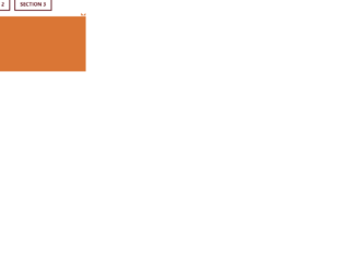
This is another example of a web form with animated navigational tabs, designed using CSS and HTML. The buttons take a shadow effect in hover and clicked events. Bootstrap styles have been imported to the code. The Li element of the ul class has been used to display the buttons in a list and the element tab panel has been used to avoid styling more than one tab at a time. The tabs are initially given a border with the value of 1px solid #5d001e and also the styles of font size as 18px, font-weight as 700, color as #5d001e, font color as #fff, box-shadow of 5px 5px 0 0 #fcca89, background as transparent, and position as relative. The tabs take a shadow effect with the values of -5px -5px 0 0 #fcca89 and takes the color white, in a clicked and focus event with a transition value of all 0.5s ease 0s. The tab content section is given the styles of padding as 20px, font size as 15px, letter-spacing as 1px, line-height as 25px, background color as #fcca89, and text color as #5d001e.
Tab style 4
4.3.1
This is another example of a web form with animated navigational tabs, designed using CSS and HTML. The buttons take a border action in hover and clicked events. Bootstrap styles have been imported to the code. The Li element of lists has been used to display the buttons in a list and the element tab panel has been used to avoid styling more than one tab at a time. The navigational tabs are initially given a border with the value of 2px solid #e6e5e1 and also the styles of padding as 10px 20px, font size as 17px, font-weight as 600, color as #293241, text-transform as uppercase to automatically transform it to uppercase, background as transparent, and position as relative. The tabs take an underlining effect with the values of 2px solid #079fc9 in a clicked and focus event with a transition value of all 0.3s ease 0s and also the tab content section has the styles of padding as 10px, font size as 17px, letter-spacing as 1px, line-height as 30px, and text color as #6f6f6f.
Tab style 3
4.3.1