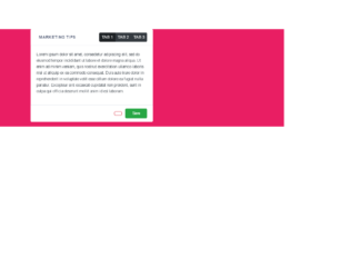
This is an example of a card header with tabs, designed using HTML, CSS, and Bootstrap framework 4. The card consists of three tabs. The body of the form is given the styles of font-family as "sans-serif", font-size as .88rem, font-weight as 400, line-height as 1.5, color as #495057, text-align as left, and background-color as #E91E63. The card is given the styles of box-shadow as 0 0.46875rem 2.1875rem rgba(4, 9, 20, 0.03), 0 0.9375rem 1.40625rem rgba(4, 9, 20, 0.03), 0 0.25rem 0.53125rem rgba(4, 9, 20, 0.05), 0 0.125rem 0.1875rem rgba(4, 9, 20, 0.03), and transition as all .2s. The card title has the styles of text-transform as uppercase to automatically convert the text to uppercase, color as rgba(13, 27, 62, 0.7), font-weight as bold, and font-size as .88rem. The card footer is given the styles of padding as .75rem 1.25rem, background-color as #fff, and border-top as 1px solid rgba(26, 54, 126, 0.125). The three tabs are given a font size as 0.8rem, and they take box-shadow effect of 0 0 0 0 rgba(82, 88, 93, 0.5), in a hover event.
Source: https://bbbootstrap.com/snippets/card-header-tabs-24201356
Card header with tabs
4.3.1

This is another example of a bootstrap card view with pricing cards and tabs, designed using HTML, and CSS. Bootstrap fonts and styles are imported to the form with their URLs. The web form is given the styles of font-family as "Montserrat", sans-serif, background color of #8d97ad, and font-weight as 300. The h1 to h6 sections are given a color of #3e4555 and a font-weight of 500, whereas the background color of the form is set to #f4f8fa. The subtitle is given the styles of color as #8d97ad, and line-height as 24px. The type of the plan is given a text color of #8d97ad, and text style of uppercase to automatically transform the text to uppercase. When selected the tab, the color of the plan title changes to #263238, with the styles of the tab also changing to background: #ffffff, border-left: 3px solid #ff4d7e, border-radius: 0px, margin-left: -3px, and box-shadow: -20px 0 40px rgba(0, 0, 0, 0.1). The submit button is given the color #ff4d7e and also the linear gradient color of that, for the browsers that support linear gradient colors. In a hover event, the color of the button switch between #ff4d7e and #ff6a5b.
Pricing with tabs
4.3.1

This is a template of a web form with bordered line buttons with a corner tab, designed using CSS, HTML, and JavaScript. There are four buttons in the form; submit, read more, add to cart and subscribe. The fonts are imported to the form with their URLs whereas JavaScript functions have been used to implement the mouse hover effects. The form is given a background color of #212121. The tabs are given the styles of font-family: 'Roboto', Arial, sans-serif, color: #ffffff, cursor: pointer to get the hand cursor, padding: 0px 40px, display: inline-block, margin: 15px 30px, text-transform: uppercase to automatically transform the text to uppercase, line-height: 2.7em, letter-spacing: 1.5px, font-size: 1em, font-size: 16px, border: 3px solid #fff, background-color: transparent, border-radius: 15px 0 15px 15px, and transition: all 0.3s. In a hover event, the border of the tabs take the color of #c87f0a.

This is an example of a web form with navigational tabs, designed using CSS and HTML. The tab buttons are arranged in a vertical order and take a border effect in hover and clicked events. Bootstrap styles have been imported to the code. The Li element of lists has been used to display the buttons in a list and the element tab panel has been used to avoid styling more than one tab at a time. The tabs are initially given the styles of font-family as 'Ubuntu', sans-serif, padding as 10px 12px, font size as 19px, font color as #333, font-weight as 500, text-transform as uppercase to automatically transform it to uppercase, letter-spacing as 1px, text-align as center , and position as relative. In a hover or a clicked event, the borders of the tabs change its color into #0083ed with a transition value of all 0.5s ease 0s. The tab content section is given the styles of padding as 20px 25px, font size as 15px, line-height as 25px,letter-spacing as 1px, font color as #fff, background color of #0083ed, and display as table-cell.
Tab style 16
4.3.1
This is an example of a web form with navigational tabs, designed using CSS and HTML. The tab buttons take a fill effect in hover and clicked events. Bootstrap styles have been imported to the code. The Li element of lists has been used to display the buttons in a list and the element tab panel has been used to avoid styling more than one tab at a time. The tabs are initially given the styles of padding as 15px 30px, font size as 14px, font color as #888, background color as #fff, border-radius as 50px to make them circular, a border with a color value of 1px solid #d3d3d3, and position as relative. In a hover or a clicked event, the tabs get filled with #d96459 color and change the font color to #fff with a transition value of background 0.20s linear 0s. The tab content section is given the styles of padding as 20px 25px, font size as 14px, line-height as 25px, margin-top as 25px, font color as #333, and a border as 1px solid #ddd.
Tab style 15
4.3.1

This is another template for a web form with animated navigational tabs, designed using CSS and HTML. The tabs take a fill effect in hover and clicked events and the content section is placed above the tabs. Bootstrap styles have been imported to the code. The Li element of lists has been used to display the buttons in a list and the element tab panel has been used to avoid styling more than one tab at a time. The tabs are initially given the styles of padding as 18px, font size as 14px, text-align as center, background color as #272e38, font color as #fff, a border-bottom-color of #6676ff, a border of 15px solid transparent, and position as relative. In a hover or a clicked event, the tabs get filled with #6676ff color with a transition value of all 0.20s ease 0s. The tab content section is given the styles of padding as 20px, font size as 14px, line-height as 25px, font color as #fff, and background color as #333.
Tab style 14
4.3.1