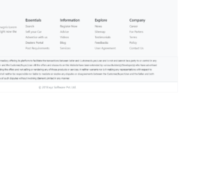
You want a disclaimer below the screens then this is the perfect footer design for you. Disclaimer visible equally well in smaller and larger screens it is made up of five divisions with the social links attached to it. Along with it, the copyright information is displayed at the bottom of the page. This can be used in a website related to big organization or financial sites or eCommerce sites. Hover your mouse over these links and social links you would see the gradient color set using CSS. CSS is pretty simple and well used for this design.
For any design to be beautiful, the space utilization is most important along with the perfect match of icons and fonts. This is the smooth looking footer example with the rich look and feel, like in any apple products. Footer space is divided well with the company information on the left side. Company links in the middle of the page, and links newsletters and search space on the extreme right side. This is created using bootstrap 4, by placing the columns and rows in the container. This design does not suffice, if not used in smaller screen devices. It is very well responsive, a check is a design adjusts on top of another like a stack, once you are in smaller screens.
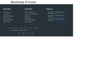
This is a stylish footer created to match your website. It uses the bootstrap 4 and font awesome CSS for styling, It is divided into 4 columns and under each column, you have links for the quick links. Check out the find us column which displays the information of contacts like phone and email. Others are quick links with the links of pages in the forum and you have the follow us links linking to their pages on the website or the social media sites. Additionally, the navigation page is also displayed in the footer. The copyright and social media icons are perfectly located at the middle bottom of the page.
Footer Bootstrap 4
4.3.1
This is an elegantly done footer for your website. This can be used to display additional information like the contact links, quick links, page links, and other search-related links. Additionally, it has the email section link to send the email, links to media sites with the copyright information with social media site links. The slot for displaying the visa and master card for payment option is an addition to your footer design. It uses bootstrap 4 and font-awesome, for its styling. The styling is simply made to fit in the footer design.

This is a classic example of the responsive navigation bar with no javascript needed. It uses clean HTML5 markup. This navigation bar is aligned to left but can be aligned to center or right. In mobile devices, the navigation bar is set on the top with the logo displayed whereas on the website it’s displayed on the left of the device. Toggling behavior can be seen by clicking on the toggle button. The dropdown is already set for some menu. The icon for each menu is set. CSS file defines responsive behavior using a media query. Navbar on the screen of width above than 767px will be displayed as block align to left, whereas for the screens below 767px the navigation bar will be displayed on the top of the page. Use this navigation bar for mobile applications to navigate to your custom links.

This is an example of vertical responsive sidebar navigation, which can be used for mobiles or other devices. This is fully responsive and space saving sidebar navigation for any project. It is decorated button with primary and large settings. It button behavior is set with toggling property. The navigation is set to be a sidebar using sidebar-nav class this gives the navigation bar an ability to be placed at one side of the site. The navbar can have its brand name set by side-bar class. CSS file defines the effects and style for this navbar. Check out the properties set for each class and the wrapper which wrappers the navbar. The mouse hover effect is set in CSS with its color changing effect. The javascript adds the effect of toggling the navbar. This navbar is perfect for its responsive behavior. Use this and tweak it to your requirement.