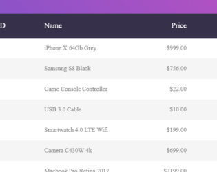
This is the classic example of a responsive bootstrap table, which can be used to display data with various size of the web page. You can use this table design in the sites which can be used in mobile, IPad or desktop versions. The table is wrapped under the classes which gives it a responsive behavior. The table is divided into header and body, header division contains the column names marked with class “table-header” and body division is made up of rows containing the data for the given columns. By changing the display size of the web page you can see the change in the display of each data. The data of each row is displayed with the column name on to the left side. The CCS style defines the look for each class. Media queries are defined to make the table responsive.
Responsive Table
4.3.1
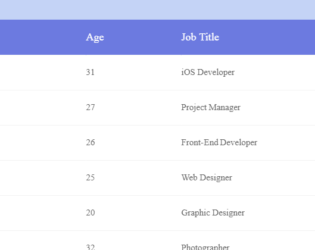
Responsive bootstrap example using HTML5 & CSS3 based which can be used as a template for your website. We have a table with example data on this template. The table is placed in wrapper having Full Name, age, job title, location as column fields. Each row is created for the data. The first row is a header row with column names followed by rows with class defined as cells and data-title defining column name. The CSS defines all the styles for the class. The table also provides highlighting the rows, when selected by the cursor. Fonts, height, padding, background are well defined to match the table and the data displayed in tabular format. CSS also defines media queries, to enable customization of content for a different presentation. For the max-width of 768pixel, the cells are displayed in block format.