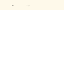
This is an example of a bootstrap toggle button with animations, designed using HTML, CSS, JavaScript, and Bootstrap framework 4. The fonts and icons are imported to the code with their URLs. JavaScript functions have been used to implement toggle features. The body of the form is given the styles of font-family as 'Lora', serif, and color as #303030. The night label is given an opacity value of 0.2. The toggle button is given a cursor style as pointer to get the hand cursor effect in a hover event. The day section of the toggle button is given a background color of #61b9e5, which changes to #d0edff, when the button switches to night, with a transform value of translate(-2 -2). The night section of the toggle button is given a background color of #004373, whereas the stars are given a background color of #fff5a6. The background color of the form turns to #b0b0b9 when the switch is turned to night event.
Source: https://codepen.io/ste-vg/pen/oNgrYOb

This is another example of a bootstrap card view with pricing cards, toggle buttons, and hover effects, designed using HTML, JavaScript, and CSS. JavaScript functions have been used to implement the toggle feature. Bootstrap fonts and styles are imported to the form with their URLs. The web form is given the styles of font-family as "Montserrat", sans-serif, background color of #8d97ad, and font-weight as 300. The h1 to h6 sections are given a color of #3e4555 and a font-weight of 500, whereas the background color of the form is set to #f4f8fa. The subtitle is given the styles of color as #8d97ad, line-height as 24px, and font-size as 14px. The title of the card is given a font-size of 18px and a line-height of 22px. The cards take a transform effect of scale (1.05) with a transition value of 0.1s, in a hover event. Three choose plan buttons are given the color #2cdd9b and also the linear gradient color of that, for the browsers that support linear gradient colors. In a hover event, the color of the button switch between #2cdd9b and #1dc8cc. The other button is given a gradient color based #ff4d7e, which switches between #ff4d7e and #ff6a5b, in a hover event.

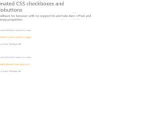
This is an example of a form with checkboxes and toggle buttons with the use of HTML, CSS, and JavaScript. JavaScript functions have been used to make the form responsive by checking the width of the screen. If the width is less than 400px, the mobile class will be added with the use of add class to apply the mobile view whereas if the width is greater than 400px, the mobile class will be removed with the use of remove class. The CSS class switch has been used for the toggle button which consists of height as 4.4rem, overflow as hidden, width as 7 rem, position as relative, display as inline-block, margin as 0, and padding as 0 whereas the switch label has the styles of width as 100%, font size as 0.5rem, and text-align as center. The CSS style class text transformation has been used with the value of uppercase to convert the text to uppercase. The hover class has been used with the style of cursor as pointer so the mouse pointer will be displayed on the toggle button on a mouse hover event. The style display has been used with the value ‘none' to hide the elements.
Source: https://codepen.io/jcgilmore2/pen/PZpmaK
This is another example of a web form with checkboxes and radio buttons designed using CSS, HTML, and JavaScript. JavaScript functions have been used to check the browsers that support and form and provide fallback. Radio buttons have been given the type ‘radio' and the checkboxes ‘checkbox'. Radio buttons have been given the same name to avoid selecting more than one button at a time. The font color has been set with #888 whereas the active color is set to darkorange. The checkbox-size is set to 20px, check-dash to 48 and radio-dot-size to 12px. Variables are used to define values to avoid using values again and again in different places. The display of the checkboxes is set as inline-block and position as relative whereas the display of the radio buttons is set as block and position as absolute. Extra styles have been added to work only in modern browsers.
Source: https://codepen.io/TommiTikall/pen/KymYBN

This is an example of a radio button which is styled well in only vanilla CSS. Though it looks simple, click on the radio button and check out the effect after selecting it. HTML is quite simple, for every radio type a class bullet is defined with classes from zero to seven. The styling for each class used to create HTML is carefully created. Each line from one to seven is styled using the right top and transform method. With the combination of these properties, the lines are created and a jelly effect is created after the click. After the button is active it displays itself like a bull's eye, and looks like a normal radio button after it is deselected. It uses the google CSS fonts which is a perfect match for the HTML. To use this snippet you need to take a closer of the styling used. Source: https://codepen.io/tomma5o/pen/grJyzL
Jelly Radio Button
4.3.1

This example can be used in any responsive designs as it is flexible, customizable, on/off toggle switches like regular radio buttons. It just uses the field set element which groups the related items in form, radio button which can be toggled. The styling is written using SCSS, using google fonts, and sass mixins. These mixins can be used to create the CSS code that can be reused throughout the website. They act like classes and can be included to add the properties to the classes. These are included using @include. Later the SaSS transpiler can convert it into CSS. Once you see the responsiveness of the code, the properties are switched from auto width to full width. In smaller screens, it adjusts well and is set in full width where as in larger screens it sets itself to auto width. You can use these for smaller screen applications. Source: https://codepen.io/dsenneff/pen/ZoLVZW
Responsive Toggle Switch
4.3.1