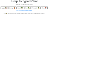
This is a keypress event where a certain element gets focused when the key that starts that element is pressed down. This is written in JavaScript. To handle the keypress event, the “key-down” function has been used in and to validate it to work only for alpha characters, a list has been declared with all the alphabetical characters with its Hexa value. There are three functions used here; handleAlphaKeyPresses, matchElemToKey and cycle focus and the use of them are respectively, to apply the keypress event, to find all the matching elements and return them and to make the “li > an” element. CSS styles have been used to apply mouse hover styles with the “hover” class and to apply the styles for the selected div with the “focus” class.
Source: https://codepen.io/miclgael/pen/LJJvyP?&page=1
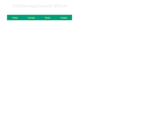
This code is used to design a responsive navigation bar where it dynamically changes according to the screen size. If the screen width is greater than 700px, the “nav-bar” class will be displayed and “small-navbar” will be hidden and vice versa. The style “display” is used with the value “none” to hide the visibility and the value “block” to make it visible. To identify the screen size, the media screen attribute has been used by specifying a min-width. The input element has been used with its type checkbox to display the clickable div; its clicked events have been handled by applying the styles when checked and remove the styles when unchecked.
Source: https://codepen.io/jewel998/pen/exVpQK?&page=1

Mega menus are a new trend. These are drop-down triggered when an event is triggered by hovering over a link mentioned in the menu. This is used to show all options under the particular menu. This is used on e-commerce site where all the available options are listed under a particular category. To add mega menu we are using “mega-dropdown menu”, to the menu item which will display the items under its list. To separate the content we are using the tab classes like “tab-content” and “tab-pane”. Define the tab-pane with particular ID’s. Define the nav tab’s as toggleable with links to the tab-pane of mega-menu items. Check out the CSS for hovering and styling. As mega menus are dropdowns using hovering events, you must be careful to add this on the selected menu items. Use this for your e-commerce website by listing your items and images.

This is a classic example of the responsive navigation bar with no javascript needed. It uses clean HTML5 markup. This navigation bar is aligned to left but can be aligned to center or right. In mobile devices, the navigation bar is set on the top with the logo displayed whereas on the website it’s displayed on the left of the device. Toggling behavior can be seen by clicking on the toggle button. The dropdown is already set for some menu. The icon for each menu is set. CSS file defines responsive behavior using a media query. Navbar on the screen of width above than 767px will be displayed as block align to left, whereas for the screens below 767px the navigation bar will be displayed on the top of the page. Use this navigation bar for mobile applications to navigate to your custom links.
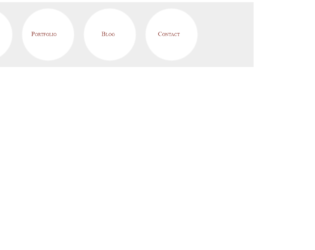
This is a stylish, elegant, and eye-catching navigation bar with the perfect match for fonts and color. This is a must use for sites like personal blogs. This uses the font awesome icons, to display details in each circle. The tag uses the main-navigation class which defines the navigation bar, which is followed by container. The span is styled with the circle, the shape is the eye catcher for this navigation bar. Try pointing the mouse on the link, and you would see the rolling effect of these circles. This effect is defined in CSS using “rotate(360 deg)”. The CSS also defines the media queries, for the screen with a maximum width. Check out other properties defined for this navigation bar. Use this navbar with your page and site, this is an eye-rolling navigation bar with fun to watch the links rollings.
Source: "https://codepen.io/TomHergenreter/pen/qHkfb"
This is an example of a clean navigation bar for an educational site. The font and the style are a perfect match for the sites like tutorials. The navigation bar displays four links which can be linked to the pages like“Home”, “Tutorials”, “About”, and “Contact”. You can add more links to accommodate the pages of your site. You can have a nested link displayed using the numbered list for any given link. Using the and list tags, various topics can be categories. Mouse hover on the “Tutorials” and “Design” link and you would see the list of topics under “Design” displaying with effect. With the classes like “drop bottom” and “dropRight”, we can decide the direction of the list to be displayed. CSS adds effects like background-color, visibility, padding and most important for mouse hovering event. Use this navigation bar style for your website with your topics and links.
Source: "https://codepen.io/rssatnam/pen/niBsD"