
This is another example of a login page designed with HTML and CSS. The input type ‘text' has been used for the text fields. A max length has been set on each text field, username as 35 and password as 30. This allows the user to enter characters up to a given number of max length; in this case user name-35 and password-30. CSS styles has been used to get a shady combination of colors with its values set as height to 100%, width to 100%, margin to 0, background to #f2306a and the background as linear-gradient (left, #f2306a 0%, #6d00a0 100%) to apply the shade of two colors. The input elements have the styles of position as absolute, height as 35px, with as 90%, padding as 0 5%, background as #050023, color as white, font size as 15px, font-weight as bold, border-radius as 4px and border as 2px solid #ff0067.
Source : https://codepen.io/michelebit/pen/NEXbOj
This is a form where users can either log in through regular user name and password or via social media accounts. The media queries have been used to implement the responsive styles to the HTML based on the screen of the user. The button hovers effects are added to the HTML by the use of the hover class in CSS styles and adding the background color on the mouse hover. The style element focus has been used to apply the styles based on the clicked element. The background colors have been set by the use of the CSS style background. Google font has been imported by adding its URL and the @import class in CSS to display text. On a mouse hover event, the href style will be set to opacity - 0.8, color - #ff5400 and text-decoration – none

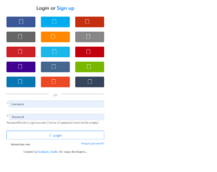
This is a snippet of different Login styles, which can be used for a website or portal. The first style is a simple Sign In form with Email and Password as login details. It also displays the link for retrieving a forgotten password and a checkbox for saving password. Two buttons Sign up and log in as displayed. Second login form displays the buttons linked with the login of Twitter and Facebook. The third style displays an icon with input text and some message. The snippet uses Bootstrap 4 and jquery 3.2. All these login forms are placed in card-body. The FormControl and FormGroup elements are used. These forms can be used in an ecommerce website, market place, and booking websites. Entire card is placed in tag of HTML5. It defines some content aside from the content it is placed in. It could also be placed as a sidebar in an article.

This is an excellent and stylish example of a navigation bar with a login form. It contains the navigation bar with menu, dropdowns, search as input and submit button. Along with this at the extreme right, we have login information like Login and Registration details or Form. To create a navigation bar, classes like navbar and navbar-inverse is used. Under the Login details, we have a listed group item as Sign-in form. Bootstrap Navigation is divided into navbarHeader and navbarBrand, and navbarForm. The form contains the login for facebook, twitter buttons to directly connect to social sites, and a login form and “sign in” button. It also contains a checkbox for ‘Keep me log in” and link to sign up. CSS styles are defined for login form and for social sites buttons.
This is an example of adding Login Form in Modal. Bootstrap contains a Modal component, They are Modals are built with HTML, CSS, and JavaScript. They’re positioned over everything else in the document and remove scroll from the so that modal content scrolls instead. Clicking on the modal “backdrop” will automatically close the modal. Bootstrap only supports one modal window at a time. Nested modals aren’t supported as we believe them to be poor user experiences. Whenever possible, place your modal HTML in a top-level position to avoid potential interference from other elements. You’ll likely run into issues when nesting a .modal within another fixed element. ModelContent is divided into modelHeader, modal-body, and ModalFooter. ModalBody contains the form and registration details whereas the ModalHeader contains header details. Form and registration details are added in two columns in a row. This does not use the modal footer.
Login Form In Modal
3.2.0
Dual Form or Multiple login forms or sign up / reset password or login options tabbed form tabbed. Forms in one panel for easy navigation designed magnificently and is absolutely FREE to download and ready to Use it in your Business website. This Widget template is designed using HTML5 and CSS3 and is super Responsive. The mono-color background and sharp Panels complement each other. The forms are placed in an equally divided column in one row. We can have the same or different input fields. This form contains the same fields placed side by side with contract design. The CSS style is the same for text and buttons for both forms, the only difference is the background color are different for these forms.
Dual Login Form
4.1.1