
This is a template of a web form with a product card with a rotate button on hover, designed using JavaScript, HTML, and CSS. JavaScript functions have been used to implement the hover effects. The icons, images and fonts are imported to the form with their URLs. The image card is given the styles of font-family: 'Raleway', Arial, sans-serif, position: relative, overflow: hidden, margin: 10px,min-width: 230px, max-width: 315px, width: 100%, background: #ffffff, text-align: left, color: #000000, box-shadow: 0 0 5px rgba(0, 0, 0, 0.15), font-size: 16px, and transform: translateZ(0). The image has the styles of vertical-align as top, max-width as 100%, and position as relative. The initial price is given an opacity value of 0.5 and a font-size of 0.9em whereas the discounted price is given the font-size 1.5em. The text-transform style of uppercase is given to the Add to Card icon along with the background color #409ad5. In a hover event, the icon takes a transform of rotateX(-90deg)

This is an example of a card layout with news cards with circled date and arrow that appears on a hover event, designed using HTML, JavaScript, and CSS. The fonts and images are imported to the form with their URLs and JavaScript functions have been used to implement the mouse hover effects. The news card is given the styles of font-family: 'Open Sans', Arial, sans-serif, position: relative, margin: 10px, min-width: 250px, max-width: 310px, width: 100%, background-color: #ffffff, color: #000000, text-align: left, font-size: 16px, and box-shadow: 0 0 5px rgba(0, 0, 0, 0.15) whereas the image has the styles of vertical-align as top, max-width as 100%, and position as relative. The date is given a styles set of background-color: #d2652d, top: 15px, color: #fff, right: 15px, min-height: 48px, min-width: 48px, position: absolute, text-align: center, font-size: 18px, font-weight: 700, text-transform: uppercase to convert the text to uppercase automatically, border-radius: 50% to make it a circle, and padding: 10px 0.

This is another example of a card layout with images with a title and a description that appears on hover, designed using HTML, JavaScript, and CSS. The fonts and images are imported to the form with their URLs. JavaScript functions have been used to implement the mouse hover effects. The image card is given the styles of background-color as #fff, color as #ffffff, display as inline-block, font-family as 'Source Sans Pro', sans-serif, font-size as 16px, margin as 10px 5px, max-width as 315px, min-width as 230px, overflow as hidden, position as relative, text-align as right, and width as 100%. The image has the styles of vertical-align as top, max-width as 100%, and backface-visibility as hidden. The upper layer is given the color #b81212 which takes a transforming effect of skew(-30deg), in a hover event. The name has the styles of font-family as 'Teko', sans-serif, font-size as 36px, font-weight as 700, line-height as 1em, and text-transform as uppercase whereas the description is given a font-size of 0.9em.

This is another example of a web form with buttons with a border effect on hover, designed using HTML, CSS, and JavaScript. The fonts are imported to the form with its URL and JavaScript functions have been used to implement the mouse hover effects. The button is given the styles of background-color as #ffffff, border-bottom as 6px solid #029ebe, border-top as 6px solid #029ebe, color as #555, cursor as pointer to make the cursor a hand pointer, display as inline-block, font-family as 'Raleway', Arial, sans-serif, font-size as 14px, font-weight as 500, height as 46px, letter-spacing as 3px,line-height as 34px, margin as 15px 45px, padding as 0 10px, position as relative, and text-transform as uppercase to automatically transform the text to uppercase. The background color of the form is set to #212121. The color of the remaining space of the border is set as 6px solid #ddd which changes the color to #029ebe in a hover event to complete the border, with a transformation style of rotate(225deg).

This is a template of a web form with rounded images with an icon on a hover event, designed using JavaScript, HTML, and CSS. The fonts and images are imported to the form with their URLs. JavaScript functions have been used to implement the mouse hover effects. The image card is given the styles of position as relative, display as inline-block, margin as 20px, max-width as 190px, width as 100%, color as #bbb, font-size as 16px, and transform as translateZ(0). The image is given the styles of vertical-align as top, max-width as 100%, backface-visibility as hidden, padding as 10px, and border-radius as 50% to make it a circle. The icon in the middle is given the styles of position as absolute, top as 50%, left as 50%, font size as 4em, and transform as translate(-50%, -50%). In a hover event, the background of the image changes the color to rgba(0, 0, 0, 0.9) and its opacity to 1 whereas the border of the image with the style 2px solid #bbb gets a transforming effect of rotate(45deg).
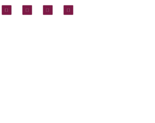
This is an example of a web form with a set icons with a page turn effect on hover, designed using CSS, HTML, and JavaScript. The fonts and icons are imported to the form with their URLs. JavaScript functions have been used to implement the mouse hover effects. The icons are given the styles of box-sizing: border-box, perspective: 50em, transition: all 0.4s ease, background-color: #7e1946, border-radius: 5px, border: 1px solid rgba(255, 255, 255, 0.1), box-sizing: 0 0 5px rgba(0, 0, 0, 0.5), color: #e6e6e6, display: inline-block, font-size: 40px,height: 75px, line-height: 75px, margin: 40px, position: relative, text-align: center, and width: 75px. The icons are given a border radius of 5px 0 0 5px. The icons are primarily given two background colors; #69153a and #7e1946 which change into #1d5599 and #2468bb, in a hover event with a transform style of transform: rotateY(180deg).