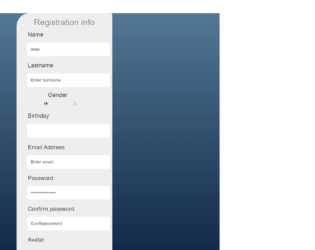
This is an example of a registration form, designed using JavaScript, CSS, HTML, and Bootstrap framework 4. The JavaScript methods have been used to implement the validation on the input fields. The body of the form is given a linear gradient color as linear-gradient(to top, #09203f 0%, #537895 100%). The information container is given a background color as #eeeeef, and a box shadow style as -9px -11px 0px 2px #eef1fb38, inset 10px 7px 0px 0px #a3a7b1f2. The form consists of input text fields, radio buttons, calendar, file upload button, and a 'Send' button. The placeholders of the input fields are displayed with a font-size of 16px, and font color of #252e387a. The title of the form is displayed with the styles of font-family as 'Source Sans Pro', sans-serif, font-size as 2em, font-weight as 300, font color as#7f8c8d, and text-shadow as 1px 1px 0px white. The input text fields are given the styles of color as #7f8c8d, font-weight as 600, and font-size as 16px. The fields change their background color to #fafafa, on focus. The 'Submit' button changes its background color to #3a5e7bdb, and change the border bottom radius value to 32% in a hover event.
Source: https://codepen.io/Mamikonars/pen/qwPaJa
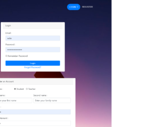
This is a form with separate panels for login, registration, and forget password features, designed using CSS, HTML, JavaScript, and Bootstrap framework 4. The background image and font styles have been imported to the code with their URLs. The JavaScript methods have been used to enhance the responsiveness and the scrolling functionality of the form. The toggle buttons of the navbar have been created as primary type buttons and displayed with a style set of font-size ad 90%, font-weight as 400, letter-spacing as 1px, color as white, and font-family as 'Montserrat', 'Helvetica Neue', Helvetica, Arial, sans-serif. The concept of Lists has been used with UL and LI components. UL element has been used with the child elements of LI to display the toggle buttons, in an orderly manner. The buttons take a box-shadow style of 0 6px 10px 0 rgba(0,0,0,0.24),0 17px 50px 0 rgba(0,0,0,0.19), in a hover event. The media quarries have been used to increase the responsiveness of the form.
Source: https://codepen.io/elmorabityounes/pen/wxxPEL
Login/ Registration Form
4.3.1
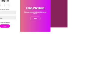
This is an example of a sliding signup/ sign-in form, designed using CSS, HTML, JavaScript, and Bootstrap framework 4. The form consists of two panels; one for signup and the other one for sign-in. The users are given the ability to switch between the panels by clicking on the button. The JavaScript methods have been used to implement the sliding functionality of the panels. The font style is imported to the code with its URL. The body of the form is given the styles of font-family as 'Teko', sans-serif, background color as #86235a, and align-items as center. The information container is given a box-shadow style as 0 14px 28px rgba(0,0,0,0.25), 0 10px 10px rgba(0,0,0,0.22). The panel content is displayed with the styles of font-size as 18px, font-weight as 100, line-height as 20px, and letter-spacing as 0.5px. The 'Sign in' button is displayed with a style set of border as 1px solid #f3f3f3, background color as #23bebe, font color as #fff, font-size as 12px, font-weight as bold, and text-transform as uppercase to automatically convert the text to uppercase.
Source: https://codepen.io/zaidik/pen/wvMapoM

This is an example of a sign in/ registration form, designed using CSS, HTML, JavaScript, and Bootstrap framework 4. The form consists of a login panel and a sign-in panel in a single form. The font style and style sheets have been imported to the code with their URLs. The JavaScript functions have been used to implement the opening fadeout and slide down animations for the forms. The information container is given a background color as #041122, and a box-shadow style as 1px 2px 2px rgba(4, 17, 34, 0.68). The image logo is given an opacity value of 0.4, width as 80px, and cursor style as pointer to get the hand cursor effect on hover. The logo increases its opacity to 1 and takes a transform effect of rotate(360deg) scale(1.2, 1.2) on hover. The panel titles are displayed with a font-size of 12px, and a background color as #041122, which gets changed to #01AEF2, in the focus mode. The opacity of the titles also gets changed to 0.6 on hover. The input text fields also take the background color of #285c7a, on hover. The 'Submit' button takes a transform effect as scale (0.8, 0.8), in a hover event
Source: https://codepen.io/mohamed-hany22/pen/gLZQeo

This is another example of a registration form that consists of radio buttons, input text fields, and Register button. It is designed using CSS, HTML, and Bootstrap framework 4. The font style has been imported to the code with its URL. The title of the form is displayed with the styles of font-size as 32px, font-weight as 300, font color as #4c4c4c, and text-align as center. The registration container is given a width and a height of 343px, and 500px. Background color of #ebebeb, box-shadow of 1px 2px 5px rgba(0,0,0,.31), and a border style of solid 1px #cbc9c9. The radio button are given a background color as #412065. The input text fields are validated by making them required in HTML. The input text fields are given a box-shadow style as 1px 2px 5px rgba(0,0,0,.09), and a border style as solid 0px #cbc9c9. The 'Submit' button is given a background color as #412065, which changes to #2e458b, on hover.
Source: https://codepen.io/alexcali93/pen/WwqRGe
Registration Form
4.3.1

This is another example of a registration form, designed using CSS, HTML, JavaScript, and Bootstrap framework 4. The form consists of input text fields and the Submit button. The JavaScript methods have been used to implement the validation on the input fields. The font style has been imported to the code with its URL. The body of the form is given the styles of font-family as "Lato", sans-serif, font color as #333, line-height as 1.4, and font-size as 16px. The registration has been given a style set of width as 550px, background color as #EEE, and opacity value as 9. The header title of the form is given the styles of font-size as 2rem, text-transform as uppercase to automatically convert the text to uppercase, and font-weight as bold, whereas the mini section of the title is given a font-size as 0.8rem. The input text fields are given a font-size as 1.1rem, and border as 1px solid #D3D3D3. In a focus event, the fields take the styles of border-color as #AAA, and box-shadow as 0px 0px 5px 0px #AAA. The 'Submit' button also takes a box-shadow style as 0px 0px 10px 0px #4E59E4, in a hover event.
Source: https://codepen.io/AutonomousHC/pen/hgJzx
Registration Form
4.3.1