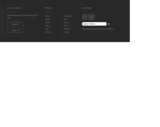
For any design to be beautiful, the space utilization is most important along with the perfect match of icons and fonts. This is the smooth looking footer example with the rich look and feel, like in any apple products. Footer space is divided well with the company information on the left side. Company links in the middle of the page, and links newsletters and search space on the extreme right side. This is created using bootstrap 4, by placing the columns and rows in the container. This design does not suffice, if not used in smaller screen devices. It is very well responsive, a check is a design adjusts on top of another like a stack, once you are in smaller screens.
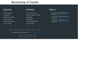
This is a stylish footer created to match your website. It uses the bootstrap 4 and font awesome CSS for styling, It is divided into 4 columns and under each column, you have links for the quick links. Check out the find us column which displays the information of contacts like phone and email. Others are quick links with the links of pages in the forum and you have the follow us links linking to their pages on the website or the social media sites. Additionally, the navigation page is also displayed in the footer. The copyright and social media icons are perfectly located at the middle bottom of the page.
Footer Bootstrap 4
4.3.1
This is an elegantly done footer for your website. This can be used to display additional information like the contact links, quick links, page links, and other search-related links. Additionally, it has the email section link to send the email, links to media sites with the copyright information with social media site links. The slot for displaying the visa and master card for payment option is an addition to your footer design. It uses bootstrap 4 and font-awesome, for its styling. The styling is simply made to fit in the footer design.
This is a simple responsive bootstrap 4 footer using font awesome; this can be adapted to have 3 columns with the quick links added. You can have the contacts, company information and quick links added instead. You can change the headings accordingly, the CSS used is the perfect match. The responsive behavior is due to the @media screens, added to CSS. Check it out for yourself the view in small screen devices. The Copyright, social media site links are well placed. You could use this snippet to add in your website with changing the links and the names for quick links.
Footer using Bootstrap 4
4.3.1
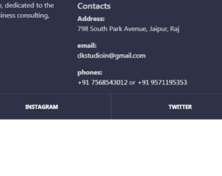
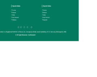
This is a classic example of footer used on the website. Footer class used is footer-classic, with a dark background. The Footer is placed in the container, with appropriate rows and columns alignment. The first half is displaying the brand and details of the brand, were as second half contains the contacts and links for other pages of the website. Class social-containers is used to display the links of social sites like Facebook and Instagram. A well-defined CSS gives the style to this footer with padding, margin, opacity defined. This footer example can be used in elaborated business pages, where they have multiple pages of contacts.
Footer Design
4.3.1

This is an excellent example of a Footer. Footer is an additional navigation method for websites. It holds company info, copyrights, links, buttons, etc. This snippet contains classes like FooterTop, FooterBottom, FooterTitle, FooterLogo, FooterSocial. Check out the CSS settings in tag of HTML. We will be using font awesome for icons. Footer tag of bootstrap sets the stage for footer in HTML, the contains of the footer is placed in the class “container”, it deals with responsive behavior of the page. The row is divided into 4 parts and each part contains respective info which is using its individual style sheets. Check out the table class inside the footer. Each class and tag has its own style defined. Check out the hovering style defined for the button.
Simple footer
4.3.1