
This is an example of a simple footer with hover effects, designed using HTML, CSS, and Bootstrap framework 4. The font, CSS and Bootstrap styles are imported to the code with their URLs. The concept of Lists has been used with UL and LI components. UL element has been used with the child elements of LI to display the child elements of the footer, in an orderly manner. The background color of the form is set as #fff, whereas the footer logo is given the styles of font-size as 1.8em, font-weight as 600, color as #333, margin-bottom as 22px, and display as block. The footer is given the styles of background as linear-gradient(to right,#fff 0,#535df1 50%,#fff 100%), height as 5px, width as 100%, and position as absolute. The child elements of the footer have the styles of font color as #6d6e71, font-size as 15px, and line-height as 30px. In a hover event, the child elements take the styles of font color as #27aae1, with a transition value of all 1s.
Source: https://www.tolmatol.com/free-snippets-footer-design/
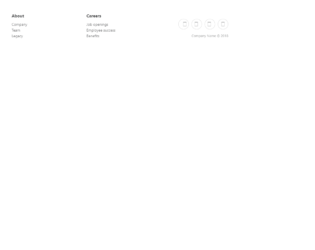
This is an example of a simple footer layout with columns, designed using HTML, CSS, and Bootstrap framework 4. The CSS styles and Bootstrap styles are imported to the code with their URLs. The concept of Lists has been used with UL and LI components. UL element has been used with the child elements of LI to display the footer items in an orderly manner. The form is given the styles of background-color as #fff, and font color as #4b4c4d. The column titles are given the styles of margin-bottom as 12px, font-weight as bold, and font-size as 16px, whereas the column list items are given the styles of line-height as 1.6, and font-size as 14px. The list items take the opacity value of 1, in a hover event. Media quarries are used to increase the responsiveness of the form. The social media icons are given the styles of font-size as 24px, width and height as 24px, line-height as 40px, display as inline-block, text-align as center, border-radius as 50% to get the circle shape, border as 1px solid #ccc, margin-left as 10px, margin-top as 22px, and opacity as 0.75. The social media icons change their opacity to 0.9, in a hover event.
Source: https://epicbootstrap.com/snippets/footer-with-columns
Footer With Columns
4.3.1
This is an example of a footer layout, designed using HTML, CSS, and Bootstrap framework 4. The icons are imported to the code with their URL. The concept of Lists has been used with UL and LI components. UL element has been used with the child elements of LI to display the footer items in an orderly manner. The form is given a background color of #ffffff, and font color of #4b4c4d. The social media icons set is given the styles of font-size as 24px, width and height as 40px, line-height as 40px, display as inline-block, text-align as center, border-radius as 50% to get the circle shape, border as 1px solid #ccc, margin as 0 8px, and opacity as 0.75. The social media icons take the opacity value of 0.9, in a hover event. The footer items are given the styles of text-align as center, font-size as 18px, opacity as 0.8, and line-height as 1.6. The footer items take the opacity value of 1, in a hover event.
Source: https://epicbootstrap.com/snippets/footer-basic
Basic Footer Layout
4.3.1
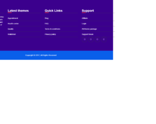
This is another example of a bootstrap footer template with hover effects, designed using HTML, CSS, and Bootstrap framework 4. The icons are imported to the code with their URLs. The concept of Lists has been used with UL and LI components. UL element has been used with the child elements of LI to display the details in an orderly manner. The footer is given a style set of padding as 60px 0, width as 100%, background as #3B008D, and color as #fff. The column title has the styles of color as #fff, font-size as 24px, font-weight as 600, margin-top as 5px, margin-bottom as 20px, and border-bottom as 1px solid #4e4e4e. The list items are given the styles of padding as 10px 0, border-bottom as 1px solid #404040, color as #fff, and transition as color 0.5s ease-in-out. The social media icons are given the styles of width and height as 40px, font-size as 16px, border as 1px solid #404040, border-radius as 50px to get the circle shape font color as #fff, line-height as 1, and transition as background 0.3s ease-in-out. Both list items and social media items take the background color of #ff304d, in a hover event.
Source: https://codepen.io/hasib_technobari/pen/QmNxwy
Bootstrap footer design
4.3.1

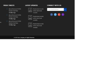
This is an example of a bootstrap footer template with hover effects, designed using HTML, CSS, and Bootstrap framework 4. The icons are imported to the code with their URLs. The concept of Lists has been used with UL and LI components. UL element has been used with the child elements of LI to display the details in an orderly manner. Media queries have been used to increase the responsiveness of the form. The footer section has the styles of background-color as #3c3d41, padding as 60px 40px, font color as rgba(255,255,255,1.00), margin-bottom as 20px, border-bottom-right-radius as 6px, border-top-left-radius as 0px, and border-bottom-left-radius as 6px. The content section has the styles of font-size as 12px, and font-color as rgba(255,255,255,0.70), whereas the Menu list items are given the styles of color as rgba(255,255,255,1.00), font-weight as bold, and text-transform as uppercase to convert the text to uppercase. The list items take the color of rgba(255,255,255,0.80), in a hover event.
Source: https://codepen.io/nonelittlesong/pen/dLQVeJ
Footer UI: Dark Theme
4.3.1
This is an example of another bootstrap footer template with hover effects, designed using HTML, CSS, and Bootstrap framework 4. The icons and the background image are imported to the code with their URLs. The concept of Lists has been used with UL and LI components. UL element has been used with the child elements of LI to display the details in an orderly manner. The form is given a background color as #222, and font color as #fff. The font-weight for the column title is set as Bold, whereas the list items are given a font color as #ccc. The social media icons have the styles of height and width as 35px, border-radius as 50% to get the circle shape, line-height as 35px, and color as #fff. The icons are given different background colors as #3a5a95, #57aced, #dd4f43, and #6b27b2, which changes to #0141a2, in a hover event with a transform value of rotate(360deg).
Source: https://codepen.io/aleksandrkarpuk/pen/zXQBdY