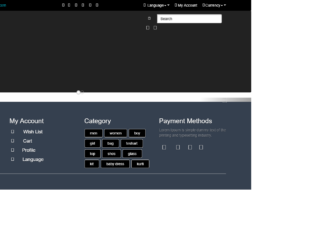
This is an example of the implementation of a top navigation bar and a footer section for a website with CSS and HTML. Bootstrap library and bootstrap style sheets have been imported to the code with the use of its grid view elements to separate and organize the displaying sections. All the icons that are displayed in the example are used with the integration of the font awesome icons. The basic styles such as background color, buttons, and labels have been used with pure CSS implementation. The background color of the top bar is set as black and in order to place the social media icons in a row, the display style is set as inline-block, font color as white and the font size as 25px.
E-Commerce menu footer
4.3.1
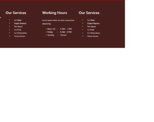
This is a simple example for the footer section of a website with pure CSS and HTML. The bootstrap style sheets are imported to the code and used with its grid view elements to separate and organize the displaying sections. The concept of Lists has been used with UL and LI components. The font awesome style sheet is used to display the icons. UL element has been used with the child elements of LI to display the unordered list. Background color has been set to a shade of maroon with rgb (71, 32, 29).

This is an example from right to left list which can be used in a list, navigation bar, footer and to display the items. Design from right to left makes sure your website follows the same design. The list items are placed in container-fluid giving it appropriate responsive behavior, The CSS is simple and keeps the list simple along with it, providing the hovering property to the links. Check out the responsive behavior, which gives an appropriate look to this design while it is viewed in smaller screens.
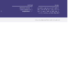
This is one of the best footer examples for the websites reading right to left. Divided into 3 columns, extreme right displays the company information, followed by the contact details on the company, and extreme left is the contact information along with appropriate social media. Check out the extra add-ons at the bottom link copyright information. If you are planning for this kind of footer then have a look at CSS which provides the style of right to left for all the components of the footer. This is even responsive and is great when it displays itself on smaller screens. If you are planning to use this make sure your website is also right-aligned and is normally read from right to left.

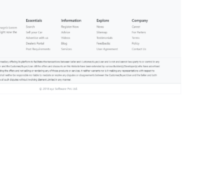
This footer is made up of bootstrap and is one of the best examples of responsive footer with the company information on the right and the links displayed on the quick links, categories and main categories. The copyright information is perfectly displayed at the bottom of the page. This can be used as a fixed or sticky footer at the bottom of the page. Check the responsiveness, displaying on the smaller screens it will stack all the columns on the top of other, this would allow it to display the complete information at the end of the page. You this footer design for an elegant website looks.
You want a disclaimer below the screens then this is the perfect footer design for you. Disclaimer visible equally well in smaller and larger screens it is made up of five divisions with the social links attached to it. Along with it, the copyright information is displayed at the bottom of the page. This can be used in a website related to big organization or financial sites or eCommerce sites. Hover your mouse over these links and social links you would see the gradient color set using CSS. CSS is pretty simple and well used for this design.