
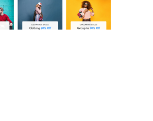
This is another example of an Our Services layout, designed using HTML, CSS, and Bootstrap framework 4. The fonts are imported to the code with its URL. The services card is given the styles of position as relative, padding as 35px 15px, text-align as center, and border as 2px solid #efefee, whereas the inner icon box has the styles of position as relative, font-size as 60px, color as #009dea, line-height as1em, and margin-bottom as 20px. The title of the services card is given the styles of color as #222222, font-size as 18px, font-weight as 600, and margin-bottom as 15px. In a hover event, the title changes its color to #009dea. The content section of the card has the styles of font color as #888888, font-size as 14px, and line-height as 1.8em. In a hover event over the service card, and outer layer with the background color of rgba(0,0,0,0.80), and opacity of 1, and a transform value of perspective(400px) rotateX(0deg), gets displayed over the inner card.
Source: https://www.tolmatol.com/our-services/
Our Services Layout
4.3.1

This is an example of an Our Services layout with hover effects, designed using HTML, CSS, and Bootstrap framework 4. The font style is imported to the code with its URL. The layout consists of three columns. The font style for the web page is given as 'Poppins', sans-serif. The form is given a linear gradient background color of (#6A1B9A, #9C27B0 50%, #fff 50%, #fff). The display style for the services cards is given as flex. The service cards are given the styles of width as 280px, background as #fff, padding as 60px 40px 60px, and box-shadow as 0px 15px 45px rgba(0,0,0,.1). The card number has the styles of font-size as 4em, font-weight as 800, z-index as 1, opacity as 0.2, and transition s 0.5s, which takes the styles of opacity as 1, color as #fff, and transform as translateY(-50px), in a hover event. The image card takes the styles of transform as scaleY(1), transform-origin as bottom, and transition as transform 0.5s, in a hover event to turn the background of the card to #ff226d.
Source: https://www.tolmatol.com/our-services-2/
Our Services Layout
4.3.1
This is an example of an image card layout depicting the item category list, designed using HTML, CSS, and Bootstrap framework 4. The images and Bootstrap styles are imported to the code with their URLs. The image is given the styles of width as 100%, and cursor as pointer to get the hand cursor effect in a hover event. The content section of the card is given the styles of position as absolute, width as 100%, text-align as center, transform as translateY(100%), background as #fffffff2, max-width as 80%, margin as 0% 10%, cursor as pointer, border-radius as 5px, padding as 15px 0px, and transition as all .5s. The subtitle of the card is given a text-transform style as uppercase to automatically convert the text to uppercase, whereas the title is given the styles of font-weight as 600, font-size as 22px, and line-height as 1.6. In a hover event, the content section takes the styles of border-radius as 50px, max-width as 90%, and margin as 0% 5% to form an oval shape.
Source: https://www.tolmatol.com/bootstrap-snippets-category-list/
Category List Layout
4.3.1

This is an example of an image card layout depicting the item categories, with animations, designed using HTML, CSS, and Bootstrap framework 4. The images, font, Bootstrap and CSS styles are imported to the code with the URLs. The image card title has the styles of color as #ffffff, font-size as 20px, and font-weight as 700. The image card container has the styles of width and height as 100%, background as #222222, transition as 0.5s, and opacity as .45. The image card also acts as a link to its respective collection, which can redirect the users to an external link. The card image is given width as 100% to cover the whole card and a transition value as 0.5s. In a hover event, the image card takes a transform value of scale(1.1), to display a zoom-in effect.
Source: https://www.tolmatol.com/bootstrap-categories-snippets-image-over-zoom/

This is an example of a portfolio image card layout, designed using HTML, CSS, and Bootstrap framework 4. The images and Bootstrap styles are imported to the code with their URLs. Media quarries are used to increase the responsiveness of the form. The background form is given the styles of background-color as RGB(255, 255, 255), color as RGB(27, 27, 27), display as flex, flex-direction as column, height as 100%, padding as 20px, position as absolute, transition as all 0.4s ease-in-out 0s, and width as 100%. The image card title has the styles of font-size as 16px, margin-bottom as 5px, and transition as all 0.4s ease-in-out, whereas the content is given the styles of color as #6b6b6b, transition as all 0.4s ease-in-out, and font-size as 13px. In a hover event, the portfolio card takes a filter with a background color of rgba(17, 214, 240, 0.65), over its image card and turns the styles of the title and the content section to color as #ffffff, font-size as 20px, and color as #fff, font-size as 16px, respectively.
Source: https://www.tolmatol.com/portfolio-using-html-css/

This is an example of a card layout with team profile details, designed using HTML, CSS, and Bootstrap framework 4. The images, fonts, CSS and Bootstrap styles are imported to the code with their URLs. The profile image is given the styles of width as 100%, transform as scale(1, 1), and transition as .5s. The images take a transform effect of scale(1.1, 1.1), to change the scale of the image, in a hover event. The name of the user profile is given a style set of font-size as 18px, text-transform as uppercase to automatically convert each letter of the word to uppercase, font-weight as 700, color as #333333, and transition as .5s. The designation text is given the styles of text-transform as uppercase, font-size as 14px, and font color as #797e82. In a hover event, the background color of the text section turns to #6f0ac8, whereas the font color of the text turns to #fff. The social media icons are given a background color as #6f0ac8, with the opacity set as 0, and the visibility set as hidden to hide when not active. In a hover event on the image, the opacity of the social media icons becomes 1 and the visibility turns to visible.
Source: https://www.tolmatol.com/our-team-with-social/