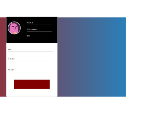
This is an example of a bootstrap animated profile card layout with hover effects, designed using HTML, CSS, and bootstrap framework 4. The images, CSS styles, and fonts are imported to the code with their URLs. The body of the form is given a linear gradient background color of linear-gradient (to right,#ac1816,#2980b9), and a font- family style as Montserrat. The profile card is given a width and a height of 30%, and 600px, border-radius as 5px, and background color as 600px. The profile picture is given a border style of 3px white solid. The content input section is given a background color of #535c68. The submit button is given a style set of width as 70%, and height as 70px, background color as RGB(131, 0, 0), transition effect as 0.7s, font-color as white, and font-size as 20px and cursor style as pointer to get the hand cursor effect. The button changes its background color to red, in a hover event.
Source: https://codepen.io/AranhaTM/pen/VwYGaOv
Animated profile card
4.3.1
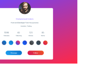
This is an example of a bootstrap profile card layout with hover effects, designed using HTML, CSS, and bootstrap framework 4. The images, icons, and fonts are imported to the code with their URLs. Media queries have been used to increase the responsiveness of the form. The body of the form is given a font family as 'Quicksand', sans-serif, and a background color as #324e63. A linear background image is set for the from background as linear-gradient(-20deg, #ff2846 0%, #6944ff 100%). The profile card has the styles of box-shadow: 0px 8px 60px -10px rgba(13,28,39,0.6), background as #fff, border radius as 12px, and position as relative. The image is given a height and a width of 150px, border-radius as 50%, to get the circular shape, and a box shadow as 0px 5px 50px 0px rgb(108, 68, 252), 0px 0px 0px 7px rgba(107, 74, 255, 0.5). The profile name has the styles of font-weight as 700, font-size as 24px, color as #6944ff, and margin-bottom as 15px, whereas the content is given the styles of font-size as 18px, font-weight as 500, color as #324e63, and margin-bottom as 15px. In a hover event, the blue button takes a box shadow effect of 0px 7px 30px rgba(19, 127, 212, 0.75), whereas the orange button takes 0px 7px 30px rgba(223, 45, 70, 0.75).
Source: https://codepen.io/mkupfer/pen/oNgPJyq
Profile Card
4.3.1

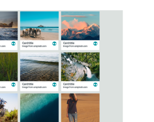
This is an example of a bootstrap grid layout used to display thumbnail details with hover effects, designed using CSS, HTML, and Bootstrap framework 4. The background images of the cards are imported to the code with their URLs. The number of grid items per row is defined as 3, and the gap between each item is set as 1, in CSS. The colors are predefined as primary-color: #333, secondary-color: #fff, and font-color: #fff. For the browser that does not support the grid layout, the background color is set as #00d2ff. The font family for the form is given as 'Roboto', sans-serif. The title of the form is given a style set of color as white, font-size as 30px, text-transform as uppercase to automatically convert the text to uppercase, and font-weight as 700, whereas the subtitle of the form is given the styles of font-size as 18px, and font-weight as 300. In a hover effect, the first card takes a transform effect of transformSkewScale (-45deg, 1), and a transition effect of (all 400ms cubic-bezier(0.175, 0.885, 0.32, 1.275)), whereas the second and third ones take transformSkewScale(45deg, 1), and transformSkewScale(45deg, 0) effects, respectively.
Source: https://codepen.io/nikhil8krishnan/pen/jbdXdr
THUMBNAIL HOVER EFFECTS
4.3.1
This is an example of a web form with a 3D fold-out reveal card preview, designed using HTML, CSS, and JavaScript. The background images of the cards are imported to the code with their URLs. JavaScript functions have been used to create 3D animations in a focused event. The font family of the form is set as Sans+Pro and imported into the code with its URL. The colors are predefined as variables and set as white: #ffffff, lightBG: #dce1df, salmon: #ff6666, teal: #0096a0, tealMid: #0ebac7, tealContrast: #33ffff, darkGrey: #4f585e, and tealShade: #007c85. The body of the form is given the styles of background: @lightBG, color: @darkGrey, font-family: 'Source Sans Pro', sans-serif, and text-rendering: optimizeLegibility. The cards are given an initial set of styles such as background: @white, display: inline-block, margin: 8px, max-width: 300px, perspective: 1000, position: relative, text-align: left, and transition: all 0.3s 0s ease-in. The cursor is set as pointer to display the cursor as a hand, in a focus event on cards.
Source: https://codepen.io/candroo/pen/wKEwRL
3D Fold out reveal
4.3.1

This is an example of a bootstrap web form with a vertical carousel feature designed using Tweenmax JavaScript library, CSS, bootstrap framework 4 and HTML. The images and bootstrap styles are imported to the code with their URLs, whereas the carousel feature had been implemented using JavaScript. The body of the form is given a height and a width of 100%, a linear gradient background color as linear-gradient(180deg, #ffb253 0%, #f56259 100%). The card image has the styles of width as 53px, height as 53px, and border-radius as 50% to get the circle shape. The card content section is given the styles of width as 100%, max-width as 374px, margin-left as 26px, and font-family as "Open Sans",sans-serif. The card title has the styles of color as #4a4545, font-size as 16px, font-weight as 400, letter-spacing as -.18px, and line-height as 24px, whereas the content description is given the styles of color as #696d74, font-size as 15px, font-weight as 300, and line-height as 24px.The city is given a font color of #696d74, and a font-size of 11px with the text-transform style set as uppercase to automatically convert the text to uppercase.
Source: https://codepen.io/rahulsingha/pen/mdyXzzj
Vertical Carousel
4.3.1