
This is another simple example of a button view with hover effects designed by using HTML and CSS. The font of the body is set as 'Open Sans Condensed', sans-serif, the display as flex and flex direction as column. Box 1 is given a background color of #FF6766, box 2 is given a color of #3C3C3C and box 3 #66A182. For the buttons, text-align is set as center and cursor is set as pointer. For button 1, styles before a hover event are set as opacity: 1, and transform: scale (1, 1) where it will change to opacity: 0, and transform: scale (0.1, 1) on a hover event. For button 2, styles before a hover event are set as transform: rotate (-45deg), and background-color: rgba (255,255,255,0) where it will change to transform: rotate(45deg), background-color: rgba(255,255,255,0) on a hover event. For button 3, styles before a hover event are set as opacity: 0, and transform: scale (0.5,0.5) where it will change to opacity: 1, and transform: scale(1,1) on a hover event.
Source: https://codepen.io/rauldronca/pen/mEXomp

This is another example of a button view with hover effects designed by using HTML and CSS. Variables have been created to define colors to store color values in CSS so variable names could be used repeatedly to avoid setting the same value in different places. The body is given the styles of background: #f5f5f5, font-family: 'Poppins', sans-serif. General styles for the button group are set as width: 100%, text-align: center, margin-bottom: 125px, margin: 5em 0, padding: 10px 30px, margin: 1em, border-radius: 5px, text-decoration: none and transition: 0.5s ease-in-out. On a hover event, button 1 will change its styles to box-shadow: 0px 0px 0px 2.5px #fff, 0px 0px 0px 5px $yellow, 0px 0px 0px 10px white, 0px 0px 0px 10.5px $yellow, background: white, color: $yellow. Button 2 will change its styles to box-shadow: 0px 0px 0px 2.5px white inset, 0px 0px 0px 5px $cyan, Button 3 to letter-spacing: 10px, box-shadow: 2.5px 2.5px 0px 5px white, 5px 5px 0px 7.5px $red, background: none, border: 2.5px solid $red, color: $red. Likewise, all the 8 buttons will change its styles according to the given styles on a hover event.
Source: https://codepen.io/samflickgraphics/pen/KajNRm
Button Hover Effects
4.3.1

This is an example of a button view with hover effects designed by using HTML and CSS. The buttons are named as button 1, 2, 3, 4, 5. The buttons are given a general style set of width as 170px, text-align as center, text-transform as uppercase and cursor as pointer. Button 1 is given a neo outline effect on a hover event by setting the styles as color: #00d7c3 and box-shadow: 0 0 10px 0 #00d7c3 inset, 0 0 20px 2px #00d7c3. Button 2 is given the styles of border: 3px solid #c266d3, and a background color of #c266d3 and will become transparent on a hover event. Button 3 is given a shadow effect on a hover event by giving the style of box-shadow: 8px 8px #99bdff and transition: .3s. Styles for button 4 are set as background-color: transparent, border: 3px solid #ff0251, color: #ff0251, transition: .3s and will take a pulse effect on a hover event by animation: pulse 1s infinite, whereas button 5 will take a gradient hover effect by background-position: -200%, transition: background 300ms ease-in-out styles.
Source: https://codepen.io/woolandcotton/pen/mBmLwq
CSS button hover effects
4.3.1

Stylish Radio Buttons
4.3.1

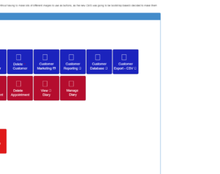
This is an example of an admin dashboard with buttons, designed using HTML and CSS. Bootstrap CSS styles have been imported to the HTML file with the use of the link and script elements. The basic CSS has been used to apply the borders of the labels to be curved with the use of the border radius in the CSS styles. The button hovers effects are added to the HTML by the use of the hover class in CSS styles and adding the background color on the mouse hover. When a button is on the active state, the value of the background image will be set to none which means the background image will not be displayed
Admin Dashboard Buttons
4.3.1