
This is an example of a loading bar animation, designed using HTML, CSS, Bootstrap framework 4. The body of the form is given the styles of display as flex, justify-content as center, align-items as center, height as 100vh, and background as #ECEFFC. The implementation of the loading feature has been done by giving different animations and styles into four bars. The loading container is given the styles of position as relative, width as 45px, height as 45px, and a transform value as rotate(75deg). An individual bar is given an animation of 1.5s cubic-bezier(0.645, 0.045, 0.355, 1) infinite. The first child element is given a background color of #0984e3, and an animation style of slide-bottom-top, whereas the second child element has the background color of #d63031, and animation style of slide-left-right. The third and fourth ones are given the background colors and animation styles of #fdcb6e, #00b894, slide-top-bottom, and slide-right-left, respectively.
Source: https://codepen.io/alphardex/pen/abzaxBB
Bar Loading
4.3.1
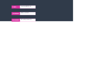
This is an example of a floating label layout, designed using HTML, CSS, JavaScript, and Bootstrap framework 4. The JavaScript functions have been used to implement the floating functionality of the labels. The body of the form is given the styles of min-height as 100vh, background as HSL(215,21%,24%), font-family as 'Roboto Condensed', sans-serif, and letter-spacing as 0.1em. The input label has the styles of display as block, height as 100%, width as 35%, padding-left and padding-right as 0.75em, background as HSL(320,69%,53%), color as white, line-height as 2.5rem, text-transform as uppercase to automatically convert the text to uppercase, and transition as transform 0.3s ease-in-out. The input field has the styles of height as 2.5rem, width as 100%, padding-left as 38%, color as HSL(215,21%,24%), border as 1px solid HSL(320,69%,53%), and transition as padding-left 0.3s ease. When an input field is checked, the border and the label color becomes HSL(90,44%,71%), and the font color becomes white.
Source: https://codepen.io/meowwwls/pen/JGbwKw
Floating Labels
4.3.1
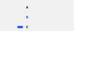
This is an example of a web form with radio buttons with hopping animations, designed using HTML, CSS, and Bootstrap framework 4. The body of the form is given a style set of background color as #f1f1f1, font color as #171717, display as flex, font as 1em Ubuntu, sans-serif, height as 100vh, line-height as 1.5, and padding as 1.5em 0. The animation timing, duration, and colors are predefined as $wormDur: 0.4s, $radioDur: 0.2s, $timing1: cubic-bezier(0.45,0.05,0.55,0.95), $timing2: cubic-bezier(0.5,0,0.5,2), and $shadowColor: rgba(0,0,0,0.2). The label of the radio button is given the styles of $shadowColor as rgba(0,0,0,0.2), cursor style as pointer to get the hand cursor effect in a hover event, font-weight as bold, text-shadow as 0 0.1em 0.1em $shadowColor, transition as color $radioDur $timing1, and margin-bottom as 1.5em. The radio button and the labels take the color of #2762f3 in the active mode. Media queries have been used to increase the responsiveness of the form.
Source: https://codepen.io/jkantner/pen/rNaPadg

This is an example of a download interaction button with animations, designed using HTML, CSS, JavaScript, and Bootstrap framework 4. The icons are imported to the code with their URLs, whereas the JavaScript functions have been used to implement the downloading animation. The body is given the styles of background as #E8EBF3, height as 100vh, font as 400 16px 'Poppins', sans-serif, display as flex, flex-direction as column, justify-content as center, and align-items as center. The download icon box is given a border-radius of 3px, and a box shadow of 0 10px 30px rgba(#000000, 0.2). The download button is given height and width of 55px, background color of #1F242D, cursor as pointer to get the hand cursor effect on a hover event, and a transition value of width .2s ease-in .4s, height .2s ease-in .4s, background .2s ease-in .4s. The arrow in the download button is given a background color of #FFFFFF, height of 15px, and width of 2px. The progress container is given the color of linear-gradient(to right top, #00A7FC, #0070ED).
Source: https://codepen.io/milanraring/pen/jOEOmbv

This is an example of a carousel with a reversed easing effect, designed using HTML, CSS, JavaScript, and Bootstrap framework 4. The fonts used in the form are imported to the code using its URL. The concept of Lists has been used with UL and LI components. UL element has been used with the child elements of LI to display the carousel items in an orderly manner. JavaScript functions have been used to implement the carousel feature. The body of the form is given a background-color of #141316, and font color of #FAFAFA. The arrow buttons are given the styles of background-color as transparent, width as 65px, padding as 20px, transition as opacity 200ms, and transform as translate3d(0, -50%, 0). In a hover or focus event, the button changes its opacity to 0.6. The carousel item heading has the styles of text-transform as uppercase to automatically transform the text to uppercase, font-size as 1.2rem, and letter-spacing as 0.05em, whereas the item quote is given the styles of font-size as 1.1rem, line-height as 1.4, and letter-spacing as 0.03em.
Source: https://codepen.io/michellebarker/pen/OaYpWp
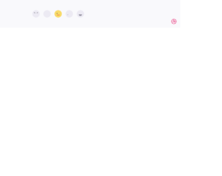
This is an example of a web form that consists of feedback reactions icons, designed using HTML, CSS, JavaScript, and Bootstrap framework 4. The feedback icons are imported to the code with their URLs. The concept of Lists has been used with UL and LI components. UL element has been used with the child elements of LI to display the icons in an orderly manner. JavaScript functions are used to implement the active status of the feedback icons. The number of feedback icons is five with angry, sad, ok icons and two happy icons. Each icon has three sections as eye left, eye right, and mouth, which is used to implement the reactions. The colors of the feedback icons are predefined as normal: #ECEAF3, normal-shadow: #D9D8E3, normal-mouth: #9795A4, normal-eye: #595861, active: #F8DA69, active-shadow: #F4B555, active-mouth: #F05136, active-eye: #313036, active-tear: #76b5e7, and active-shadow-angry: #e94f1d. The cursor style for the icons is given as pointer to get the hand cursor effect on a hover event. The reaction animations are created by giving different styles to the eyes and mouth sections of each icon.
Source: https://codepen.io/aaroniker/pen/mdyYBPP
Feedback Reactions Form
4.3.1