- Latest
- Featured
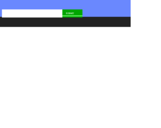
This is an example of a submission web form with animations, designed using HTML, CSS, JavaScript, and Bootstrap framework 4. The images are imported to the code with their URLs. JavaScript functions have been used to implement the animations on the submit button click. The colors are predefined as $o as #ffa440, $g as #01a500, $b as #6a88fe, and $elastic as cubic-bezier(0.175, 0.885, 0.32, 1.275). The body of the form is given the styles of display as grid, place-items as center, height as 100vh, font-family as 'Press Start 2P', overflow as hidden, and background as $b. The fireworks image is given height and width of 16px, and a transform style of scale(2), with an animation style of boom 0.5s steps(2, end) 1 forwards, fade 0s ease-in-out 1 forwards. The green color pipe is given a transition of 1.5s $elastic, and animation of grow2 0.5s ease-in-out 1 forwards, run2 1.5s ease-in 1 forwards.
Source: https://codepen.io/cobra_winfrey/pen/OJVJJoj

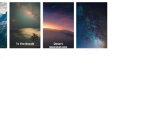
This is a web form with a responsive photo gallery grid, designed using CSS, HTML, and Bootstrap framework 4. The images and CSS styles have been imported to the code with their URLs, whereas the media queries are used to increase the responsiveness of the form. The number of rows and the minimum number of columns for the grid is given as 3 and 2, respectively. The background of the form is given as #262626, with the height as 100vh, and filter as drop-shadow(2px 2px 5px). The hex cell is given the styles of grid-column-end as span 2, margin as calc(-1*var(--hl)) 0, transform as scale(.95), and clip-path as polygon(50% 0, 100% 25%, 100% 75%, 50% 100%, 0 75%, 0 25%) to implement the polygon shape. The images are given a transform style of scale(calc(1 + .2*var(--hl))). In a hover event, the images in the hex cell, take a zooming effect.
Source: https://codepen.io/thebabydino/pen/PowXYpV
Hive Photo Gallery Grid
4.3.1

This is an example of a web form with buttons with hover effects, designed using HTML, CSS, JavaScript and Bootstrap framework 4. The icons have been imported to the code with their URLs, whereas the media queries are used to increase the responsiveness of the form. JavaScript functions have been used to implement the hover effects on buttons. There are three buttons in the form named as Buttton, Playful Hover, and Simple. The colors are predefined as --color-hover: #2B3044, --background: #362A89, --hover-back: #6D58FF, --hover-front: #F6F8FF, --background: #275EFE, and --background-hover: #1749DB. The cursor style for the buttons is set as pointer to get the hand cursor effect. The form is given the styles of font-family as 'Inter UI', 'Inter', Arial, and background as #E1E6F9. The buttons are given the styles of border-radius as 20px, line-height as 24px, font-size as 14px, font-weight as 600, and letter-spacing as .02em. The first two buttons take a fill effect with the colors #6D58FF, and #F6F8FF, whereas the third one takes a transforming effect.
Source: https://codepen.io/aaroniker/pen/OJPqPMR

This is an example of a task management User Interface, designed using HTML, JavaScript, and Bootstrap framework 4. The users are given the ability to change the color theme of the interface by a color picker. JavaScript functions have been used to implement the color theme effect. The images have been imported to the code with their URLs. The interface is designed in two containers. The name title of the first container is given the styles of text as indigo-600, font as medium ml-3, whereas the description is given the styles of text as gray-600, and font as sm. The New Contact and New Task buttons have the styles of text as gray-600, and border as gray-400. There are checkboxes to select each person, and the theme buttons are assigned their respective colors to pick from.
Source: https://codepen.io/knyttneve/pen/vYEzXOR
Task Management UI
4.3.1
This is an example of an image card layout form with hover effects, designed using HTML, CSS, and Bootstrap framework 4. Media queries have been used to increase the responsiveness of the form, whereas the fonts and images are imported to the code with their URLs. The font sizes are predefined as --font-sans: 'Rubik', sans-serif, and --font-serif: 'Cardo', serif. The image cards are placed in a grid layout. The page content is given the styles of display as grid, grid-gap as 1rem, padding as 1rem, max-width as 1024px, and font-family as var(--font-sans). The title of the card has the styles of font-size as 1.3rem, font-weight as bold, and line-height as 1.2. The card description has the styles of font-family as var(--font-serif), font-size as 1.125rem, font-style as italic, and line-height as 1.35, whereas the button is given the styles of cursor as pointer to get the hand cursor effect, margin-top as 1.5rem, padding as 0.75rem 1.5rem, font-size as 0.65rem, and text-transform as uppercase to convert the text to uppercase. The button takes the background color of lighten(black, 5%), in a hover event and outline of 1px dashed yellow, in a focus event. The image cards take a transforming effect of translateY(-50%), in a hover event.
Source: https://codepen.io/hexagoncircle/pen/XWbWKwL
Card Hover Interactions
4.3.1
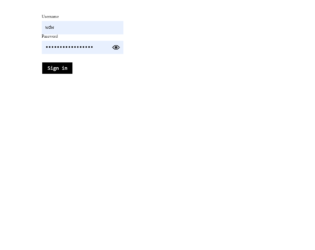
This is an example of a password input form with a light beam animation, designed using CSS, HTML, JavaScript, and Bootstrap framework 4. JavaScript functions have been used to implement the animation in a clicked event on the eyeball icon. The colors are predefined as --bgColor: white, --inputColor: black, --outlineColor: dodgerblue, and --beamColor: yellow. The body is given a background color as var(--bgColor), whereas the form is given a transform value as translate3d(0,0,0). The sign-in button has the styles of font-size as 1.5rem, font-family as monospace, and color as var(--inputColor), which takes an outline style of 3px solid var(--outlineColor), in a focus event. The user name and password are given a font color as black. The cursor style for the button and eyeball is set as pointer to get the hand cursor effect. The eyeball is given the size of 1.25rem, and a transform style of translateY(-50%). In a focus event on the eyeball, the background color of the form turns to black, revealing the password value and a light beam is displayed in a polygon(100% 50%, 100% 50%, 0 0, 0 100%) path, with the beam color as yellow.
Source: https://codepen.io/hexagoncircle/pen/zYxzQqa
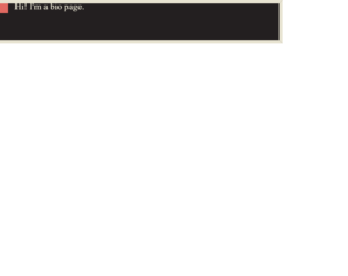
This is an example of a page header with page transitions, designed using HTML, CSS, JavaScript, and Bootstrap framework 4. The images are imported to the code with their URLs. The concept of Lists has been used with UL and LI components. UL element has been used with the child elements of LI to display the details in an orderly manner. The colors and values are predefined as --purple-brown: #231f20, --egg-shell: #e8e4d2, --dark-peach: #e26961, --border-width: .75rem, and --dots-gap: 10px. The body of the form is given the styles of font-family as Trocchi, Georgia, serif, line-height as 1.5, and color as var(--egg-shell). The background is given the styles of min-height as 100vh, padding as 25vh 0 1.5rem, and transition as background 0s 1s, color .6s. Bio, Projects, and Find Me sections are given different background colors as var(--purple-brown), var(--egg-shell), and var(--dark-peach). The dots are given an animation of movebg .2s linear infinite.
Source: https://codepen.io/pehaa/pen/wvBLpNK
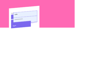
This is an example of a login form with hover animations, designed using CSS, HTML, and bootstrap framework 4. The fonts and icons are imported to the code with their URLs. The values and font sizes are predefined as color-primary: mediumslateblue, color-secondary: black, color-tertiary: hotpink, base-border-radius: 0.25rem, ease: cubic-bezier(0.075, 0.82, 0.165, 1), duration: 350ms, font-family: 'Roboto', sans-serif, and font-size: 1.25rem. The laels are given the styles of font-size as calc(var(--font-size) / 1.65), font-weight as 700, text-transform as uppercase to automatically convert the text to uppercase, and letter-spacing as 0.065rem. The body of the form is given a style set of padding as var(space-m), font-size as var(font-size), font-family as var(font-family), line-height as 1.2, and background-color as var(color-tertiary). The header of the form is given the styles of font-weight as 700, and font-size as calc(var(--font-size) * 1.5). The form is given a transform value of skewY(-5deg) translateY(10%) scale(0.94). In a hover event, the form takes a transform of scale(1.0001) to get the folded animation.
Source: https://codepen.io/hexagoncircle/pen/XWJGQqy
Folded Paper Login Form
4.3.1