- Latest
- Featured
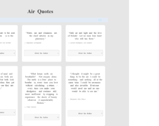
This is an example of a quote cards grid layout with the content displayed in an accordion, designed using HTML, CSS, JavaScript, and Bootstrap framework 4. The quotes are imported to the code with the URL, whereas the JavaScript functions have been used to implement the accordion expand feature. The body of the form is given the styles of background as #e6e6e6, padding as 50px 0, font-family as 'Noto Serif', serif. The quote cards can be displayed either in card layout or row layout. The quote grid is given the styles of max-width as 1000px, margin as 0 auto, font-family as 'Noto Serif', serif, theme-color-primary as #383838, and color as #414141. The quote caption has the styles of color as #414141, font-size as 40px, and font-weight as bold. The quote cards take the styles of border-radius as 10px, margin as 10px, and box-shadow as 0 4px 8px 0 rgba(0, 0, 0, 0.1), 0 6px 20px 0 rgba(0, 0, 0, 0.09), in the card layout. The accordion of the card is given the styles of position as relative, display as block, background as #f7f7f7, border-radius as .25em, cursor style as pointer to get the hand cursor effect, margin-bottom as .125em, padding as .75rem 1em, z-index as 20, border as 1px solid #cccccc, text-align as center, and font-size as 13px, which takes the background color of #ccc, in a hover event.
Source: https://codepen.io/zinggrid/pen/ZVJZEM
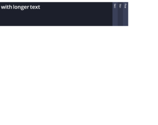
This is an example of a horizontal accordion, designed using HTML, CSS, and Bootstrap framework 4. The fonts are imported to the code with its URL. The colors used in the form are predefined. The body of the form is given the styles of background as $clr-bg, color as $clr-text, and font-family as 'Open Sans', sans-serif. The accordion is given four child elements, which are given the styles of display, block, float as left, height as 100vh, width as 40px, overflow as hidden to hide the content, background as $clr-bg-light, text-align as center, font-size as 14px, line-height as 40px + 10, and transition as background 300ms ease. In a hover event, the background color of the child elements turn to $clr-primary and gets the cursor style as pointer t get the hand cursor effect. The accordion child element title is given a transform effect of rotate(90deg), which turns to display none in a checked event, which hides the title when the element is clicked.
Source: https://codepen.io/milesmanners/pen/QEQPjw

This is an example of an accordion image gallery, designed using HTML, CSS, and Bootstrap framework 4. The background images are imported to the code with their URLs. The body of the image container is given the styles of padding as 75px 0, margin as 0 auto, and width as 1140px. The form title is given the styles of position as relative, margin-bottom as 45px, font-family as 'Oswald', sans-serif, font-size as 44px, text-transform as uppercase to get the hand cursor effect, and color as #424242. The image gallery wrap is given width as 100%, and height as 70vh, whereas the image is given width as 32px. The accordion item has the styles of flex as 1, height as 100%, background-position as center, background-size as cover, transition as flex 0.8s ease, which turns its flex value to 7, in a hover event to increase the size of the image.
Source: https://codepen.io/stefcharle/pen/Gydvbx
Accordion Image Gallery
4.3.1
This is an example of a product template, powered by an accordion feature, which is designed using HTML, CSS, JavaScript, and Bootstrap framework 4. The fonts and images are imported to the code with their URLs. The concept of Lists has been used with UL and LI components. UL element has been used with the child elements of LI to display the child elements of the accordion in an orderly manner. The media queries are also used to increase the responsiveness of the form. JavaScript functions are used to implement the accordion expand features, search button function, and add item features. The colors used in the form are predefined. The body of the form is given the styles of font-family as "Roboto", sans-serif, and background as @white. The title of the accordion is given the styles of font-size as 1.8rem, font-weight as 300, and text-transform as uppercase to automatically convert the text to uppercase. The accordion items are given a cursor style as pointer to get the hand cursor effect, whereas the content of the accordion has the styles of background-color as rgba(255, 255, 255, 0.8), color as @black, font-size as 1.6rem, and letter-spacing as 0.15rem.
Source: https://codepen.io/robinsavemark/pen/qOJgPZ
This is another example of a simple horizontal accordion, designed using HTML, CSS, and Bootstrap framework 4. The accordion is given 4 child elements. The accordion is given the styles of top and left as 100px, background as linear-gradient (bottom,#eaeaea, #fafafa), padding as 10px, display as inline-block, box-shadow as 0 1px 1px rgba(0,0,0,.65), border-radius as 3px, border as solid 1px #ddd, width as 460px, height as 200px, and overflow as hidden to hide the content. In a hover or checked event, the background of the accordion item turns to #4D90FE, and get the styles of border as solid 1px rgba(0,0,0,.15), font color as white, box-shadow as 0 1px 1px rgba(0,0,0,.65), 0 1px 0 rgba(255,255,255,.1) inset, and text-shadow as 0 -1px 0 rgba(0,0,0,.6). The label of the accordion item is given a font-family style as Helvetica and cursor style as pointer to get the hand cursor effect. The accordion item content has the styles of font color as #333, font-size as 12px, line-height as 18px, width as 245px, and padding as 5px 10px.
Source: https://codepen.io/sfearl1/pen/cdrpk
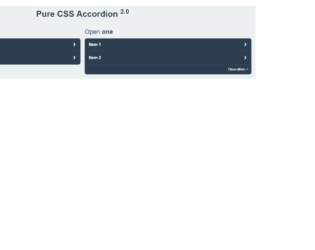
This is an example of a Bootstrap accordion, designed using HTML, CSS, and Bootstrap framework 4. The form has two accordions that have different expanding styles. The body of the form is given the styles of color as #2c3e50, background as #ecf0f1, and padding as 0 1em 1em. The title of the form is given the styles of line-height as 2, and text-align as center, whereas the accordion titles are given the styles of margin as 0 0 .5em, and font-weigh as normal. The accordions are given the styles of display as flex, justify-content as space-between, padding as 1em, background as #2c3e50, font-weight as bold, and cursor as pointer to get the hand cursor effect. In a hover event and a checked event, the background of the accordions turn to darken($#2c3e50, 10%). The accordion tabs take a transform effect of rotate(90deg) to hide the content, in the shrink mode.
Source: https://codepen.io/raubaca/pen/PZzpVe
This is an example of a simple accordion with plain background color, designed using HTML, CSS, JavaScript, and Bootstrap framework 4. JavaScript functions have been used to implement the accordion expand features. The accordion is sectioned into five divisions and given the styles of margin-left as 5px, margin-right as 5px, border-radius as 3px, background color as rgba(220,220,220,.5), transition as all 200ms ease-in-out 50ms, font-family as Helvetica, Arial, Sans-Serif, font-weight as 500, cursor style as pointer to get the hand cursor effect, and font-size as 16pt. It is given a default style set of height as 50vh, width as 10vw, color as rgba(255,255,255,0), font-size as 16pt, and overflow as hidden to hide the content. It takes the styles of height as 50vh, width as 100vw, background as #7ab7ff, color as rgba(255,255,255,1), and padding as 20px, in the expanded mode.
Source: https://codepen.io/valaxin/pen/reQMXp
Horizontal Accordion
4.3.1
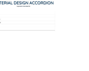
This is another example of an accordion, designed using CSS, HTML, JavaScript, and Bootstrap framework 4. Materialize UI component library has been used in CSS to design the interface of the accordion whereas the JavaScript functions have been used to implement the accordion expand features. The concept of Lists has been used with UL and LI components. UL element has been used with the child elements of LI to display the accordion items in an orderly manner. The body of the form is given the styles of font-family as 'Open Sans', sans-serif, color as rgba(0,0,0,0.8), line-height as 1.5, and font-size as 14px. The title of the form is given the styles of text-align as center, font-size as 1.5rem, padding as 0px 30px, and font-family as "Quicksand", with the text-transform set as uppercase to automatically convert the text to uppercase. The text color of the title is set as #1E4A6F. The cursor style is given as pointer for the accordion blocks to get the hand cursor effect. The accordion item blocks take a box shadow effect of 0 5px 11px 0 rgba(0,0,0,0.18),0 4px 15px 0 rgba(0,0,0,0.15), in the active mode.
Source: https://codepen.io/renanpupin/pen/oXmPWL