This is an example of a side-bar template, designed using HTML, CSS, JavaScript, and Bootstrap framework 4. The concept of Lists has been used with UL and LI components. UL element has been used with the child elements of LI to display the menu items in an orderly manner. JavaScript functions have been used to implement the dropdown function of the menus, whereas media quarries are used to make form responsive. The page wrapper is given the background color of #1e2229. The side-bar wrapper has the styles of width as 260px, height, and max-height as 100%, position as fixed and left as -300px. The user status section of the side-bar has the styles of font-size as 8px, margin-right as 4px, and color as #5cb85c. The side-bar menu items have the styles of margin-right as 10px, font-size as 12px, width and height as 30px, line-height as 30px, text-align as center, and border-radius as 4px. The side-bar list items take an animation effect of swing ease-in-out 0.5s 1 alternate, in a hover event.
Source: https://codepen.io/azouaoui-med/pen/wpBadb
This is an example of an animated accessible menu with a toggle button, designed using HTML, CSS, JavaScript, and Bootstrap framework 4. The concept of Lists has been used with UL and LI components. UL element has been used with the child elements of LI to display the menu items in an orderly manner. JavaScript functions have been used to implement the menu expand features. The toggle button is given the styles of display as inline-block, position as absolute, background as transparent, right as 15px, top as 15px, and cursor as pointer to get the hand cursor effect in a hover event, border-radius as 50% to get the circle shape, and transition as background-color .15s linear. The button changes its background color to rgba(0,0,0,.5), in a hover event. The menu- list items are given the styles of color as white, display as block, text-align as center, text-transform as uppercase to automatically convert the text to uppercase, letter-spacing as 5px, font-size as 1.25rem, and padding as 1rem, which take background-color of rgba(0,0,0,0.2), in a hover and an active event. To animate the menu icon, a transform style of rotate(180deg), is given.
Source: https://codepen.io/mxbck/pen/xdaGNL
This is an example of a flat navigation bar with hover effects, designed using HTML, CSS, and Bootstrap framework 4. The concept of Lists has been used with UL and LI components. UL element has been used with the child elements of LI to display the menu items in an orderly manner. The navigation bar is given five list items, whereas the form consists of four navigation bars. The body of the form is given the background color of #1b1b1b. The menu items are given the styles of position as relative, display as block, text-align as center, width as 62px, and height as 66px. In a hover event, the background color of the list items turn to #b651d8, #71c55e, #fab904, #e94739, and #407ded, respectively. The top navigation bar takes the background fill effect from top to bottom, whereas the others take it from left to right, bottom to top, and right to left, respectively.
Source: https://codepen.io/seyedi/pen/vBlCe
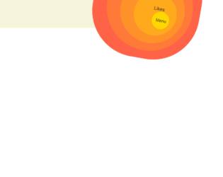
This is an example of a web form with a rings navigation button, designed using HTML, CSS, JavaScript, and Bootstrap framework 4. The fonts are imported to the code with the URL whereas the JavaScript functions are used to implement the button expand function. The colors and values are predefined as $size : 50px, $items : 5, $transition : .5s, $bounce : cubic-bezier(.3,1.4,.5,.9), $color-inner : gold, $color-outer : tomato, $background: mix($color-inner, $color-outer), $black : shade($color-outer, 80%), $start-scale : .5, and, $start-rot : 190deg. The body of the form is given the styles of background as beige, and font-family as Alegreya Sans, sans-serif. The toggle button has the styles of line-height as $size*2, width as $size*2, background as $color-inner, and opacity as 1. The button takes the styles of background as shade($color-inner, 90%), and text-decoration as underline in a hover event, and background as shade($color-inner, 50%), color as rgba($color-inner, .5), transform as scale(.9), in the active mode. The menu items in the disc are given the different shades of gold color with the font style set as $size*.5 Alegreya Sans, sans-serif.
Source: https://codepen.io/bennettfeely/pen/qRJOZJ
This is an example of a web layout with responsive buttons with hover effects, designed using HTML, CSS, and Bootstrap framework 4. The fonts are imported to the code with their URLs. The body of the form is given a background color of #1D1F20. There are four buttons in the form named as Settings, Random, Download, and Messages. The buttons are given the styles of background as linear-gradient(to right, #2a2d35 0%, #353742 100%), border-color as #404454 white black red, border-style as solid, border-width as 2px 0px 2px 0px, color as #00FFAD, font-size as 35px, height as 76px, line-height as 76px, text-align as center, text-shadow as 0px -2px 1px #23252B, 0px 2px 2px #23252B, 0px 0px 20px #049B6A, width as 80px, and cursor style as pointer to get the hand cursor effect in a hover event. The button names have the styles of cursor as pointer, font-family as hipster, font-size as 25px, height as 76px, line-height as 76px, and margin-top as -76px. In a hover event, the buttons take the styles of background as linear-gradient(to right, #393c47 0%, #4a4e5b 100%), color as #FFD5A0, font-size as 45px, and text-shadow as 0px 0px 20px #FF8E00, 0px 2px 0px #23252B, 0px -1px 0px #23252B.
Source: https://codepen.io/Trinca/pen/rLqNXv
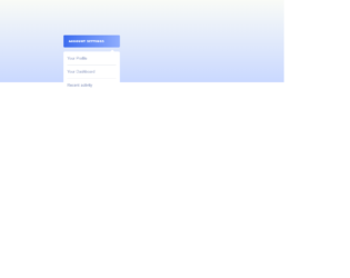
This is an example of a custom dropdown menu with hover effects, designed using HTML, CSS, JavaScript and Bootstrap framework 4. The fonts and icons are imported to the code with their URLs. The concept of Lists has been used with UL and LI components. UL element has been used with the child elements of LI to display the menu items in an orderly manner. The JavaScript functions have been used to implement the expanding functions of the menu button. The body of the form is given the styles of font-family as 'Raleway', sans-serif, background as linear-gradient(to bottom,#f9fbf7, #C9D8FF), height as 100%, display as table, width as 100%, and text-align as center. The dropdown menu button is given the styles of background as linear-gradient(to right,#3d6def, #8FADFE), display as inline-block, line-height as 40px, padding as 0 18px, text-align as left, border-radius as 4px, box-shadow as 0px 4px 6px 0px rgba(0,0,0,0.2), and cursor style as pointer to get the hand cursor effect in a hover event. The name of the button has the styles of font-size as 9px, and text-transform as uppercase to automatically convert the text to uppercase. The menu items take the background color of #3d6def, in a hover event.
Source: https://codepen.io/veronicadev/pen/JLoaVg
This is a mobile navigation layout with a toggle button, designed for Netflix using HTML, CSS, JavaScript, and Bootstrap framework 4. The images and fonts are imported to the code with their URLs. The concept of Lists has been used with UL and LI components. UL element has been used with the child elements of LI to display the menu items in an orderly manner. The JavaScript functions have been used to implement the expanding functions of the toggle button, whereas media quarries have been used to make the form responsive. The body of the form is given the styles of font-family as 'Muli', display as flex, flex-direction as column, height as 100vh, align-items as center, and justify-content as center. The header of the form is given a text0-transform style as uppercase to automatically convert the text to uppercase. The cursor style for the navigation button is set as pointer to get the hand cursor effect in a hover event. The child elements of the menu are set to be visible in a checked event of the menu button, in a white background after displaying a red, and a black background. The black background is given a color of RGB(34, 31, 31), whereas the red background has the color of RGB(229, 9, 20). Source: https://codepen.io/FlorinPop17/pen/KKPBgeQ
This is an example of a menu-bar with hover effects, designed using HTML, CSS, and Bootstrap framework 4. The font style is imported to the code with its URL. The colors and transition values used in the form are predefined as $page-background: #303f9f, $nav-background: white, $color: rgba(black, .87), and $transition: .75s. The body of the form is given the styles of font as 100% Roboto, background as $page-background, and margin as 50px. The navigation icon is given the styles of width as 300px, background as $nav-background, color as $color, clip-path as circle(24px at 32px 24px), and transition as clip-path $transition/2. The navigation icon list-items are given the styles of display as block, line-height as 50px, padding as 0 20px, and color as inherit. In a hover event, the navigation icon expands to display the menu-bar, which takes the background color of #ffe082 in a hover event, and #ffca28 in the active mode.
Source: https://codepen.io/bennettfeely/pen/fHdFb
This is an example of a vertical magicline style navigation bar, designed using HTML, CSS, JavaScript and Bootstrap framework 4. The HTML version used here is Haml, whereas the JavaScript functions have been used to implement the magicline bar function on the navigation bar. The colors used in the form are predefined as $bg: #17B794, and $color: #22267B. The body of the form is given the styles of color as #fff, font-family as 'Cairo', sans-serif, and line-height as 1.25, whereas the background color of the form is set as radial-gradient(ellipse farthest-corner at center top, $bg, shade($bg, 60%)). The menu wrapper has the styles of position as relative, box-shadow as 0 .5em 2em rgba(black, 0.5), background as black, text-transform as uppercase to automatically convert the text to uppercase, text-align as center, display as inline-block, letter-spacing as .25em, and font-size as 1.5em. There are five child elements of the navigation bar, which are given a background color based on #22267B, which changes the percentage of its value accordingly, to give each child element a different shade of #22267B. The magicline has the styles of width as .5em, and box-shadow as 0 .5em 2em rgba(black, 0.5).
Source: https://codepen.io/mican/pen/dNqPaZ
This is an example of a bulb style navigation menu that changes the background color accordingly, designed using HTML, CSS, JavaScript, and Bootstrap framework 4. The fonts and CSS styles are imported to the code with their URLs. JavaScript functions have been used to implement the active status of the navigation bar. The colors used in the form are predefined as $blue:#3498db, $orange:#e67e22, $green:#1abc9c, and $red:#e74c3c. The body of the form is given a font-family style 'Open Sans', sans-serif, font-weight as 600, whereas the background color is set to change to the above mentioned colors according to the selected navigation item. The header title of the form has the styles of color as rgba(255,255,255,.9), margin-top as 30vh, font-weight as 100, text-align as center, font-size as 55px, line-height as 1.5, background as rgba(0,0,0,.1), and padding as 0px 0 20px 0. The navigation items have the styles of width as 25%, text-align as center, padding as 25px 20px, and font color as rgba(255,255,255,.3), which changes its font color to #fff, in a hover event.
Source: https://codepen.io/soulrider911/pen/zGmYQK
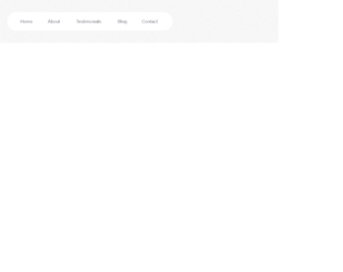
This is an example of an animated menu indicator, designed using HTML, CSS, JavaScript, and Bootstrap framework 4. The background image and fonts are imported to the code with their URLs. Media queries are used to increase the responsiveness of the form, whereas JavaScript functions have been used to implement the active color of the indicator. The body of the form is given the styles of text-align as center, display as flex, height as 100vh, width as 100%, justify-content as center, align-items as center, and padding as 0 20px. The navigation wrapper is given the styles of display as inline-flex, background-color as #fff, border-radius as 40px, and box-shadow as 0 10px 40px rgba(159, 162, 177, .8), whereas the child elements of the navigation bar is given the styles of color as #83818c, padding as 20px, transition as .3s, margin as 0 6px, font-family as 'DM Sans', sans-serif, and font-weight as 500. The five child elements take five different font colors and a border-bottom effect, in the active mode. The child elements also take the font color of #333, in a hover effect.
Source: https://codepen.io/knyttneve/pen/LKrGBy
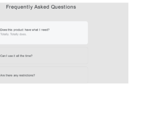
This is an example of an accordion that displays the details and summary, designed using HTML, CSS, and Bootstrap framework 4. The body of the form is given the styles of font-family as "IBM Plex Sans", sans-serif, and background-color as rgba(0,0,0,.1), whereas the header of the form is given the styles of margin as 20px auto 80px, font-size as 38px, font-weight as 300, text-align as center, letter-spacing as 2px, and line-height as 1.5. The details section of the accordion has the styles of width as 75%, min-height as 5px, max-width as 700px, padding as 45px 70px 45px 45px, margin as 0 auto, position as relative, font-size as 22px, border as 1px solid rgba(0,0,0,.1), border-radius as 15px, box-sizing as border-box, and transition as all .3s. The summary section of the accordion is given the styles of display as flex, justify-content as space-between, align-items as center, font-weight as 500, and cursor as pointer to get the and cursor effect. The summary section takes a style of box-shadow as 0 0 0 4px #f6f7f8, 0 0 0 5px rebeccapurple, in a focused event.
Source: https://codepen.io/frogmcw/pen/deqRwa