- Latest
- Featured
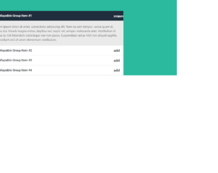
This is another example of an accordion widget with plus and minus icon, designed using CSS, HTML, Bootstrap framework 4, and JavaScript. The font and Bootstrap styles are imported to the code with their URLs. The form consists of four accordion items. Each accordion item is given a collapsible effect to hide the non-active sections. The background color of the form is set as #2bba9e. The accordion card header is given the styles of background color as #fff, and font-family style as "Roboto", sans-serif. The card header changes its background color to #f8f8f8, in a hover event. The header title is displayed using a font-size of 1.3rem, and a font-weight as bold. The body of the accordion item is given a background color of #eaeaea, and font color of #595959. The header of the selected accordion card takes the color #202d3c, when active. JavaScript methods are used to create the minus icon on the accordion header, its functionality and highlight the header of the selected accordion card.
Source: https://www.tutorialrepublic.com/snippets/preview.php?topic=bootstrap&file=accordion-menu-with-plus-minus-icon
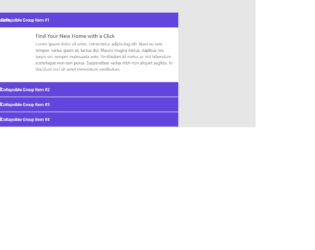
This is an example of an accordion widget, designed using HTML, CSS, JavaScript, and Bootstrap framework 4. The form consists of four accordion items. Each accordion item is given a collapsible effect to hide the non-active sections. The images, font, and Bootstrap styles are imported to the code with their URLs. The body of the form is given a background color of #e6e6e6, whereas the accordion card is given a box-shadow effect of 0 0 6px rgba(0,0,0,0.2). The accordion card header has a background color of #6245dd. The title of each accordion card header is displayed with the styles of font color as #fff, font-size as 1rem, font-weight as 500, and font-family as "Roboto", sans-serif. The accordion image is given a width of 150px. JavaScript methods are used to create the minus icon on the accordion header and its functionality.
Source: https://www.tutorialrepublic.com/snippets/preview.php?topic=bootstrap&file=elegant-accordion-widget
Elegant Accordion Widget
4.3.1

This is an example of an accordion feature on a sidebar menu, designed using HTML, CSS, JavaScript, and Bootstrap framework 4. The font, icons, and Bootstrap styles are imported to the code with their URLs. The concept of Lists has been used with UL and LI components, whereas the UL element has been used with the child elements of LI to display the child elements of the accordion, in an orderly manner. JavaScript methods have been used to implement the collapse feature of the accordion menu. The header of the accordion is given a background color of linear-gradient(#fff, #f1f1f1), which gets changed to linear-gradient(#f1f1f1, #e8e8e8), in a hover event. The cursor style for the accordion items is set as pointer to get the hand cursor effect on hover. The accordion item is given an opacity of 0.7 which gets changed to 1, in a hover event. The child elements of the accordion items are given a background color of #d6dbe0, which gets changed to #007bff, on hover.
Source:https://www.tutorialrepublic.com/snippets/preview.php?topic=bootstrap&file=accordion-menu-for-all-purpose

This is an example of a stylish newsletter subscription form, designed using HTML, CSS, JavaScript, and Bootstrap framework 4. The font and Bootstrap styles are imported to the code with their URLs. JavaScript methods have been used to display the subscription form when the page is refreshed. The body of the form is given a font family style of 'Open Sans', sans-serif. The title of the subscription card is displayed using the styles of font color as #000, text-align as center, font-family as 'Lato', sans-serif, font-weight as 900, font-size as 30px, and text-transform as uppercase to automatically convert the text to uppercase. The close button is given a background color of #c0c3c8, an opacity of 0.5, which gets changed to 0.8 on hover. The input text field is given a border color of #dbdbdb. The text field takes the styles of border-color as #49c5c1, and box-shadow as 0 0 8px rgba(73, 197, 193, 0.5), in a focus event. The 'Subscribe' button is given the styles of font-size as 14px, font-weight as bold, text-transform as uppercase, and background color as #49c5c1, which gets changed to #39b3af, on hover.
Source: https://www.tutorialrepublic.com/snippets/preview.php?topic=bootstrap&file=elegant-subscribe-newsletter-modal-form
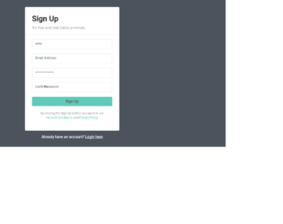
This is an example of another signup form, designed using CSS, HTML, and Bootstrap framework 4. The font and Bootstrap styles are imported to the code with their URLs. The form consists of the input text fields and the 'Signup' button. The body of the form is given the styles of font color as #fff, background color as #4c535d, and font-family as 'Roboto', sans-serif. The signup card is given a width of 400px, font color as #9ba5a8, background color as #fff, and box-shadow as 0px 2px 2px rgba(0, 0, 0, 0.3). The text fields are given a border color as #e1e4e5, and a font-size as 14px. The form title is displayed using the styles of font color as #333, and font-weight as bold. The 'Signup' button is created as a primary type button and given the styles of font-size as 16px, font-weight as bold, and background color as #5fcaba. The button changes its background color to #3fc0ad on hover, whereas the 'terms of use' and 'privacy policy' links take an underline effect.
Source: https://www.tutorialrepublic.com/snippets/preview.php?topic=bootstrap&file=quick-sign-up-form
Quick Sign Up Form
4.3.1

This is an example of a user login form which can be accessed through a modal, designed using CSS, HTML, and Bootstrap framework 4. The login form consists of the input text fields, the 'Login' button, and the user avatar image. The body of the form is given a font-family style as 'Varela Round', sans-serif. The form is given a background color of #636363 and a width of 350px. The title of the login card is displayed with text-align style as center, and font-size as 26px. The input text fields take a border color effect as #70c5c0, in the focus mode. The avatar image is given a background color as #60c7c1, box-shadow style as 0px 2px 2px rgba(0, 0, 0, 0.1), and the border-radius as 50% to get the circle shape. The 'Login' button is given a background color of #60c7c1, which gets changed to #45aba6, on hover.
Source:https://www.tutorialrepublic.com/snippets/preview.php?topic=bootstrap&file=elegant-modal-login-form-with-avatar-icon

This is an example of a simple registration form, designed using CSS, HTML, and Bootstrap framework 4. The form consists of input text fields, 'Accept terms' checkbox, and the 'Signup' button. The font and Bootstrap styles are imported to the code with their URLs. The body of the form is given the styles of font color as #fff, background color as #63738a, and font-family as 'Roboto', sans-serif. The signup form is given a width of 450px, background color as #f2f3f7, box-shadow as 0px 2px 2px rgba(0, 0, 0, 0.3), and font color as #999. The input text fields are given a background color as #969fa4, which gets changed to #5cb85c, in a focus event. The 'Signup' button is created as a success type button and given the styles of font-size as 16px, and font-weight as bold. The 'terms of use' and 'privacy policy' link also take an underline effect on hover.
Source: https://www.tutorialrepublic.com/snippets/preview.php?topic=bootstrap&file=simple-registration-form
Simple Registration Form
4.3.1
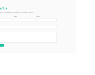
This is an example of a stylish contact us form, designed using CSS, HTML, and Bootstrap framework 4. The font and Bootstrap styles are imported to the code with their URLs. The form consists of input text fields and the 'Send' button. The body of the form is given the styles of font color as #333, background color as #fafafa, and font-family as "Patua One", sans-serif. The title of the form is displayed using a font color of #19bc9d, and the font-weight as bold. The text fields are given a border color of #19bc9d, which gets changed to #19bc9d, in a focus event. The 'Send' button is created as a primary type button and displayed with a style set of font color as #fff, min-width as 150px, font-size as 16px, and background color as #19bc9d. The buttons turn its background color to #15a487, on hover. The subtitle of the form is displayed with a font size of 15px. The input text fields have been validated by making them required.
Source: https://www.tutorialrepublic.com/snippets/preview.php?topic=bootstrap&file=elegant-contact-form
Elegant Contact Form
4.3.1