- Latest
- Featured

This is an example of a registration form with an animated background, designed using CSS, HTML, JavaScript, and Bootstrap framework 4. The form consists of an animated background and a registration section with input text fields and a 'Submit' button. Particles.js JavaScript library has been imported to the code and JavaScript methods have been used to implement the animations in the background form. The body of the form is given the styles of height and width as 100%, font-family as 'Roboto', sans-serif, and font color as #fff. The background of the form is given a linear gradient color of linear-gradient(to right, #6819e8 0%,#7437d0 35%,#615fde 68%,#6980f2 100%). The title of the form is displayed with a font-size of 59px. The input text fields have been validated by making them required. The 'Submit' button is created as a primary type button in HTML.
Source: https://www.bootdey.com/snippets/view/Register-form-with-particles-js#js
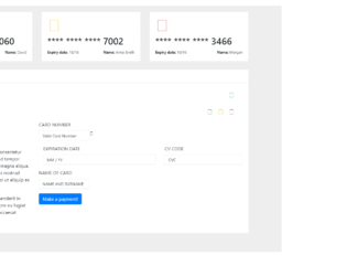
This is an example of a credit card payment form, designed using CSS, HTML, and Bootstrap framework 4. The card images and font styles are imported to the code with their URLs. The body of the form is given a background color of 0 3px 2px 0 #516cd9. Media quarries have been used to increase the responsiveness of the form. The payment card is given the styles of background color as #ffffff, padding as 20px, margin-bottom as 25px, and border as 1px solid #e7eaec. The payment method section is given two panels as PayPal, and Credit Card. The title of each payment method accordion is displayed with the styles of background-color as #ffffff, border-color as #e7eaec, border-style as solid solid none, border-width as 3px 0 0, and color as inherit. The PayPal section is given a success type button. The Credit Card Payment section is given input text fields with the styles of background-color as #FFFFFF, border as 1px solid #e5e6e7, and display as block, transition as border-color 0.15s ease-in-out 0s, box-shadow 0.15s ease-in-out 0s, and font-size as 14px.
Source: https://www.bootdey.com/snippets/view/payment-credit-card-form#css
Credit Card Payment Form
4.3.1

This is an example of a login form with a blue color background, designed using CSS, HTML, and Bootstrap framework 4. The body of the form is given a background color as linear-gradient(to right, #4e63d7 0%, #76bfe9 100%). The icons and font style is imported to the code with their URLs. The form consists of three sections; login signup, and sign in. Media quarries have been used to increase the responsiveness of the forms. The login section is given a box-shadow style of box-shadow: 0 10px 20px 0 rgba(0, 0, 0, 0.1). It is also given the input text fields and the 'Sign in' button which is created as a dark button. The input text fields are given the styles of border as 1px solid #e1e1e1, background color as #fff, and font-color as #858585. The social media button are given a height and a width of 35px, background color of #6893e1, box-shadow style of 0 3px 2px 0 #516cd9, and a font-size of 16px.
Source: https://www.bootdey.com/snippets/view/blue-login#css
Blue Color Login Form
4.3.1

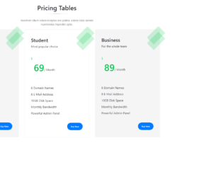
This is another example of a detailed pricing table, designed using CSS, HTML, and Bootstrap framework 4. The body of the form is given the styles of font-size as 1rem, font-weight as 400, line-height as 1.5, color as #1a202c, text-align as left, and background-color as #e2e8f0. The concept of Lists has been used with UL and LI components. UL element has been used with the child elements of LI to display the pricing details in an orderly manner. The price card is given a border style of 0 solid rgba(0,0,0,.125), and a word-wrap style as break-word to break the long lines and wrap onto the next line. The card header is given the styles of background-color as #fff, and border-bottom as 0 solid rgba(0,0,0,.125), whereas the card footer is given the styles of background-color as #fff, and border-top as 0 solid rgba(0,0,0,.125). The four cards are also given four types of 'Subscribe' buttons which are secondary, success, primary, and danger.
Source: https://www.bootdey.com/snippets/view/Pricing-table-with-detail#css
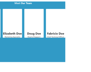
This is an example of a meet our team layout with hover effects, designed using HTML, CSS, and Bootstrap framework 4. The profile images and font styles are imported to the code with their URLs. The form is given a height of 800px, and background color as #319ac6. The form title is displayed using a font color of #fff. The user profile cards are given a box-shadow style of 0 4px 0 #2b86a. The profile cards are given a wrap which appears on top of the user card, in a hover event. The wrap is given a transition value of all .3s ease. The user name on the wrap is displayed with a font-size of 24px, whereas the designation is displayed with a font-size of 14px, and font color of #555659. Each wrap is also given a set of social media icons with a width and height of 40px, and a box-shadow of 0 3px 0 rgba(0, 0, 0, .1). The icons are given background colors of #3262b9, #3dd7e5, #e23535, and #069, which turn to #2d57a5, #27d2e2, #de2020, and #005580 respectively, in a hover event. The user image turns its opacity to 0, on hover.
Source: https://www.bootdey.com/snippets/view/meet-our-team-with-hover-effect#css
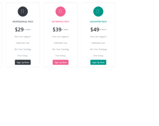
This is another example of a price plan layout, designed using CSS, HTML, and Bootstrap framework 4. The images and font styles are imported to the code with their URLs. The form consists of four different price cards. The card icon is given a style set of display as inline-block, font-size as 35px, width and height as 100px, font color as #ffffff, line-height as 76px, border as 12px solid #ffffff, border-radius as 50% to get the circle shape, box-shadow as 0 0 3px #cccccc, and transition as all .3s, The profile icons are given different background colors as #67a8e4, #f06292, and #009688. The price card title displayed with a font-size of 15px, and a text-transform style as uppercase to automatically convert the text to uppercase. The price cared details are displayed using a muted text. Four types of 'Signup' buttons are also given to the four cards as primary, dark, pink, and teal.
Source: https://www.bootdey.com/snippets/view/bs4-beta-pricing#css
Price Plan Layout
4.3.1
This is an example of a pricing card layout, designed using HTML, CSS, and Bootstrap framework 4. The form title is displayed with the styles of font color as #1d2025, position as relative, font-size as 24px. The form description displayed with the styles of font-family as "Montserrat", sans-serif, font color as #8b8e93, font-size as 14px, and font-weight as 300. The price card is given the styles of background color as #f5f5f6, and padding as 40px 35px. The price card is given a transform style as rotate(45deg). The price card title is displayed with a font-size of 26px, and a font-weight of 600. The price card button is given a style set of font-size as 11px, border-radius as 100px, and font color as #fff. The card button is created as a primary type button and take the background color of #0cc652, in a hover event. The price is displayed with a font-size of 16px, and a font-weight of 300.
Source: https://www.bootdey.com/snippets/view/pricing-tables#css
Pricing Cards Layout
4.3.1

This is an example of a schedule table layout, designed using HTML, CSS, and Bootstrap framework 4. The item images and font styles are imported to the code with their URLs. Media quarries have been used to increase the responsiveness of the form. The form is given a navbar to select the dates of the week and six schedule cards to display the scheduled events. The navbar is given a border-bottom style as 2px solid #104455. The navbar items are given a style set of font-size as 12px, text-align as center, text-transform as uppercase to automatically convert the text to uppercase, font color as #3d3d3d, font-weight as 500, and cursor style as pointer to get the hand cursor effect on hover. The active tab of the navbar is displayed with a background color of #104455, and font color of #fff. The other tabs take the background color of #46c1be, and font color of #fff, in a hover event.
Source: https://www.bootdey.com/snippets/view/schedule-table#css
Schedule table Layout
4.3.1