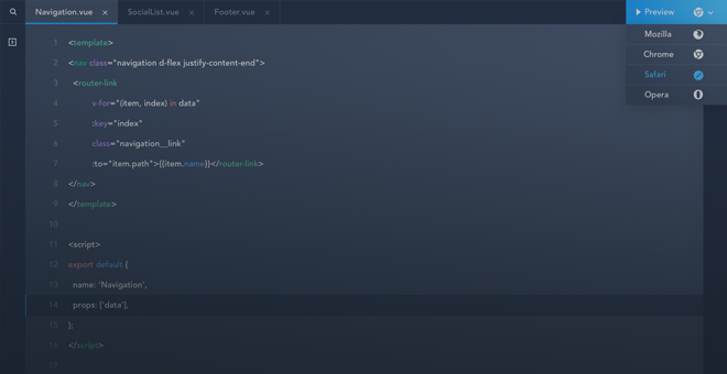
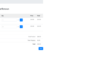
This is an example of a user shopping cart layout, designed using CSS, HTML, and Bootstrap framework 4. The font style and images are imported to the code with their URLs. The background color of the table is set as #eee. The form is given two bread crumb tabs as 'Home', and 'Cart'. The panel heading of the form is given a box-shadow style of rgba(0, 0, 0, 0.3) 7px 7px 7px. Each available product line item in the cart is given the ability to be edited and removed from the cart. The 'Edit' button is created as a default types button whereas the 'Remove' button is created as a primary type button. The 'Continue Shopping' and 'Next' buttons are created as success and primary type buttons, respectively. The amount labels are given a text-right value to make them aligned to the right side of the form.
Source: https://www.bootdey.com/snippets/view/shopping-cart#css
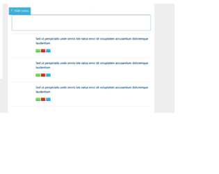
This is another example of a user timeline layout with a hide option, designed using HTML, CSS, JavaScript, and Bootstrap framework 4. The images, icons, and font styles are imported to the code with URLs. JavaScript methods have been used to implement the functionality of the 'Hide' icon and the tooltips. The concept of Lists has been used with UL and LI components. UL element has been used with the child elements of LI to display the child elements of the sidebar, in an orderly manner. The body of the form is given a background color as #eee. The user profile pic has a border-radius value of 50% to get the circle shape and a width and a height of 50%. The user title name is displayed with the styles of font color as #5a7391, font-size as 16px, and font-weight as 600. The 'Follow' button is given a text-transform style as uppercase to automatically convert the text to uppercase. The View, Delete, and a Share button is given different background colors as #80d752, #39b3d7, and #d73814, and given a tooltip feature to be activated on hover.
Source: https://www.bootdey.com/snippets/view/User-wall-with-sidebar-show-hide#js
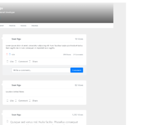
This is an example of a user timeline layout, designed using CSS, HTML, and Bootstrap framework 4. The images and Font styles are imported to the code with their URLs. The profile header is imported to the code as an image with its URL. The user name is displayed with a font color of #fff, and font size of 7zpx. The 'Edit Profile' button is created as an info type button. The toggle tabs of the menu bar are displayed using a font size of 12px, font-weight of 700, and font color of #929ba1, which gets changed to #242a30, in the active mode. %. The concept of Lists has been used with UL and LI components. UL element has been used with the child elements of LI to display the child elements of the toggle buttons, in an orderly manner. The timeline bar is displayed with a font color of #2d353c, whereas the date in the timeline bar is displayed with a font size of 20px.
Source: https://www.bootdey.com/snippets/view/bs4-profile-with-timeline-posts#css
This is an example of an 'About Me' profile layout, designed using CSS, HTML, and Bootstrap framework 4. The images and Bootstrap styles are imported to the code with their URLs. Media quarries have been used to increase the responsiveness of the form. The form consist of a user information section, skills section, about me and settings forms, and project experience table. The body of the table is given the styles of font color as #6c757d, and background-color as #f5f6f8. The card box is given a background color of #fff, and a border style of 1px solid #e7eaed. The 'Follow' and 'Message' buttons are created as success and danger type buttons. The About me header is displayed with a font size of 13 and a text-transform style as uppercase to automatically convert the text to uppercase. The 'About Me' and 'Settings' toggle buttons are given a background color of #1abc9c.
Source: https://www.bootdey.com/snippets/download/about-me-profile
This is an example of a multiple item product carousel feature, designed using HTML, CSS, JavaScript, and Bootstrap framework 4. The product images, font, and Bootstrap styles are imported to the code with their URLs. The body of the form is given the styles of background color as #e2eaef, and font-family as "Open Sans", sans-serif. The form title is displayed with the styles of font color as #000, font-size as 26px, font-weight as 300, text-align as center, and text-transform as uppercase to automatically convert the text to uppercase. The carousel item is given the styles of color as #747d89, and text-align as center. The carousel item title is displayed with a font-size of 18px. Each carousel item is given an 'Add to Cart' button' which is given the styles of color as #7ac400, font-size as 11px, text-transform as uppercase, font-weight as bold, and border as 1px solid #7ac400. The button changes its background and font color to #7ac400, and #fff respectively, on hover. JavaScript methods have been used to implement the functionality of the carousel.
Source: https://www.tutorialrepublic.com/snippets/preview.php?topic=bootstrap&file=multiple-item-product-carousel
This is another example of a simple contact form, designed using CSS, HTML, and Bootstrap framework 4. The font and Bootstrap styles are imported to the code with their URLs. The form consists of the input text fields and the 'Submit' button. The body of the form is given the styles of font color as #566787, background color as #f5f5f5, and font-family as "Open Sans", sans-serif. The title of the form is given a text-transform style as uppercase to automatically convert the text to uppercase. The text field labels are given an opacity value of 0.9, whereas the hint text is given an opacity value of 0.9 and a font-size of 15px. The text fields are validated by making them as required fields. The 'Submit' button is created as a primary type button and given a background color of #299be4, which gets changed to #1c8cd7 on hover.
Source: https://www.tutorialrepublic.com/snippets/preview.php?topic=bootstrap&file=simple-contact-form
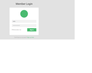
This is an example of a simple sign-in form with a user avatar, designed using CSS, HTML, JavaScript, and Bootstrap framework 4. The form consists of the user image, input text fields, 'Sign in' button, and signup link. The user image, font, and Bootstrap styles are imported to the code with their URLs. The body of the form is given the styles of font color as #4e4e4e, background color as #e2e2e2, and font-family as 'Roboto', sans-serif. The login card is given a width of 380px, font color of #7a7a7a, and a background color of #fff. The input text fields are given the styles of background color as #f2f2f2, and font-size as 16px. They are also validated by making them as required fields. The title of the login form is displayed with a font-size of 34px. The user avatar is displayed with the background color as #4aba70, box-shadow as 0px 2px 2px rgba(0, 0, 0, 0.1), and border-radius as 50% to get the circle shape. The 'Sign in' button changes its color to #40aa65 on hover, whereas the signup link takes an underline effect.
Source: https://www.tutorialrepublic.com/snippets/preview.php?topic=bootstrap&file=green-colored-sign-in-form-with-avatar-icon
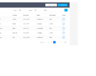
This is an example of a stylish data table layout with a search filter, designed using HTML, CSS, JavaScript, and Bootstrap framework 4. The user images, font, and Bootstrap styles are imported to the code with their URLs. The JavaScript functions have been used to implement the tooltip feature on the 'Action' button. The body of the form is given the styles of font color as #566787, background color as #f5f5f5, font-family as 'Varela Round', sans-serif, and font-size as 13px. The table container is given a background color of #fff, and a box-shadow style of 0 1px 1px rgba(0,0,0,.05). The table rows are given a background color of #fff, which gets changed to #f2f2f2 on hover. The table header is given a background color of #4b5366, and the title is displayed with a font color of #fff, and a font-size of 24px. The customer names on the table are displayed with a font color of #566787, which gets changed to #2196F3, in a hover event.
Source: https://www.tutorialrepublic.com/snippets/preview.php?topic=bootstrap&file=order-details-table-with-search-filter
This is an example of another accordion widget with the highlighted item feature, designed using CSS, HTML, JavaScript, and Bootstrap framework 4. The form consists of four accordion items. Each accordion item is given a collapsible effect to hide the non-active sections. The Bootstrap and CSS styles are imported to the code with their URLs. The card header is displayed with the styles of background color as #ececec, font-family as "Roboto", sans-serif, and box-shadow as 1px 1px 2px rgba(0,0,0,0.3). The card header turns its background color to #e0e0e0, in a hover event. The card header title is displayed using the font size of 1.3rem, and font-weight as bold. JavaScript methods have been used to create the minus icon on the accordion header, its functionality, and to highlight the selected accordion card. The background of the selected accordion header is set to change as #47b9de, in the active mode.
Source: https://www.tutorialrepublic.com/snippets/preview.php?topic=bootstrap&file=accordion-with-highlighted-item
This is another example of an accordion widget for FAQ and Answers, designed using CSS, HTML, JavaScript, and Bootstrap framework 4. The form consists of four accordion items. Each accordion item is given a collapsible effect to hide the non-active sections. The font and Bootstrap styles are imported to the code with their URLs. The accordion card is given a border style of 1px solid #eceded. The card header is given a background color of #f9fafa, and a font family style as "Roboto", sans-serif. The card header changes its background color to #ecf0f0, on hover. The card header title is displayed with the styles of font-size as 1.3rem and font-weight as bold. The accordion body is given the styles of font color as #324353, text-align as justify, and border-top as 1px solid #eceded. JavaScript methods have been used to create the minus icon on the accordion header and its functionality.
Source: https://www.tutorialrepublic.com/snippets/preview.php?topic=bootstrap&file=toggle-faq-accordion
This is an example of a colorful contact us form, designed using CSS, HTML, and Bootstrap framework 4. The font and Bootstrap styles are imported to the code with the URLs. The body of the form is given the styles of font color as #000, background color as #fcda2e, and font-family as "Roboto", sans-serif. The title of the form is displayed using the styles of font-size as 42px, font-family as 'Pacifico', sans-serif, and text-align as center. The input text fields are given a border color as #e2c705, whereas the text field labels are given an opacity value of 0.9. The input fields are validated by making them required in the HTML. In a focus event, the text fields take the styles of border-color as #d8b012, and box-shadow as 0 0 8px #dcae10. The 'Send' button is given the styles of font color as #fcda2e, and background color as #000. In a hover event, the font color of the button gets changed to #fff.
Source: https://www.tutorialrepublic.com/snippets/preview.php?topic=bootstrap&file=contact-form-with-yellow-background
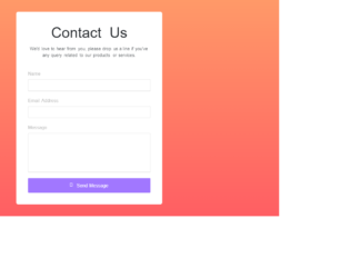
This is an example of a contact us form with a gradient background, designed using CSS, HTML, and Bootstrap framework 4. The font and Bootstrap style is imported to the code with its URL. The body of the form is given the styles of font-family style as "Varela Round", sans-serif, and background color as linear-gradient(#ff9968, #ff5e63). The form consists of the input text fields, and the 'Send Message' button. The contact form is given a background color of #fff and a width of 500px. Input text fields are validated by making them required in HTML. In a focus event, the fields take the styles of border-color as #a177ff, and box-shadow as 0 0 8px #c2a8ff. The title of the form is displayed with a font-size of 50px. The 'Send Message' button is created as a primary type button and given the styles of background as #a177ff, and font-size as 16px. The button changes its background color to #8048ff, on hover.
Source: https://www.tutorialrepublic.com/snippets/preview.php?topic=bootstrap&file=beautiful-contact-form-with-gradient-background