- Latest
- Featured

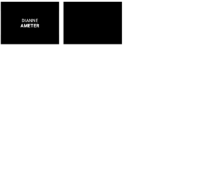
This is an example of an Article News Card, designed using CSS, HTML, and JavaScript. JavaScript functions have been used to implement hover animations. The images have been imported to the form with their URLs. The body of the form is given a style set of background as darken(@white, 5%), font-family as 'proxima-nova-soft', sans-serif, and font-size as 14px. The month section of the thumbnail is given the styles font-size as 12px, background as @accent, and text-transform as uppercase. The title is given the styles color: @dark_gray, font-size: 26px, and font-weight: 700 whereas the subtitle is given the styles color: @accent, font-size: 20px, and font-weight: 400. The description has the styles color: @gray, font-size: 14px, and line-height: 1.8em. In a hover event, the description section takes the styles display: block, height: auto, and opacity: 1.
Source: https://codepen.io/andytran/pen/BNjymy/
Article News Card
4.3.1

This is a template of a web form with a product card with animations, designed using HTML, CSS, and JavaScript. The concept of Lists has been used with UL and LI components. UL element has been used with the child elements of LI to display the details in an orderly manner. The pictures imported to the form with their URLs. JavaScript hover(function(), click(function(), each(function() are used to implement carousel, flipping, load images animations. The form is given a background color of #eaebec and a font family of "Open Sans", sans-serif. The product card is given a transform-style of preserve-3d to add a 3D-space effect. It is also given a transform of rotateY( 180deg ) for the flipping animation. The view details button is given the styles border as 2px solid #fff, color as #fff, font size as 19px, text-align as center, text-transform as uppercase, and font-weight as 700 whereas it takes the color #48cfad and cursor takes the pointer effect in a mouse hover. The product card takes the color #34c29e in a mouse hover event.
Source: https://codepen.io/virgilpana/pen/RNYQwB/
Product Card
4.3.1

This is an example of a web form with parallax depth cards layout, designed using CSS, HTML and JavaScript. JavaScript functions have been used to implement the card warping animations based on mouse movement, in a hover event. The body of the form is given the styles of margin as 40px 0, font family as "Raleway", font size as 14px, font weight as 500, and background color as #BCAAA4. The title is given the styles of the same font family, font size as 24px, font weight as 700, color as #5D4037, and text align as center. The card is given the styles of position as relative, flex as 0 0 240px, width as 240px, height as 320px, background color as #333, overflow as hidden, border radius as 10px, and box shadow as rgba(black, 0.66) 0 30px 60px 0, inset #333 0 0 0 5px, inset rgba(white, 0.5) 0 0 0 6px. Cursor is set as pointer to get the hand cursor effect on cards. Parallax depth effect has been achieved by using $hoverEasing, and $returnEasing variables.
Source: https://codepen.io/andymerskin/pen/XNMWvQ/
Parallax Depth Cards
4.3.1

This is a template of a Google Now inspired flip card layout, designed using HTML, CSS, and JavaScript. The Li element of lists has been used to display the details in a list whereas JavaScript functions have been used to implement the flipping animations. Variables are used to define values to avoid using values again and again in different places such as colors. The predefined colors are $color1: #5271C2, $color2: #35a541, $color3: #bdb235, $color4: #db6623,
$color5: #3e5eb3, and $color6: #aa9e5c. The body of the form is given the styles of min-height as 100vh, background as lighten(black, 12), color as white, font family as 'Lato', and text rendering as optimizeLegibility. The card is given the styles float as left, width as calc(100% * .3333 - 30px + .3333 * 30px), height as 340px, margin as 0 30px 30px 0, and perspective as 1000. For the flipper, the cursor is set to pointer to display the hand cursor, transform style is set to preserve-3d and back face visibility is set as hidden. In a flipping event, the card takes a transformation of rotateY(180deg) scale(1.1) and changes the background to lighten(black, 8).
Source: https://codepen.io/ettrics/pen/zxMPWj/
This is an example of an image layout view where the title appears on the image in a hover event, designed using CSS, HTML, and JavaScript. JavaScript functions have been used to implement hover animations. The images are imported to the form with their URLs. The form is given an initial styles set of background color as #000, color as #fff, font family as 'Roboto', sans-serif, font size as 24px, margin as 1px, text-align as center, max-width as 31px, and min-width as 230px. After a hover event, the images take the background color of rgba (0, 0, 0, 0.5. and a border top and bottom of 50px solid rgba(0, 0, 0, 0.5) and a transformation of scaleY(2). The text-transform of the title is set to uppercase to automatically convert the text to uppercase and the text size is set to 1em.
Source: https://littlesnippets.net/snip1585
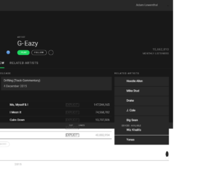
This is a template of a Spotify user interface, designed using HTML, CSS, and JavaScript. The form displays a playlist by an artist with buttons, placeholders, drop-down menus, and a navigation bar. The Li element of lists has been used to display the details in a list whereas JavaScript functions have been used to implement sliders, collapse toggles, and tooltips. Colors, spacing, borders, and font values are defined as variables to avoid using values again and again in different places. The background images are imported with its URL added to the code. The background of the body is given the styles color as $black, and font family as 'Roboto', sans-serif. The header is given the styles background as $light-black, padding as $padding-sm, color as $grey, align-items as center, and border-bottom as 1px solid $black. Cursor is set as pointer for most of the headings, buttons, and sections. The playlist is given the styles of padding as $padding, background as $light-black, border top and bottom as 1px solid $black which then changes background color to lighten( $light-black, 10% ) in a hover event.
Source: https://codepen.io/alowenthal/pen/rxboRv
Spotify Artist Page UI
4.3.1

This is another template of a simple web form, designed using CSS and HTML. The concept of Lists has been used with UL and LI components. UL element has been used with the child elements of LI to display the information in a list. The font family of the body is set as Verdana. The background color of the body is set to #10889E whereas the background color of the container is set to #E1F1F2. The header has the styles of text-align as center, font size as 3em, color as #445566, font family as Georgia, Times, Serif, font-weight as normal, and padding as 20px. Header 2 and 3 are also given the color #445566 whereas the navigational bar is given the styles background color as #45bcd2, height as 30px, margin-bottom as 20px, and text-align as center. Finally, the footer is given a style set of height as 50px, and background color as lightgrey.
Source: https://codepen.io/wcc/pen/LDqlI
Fixed Daily Kitteh
4.3.1
This is a template web form with a skeleton layout, designed using HTML, and CSS. The concept of Lists has been used with UL and LI components. UL element has been used with the child elements of LI to display the unordered list. The background image is imported with its URL added to the code. The body is given a background of #FDD761, font family of 'Lucida Sans Unicode', 'Arial', serif, and the color as white. The font-weight for headers and buttons is set as 700. The text-transform of the header is set to uppercase. The menu items have the styles of text-align as center, background as #fcca2f, font size as 14px, color as steelblue, text-shadow as 0px 1px 0px rgba(0, 0, 0, 0.25), and a transition of all ease .3s which changes its color to #fcc316, in a hover event. The services section has an initial style set of padding as 25px, background as #fafafa, and border-radius as 4px which in a hover event, changes the color to #f4ba04 and font size to 5.5em.
Source: https://codepen.io/SitePoint/pen/PwmjYp
Skeleton layout example
4.3.1