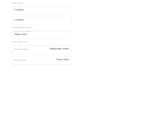
This is an example of an input boxes layout, designed using HTML, CSS, and Bootstrap framework 4. The values and colors are predefined as variables. The body of the form is given the styles of font-family as "Lato", sans-serif, and font-size as 16px. The section header is given the styles of text-transform as uppercase to automatically convert the text to uppercase, font-weight as bold, color as #9FAAB7, font-size as 16px/1.4, and margin-bottom as 1.4. The input fields are given the styles of border as 1px solid #C0CCDA, margin-bottom as 16px, and border-radius as 4px. The input fields take a border-color of #270D7C, in a checked event. The input text is given the styles of opacity as 1, font-size as 8px* 1.4, background-color as white, color as #9FAAB7, padding as 4px/2 4px, and margin as -58px 0 0 8px*1.4.
Source: https://codepen.io/swapnet/pen/oJeKyL
Input Boxes Layout
4.3.1
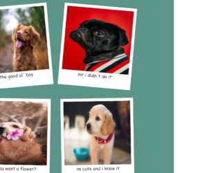
This is an example of a photo gallery layout designed using HTML, CSS, JavaScript, and Bootstrap framework 4. The images and fonts are imported to the code with their URLs, whereas the JavaScript functions have been used to rotate the image cards at a random angle. The body of the form is given the styles of font-family as 'Poor Story', cursive, and background as #5b9489. The image card has the styles of margin as 30px, width as 400px, height as 450px, background-color as white, padding as 1rem, and box-shadow as 0 0.2rem 1.2rem rgba(0,0,0,0.2). The image is given a height of 350px and a width of 100%. The caption of the image is given the styles of display as flex, justify-content as center, align-items as center, and font-size as 25px.
Source: https://codepen.io/braydoncoyer/pen/yLyQqdR
Photo Gallery Layout
4.3.1
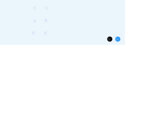
This is an example of a web form with neuomorphic checkboxes container, designed using HTML, CSS, and Bootstrap framework 4. The icons and fonts are imported to the code with their URLs. The concept of Lists has been used with UL and LI components. UL element has been used with the child elements of LI to display the icons in an orderly manner. The body of the form is given the styles of display as flex, justify-content as center, align-items as center, min-height as 100vh, and background as #ebf5fc. The checkbox icons are given a background color of #6a9bd8. The checkbox container is given the styles of width and height as 60px, background as #ebf5fc, display as flex, justify-content as center, align-items as center, box-shadow as -2px -2px 5px rgba(255, 255, 255, 1), 3px 3px 5px rgba(0, 0, 0, 0.1), and border-radius as 10px. The checkbox icons take a box-shadow effect of -2px -2px 5px rgba(255, 255, 255, 1), 3px 3px 5px rgba(0, 0, 0, 0.1), when they are in checked mode.
Source: https://codepen.io/braydoncoyer/pen/yLyrWOq
Neuomorphic Checkboxes
4.3.1
This is an example of a neomorphic login web form with hover effects, designed using CSS, HTML, and Bootstrap framework 4. The colors used in the form are predefined as $color-red: #AE1100, $color-bg: #EBECF0, $color-shadow: #BABECC, and $color-white: #FFF. The form is given a background color of $color-bg. The body and button sections are given the styles of font-family as 'Montserrat', sans-serif, letter-spacing as -0.2px, and font-size as 16px. The login button is given a font size as 16px and a padding as 16px, and a background color as $color-bg, and a text shadow as 1px 1px 0 $color-white. The input fields are given a box-shadow of inset 2px 2px 5px $color-shadow, inset -5px -5px 10px $color-white, and a transition value as all 0.2s ease-in-out. The login button is given a cursor style as pointer to get the hand cursor effect in a hover event, font-weight as 600, color as #61677C, transition as all 0.2s ease-in-out, and box-shadow as -5px -5px 20px $color-white, 5px 5px 20px $color-shadow. In a focus event, the box-shadow of the input fields turns to inset 1px 1px 2px $color-shadow, inset -1px -1px 2px $color-white. In hover and active events, the login button takes the styles of box shadow as -2px -2px 5px $color-white, 2px 2px 5px $color-shadow, and inset 1px 1px 2px $color-shadow, inset -1px -1px 2px $color-white.
Source: https://codepen.io/swapnet/pen/QWwPVwE

This is an example of a download interaction button with animations, designed using HTML, CSS, JavaScript, and Bootstrap framework 4. The icons are imported to the code with their URLs, whereas the JavaScript functions have been used to implement the downloading animation. The body is given the styles of background as #E8EBF3, height as 100vh, font as 400 16px 'Poppins', sans-serif, display as flex, flex-direction as column, justify-content as center, and align-items as center. The download icon box is given a border-radius of 3px, and a box shadow of 0 10px 30px rgba(#000000, 0.2). The download button is given height and width of 55px, background color of #1F242D, cursor as pointer to get the hand cursor effect on a hover event, and a transition value of width .2s ease-in .4s, height .2s ease-in .4s, background .2s ease-in .4s. The arrow in the download button is given a background color of #FFFFFF, height of 15px, and width of 2px. The progress container is given the color of linear-gradient(to right top, #00A7FC, #0070ED).
Source: https://codepen.io/milanraring/pen/jOEOmbv

This is an example of a toggle buttons card layout with animations, designed using CSS, HTML, and Bootstrap framework 4. The icons and CSS styles are imported to the code with their URLs, whereas media queries have been used to increase the responsiveness of the form. The form has eight toggle button container cards named as Normal, Transparent, Yes & No, Gravity, Pancake Stacks, Doggo Wants a Treat, Kobe Bryant Tribute, and Beer Pong. The body of the form is given a background color of #2e394d, whereas the toggle button containers are given eight different background colors. The colors are #dec387, #de8797, #87aade, #c5de87, #87ded2, #c487de, #de8787, and #decf87. The title of the toggle button container is given the styles of font as 500 14px 'Rubik', sans-serif, letter-spacing as .5px, text-transform as uppercase, and text-shadow as 0 1px 1px rgba(0,0,0,0.4). The toggle buttons are given the styles of width as 7em, background as #2e394d, height as 3em, display as inline-block, border-radius as 50px, margin as 40px, transition as all .3s ease, transform-origin as 20% center, and cursor as pointer to get the hand cursor effect on a hover event. The toggle buttons take different animations such as rotating, hooping, and rolling over when the buttons are checked as active.
Source: https://codepen.io/oliviale/pen/xxboXzo
Toggle Buttons
4.3.1