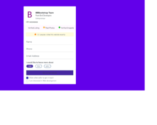
This is an example of a contact us form with custom check-boxes, designed using CSS, HTML, JavaScript, and Bootstrap framework 4. The images are imported to the code with their URLs. The title of the form is given a font style as Bold to make it highlighted. The body of the form is given a background color as #6200EA. The checkbox title is displayed using a font-size of 14px. When in checked mode, the background color of the checkboxes turns to #4527A0. JavaScript methods have been used to implement the functionality of the checkboxes and the progressing function of the progress bar. The progress bar has the styles of width as 10%, height as 15px, background-color as #4527A0, font color as white, and border-radius as 50px. The progress of the bar is indicated with the color #4527A0. The button is crated as primary type buttons. The alert message is given a background color of RGB(255, 251, 222), while the message is displayed using a font-size of 12px.
Source: https://bbbootstrap.com/snippets/contact-us-form-custom-checkboxes-72208201
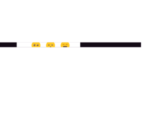
This is an example of a modal that expands to a rating form with rating emoji's, designed using HTML, CSS, and Bootstrap framework 4. The emojis are imported to the code as images with their URLs and created as radio type buttons. The body of the form is given a font style of 300 18px/1.5 'Rubik', sans-serif, and background color as #BA68C8. The rating card is given a transition value as background 0.4s ease-out. The cursor style for the rating card is set as pointer to the get the hand cursor effect in a hover event and an animation style of levitate 1s ease-in-out infinite is also given to apply the levitating effect to the emojis. The emojis are also given a transform effect of scale(1.8), to be effective on a hover event. The responsiveness and the mobile-friendliness of the form have been increased with the use of media quarries.
Source: https://bbbootstrap.com/snippets/rating-experience-modal-emojis-31937710
This is an example of a modal that expands to a form with multiple tabs, designed using HTML, JavaScript, CSS, and Bootstrap framework 4. The functionality of the tabs has been implemented by JavaScript methods, whereas media quarries have been used to increase the responsiveness of the form. The body of the form is given a background color as #D1C4E9. The modal function is created by setting the value of data-toggle as modal in HTML. The input text fields take the border style of 1px solid #2196F3, and font-weight of 400, in a focus event. The tabs take a border-bottom effect of 1px solid #2196F3, in a hover event. The 'popular topics' list turns its font color to #1565C0, in hover. The cursor style for the tabs is set as pointer to get the hand cursor effect in a hover event. The button is created as primary type buttons.
Source: https://bbbootstrap.com/snippets/modal-multiple-tabs-89860645
Modal with multiple tabs
4.3.1

This is an example of an order confirmation form, designed using CSS, HTML, JavaScript, and Bootstrap framework 4. The images are imported to the code using their URLs, whereas the media quarries have been used to increase the responsiveness of the form. The body of the form is given the styles of font-family as "Poppins-Regular", font-size as 15px, font color as #666, and background-color as #6645eb. The input field and button text are displayed using a font-size of 15px and color of #666. The progress bar is given a background color of #e6e6e6, which changes to #6645eb, as it progresses. The header title of the form is displayed using a font size of 22px and a font style of "Poppins-SemiBold". The input text fields are given the styles of height as 42px, border as 1px solid #e6e6e6, and width as 100%. The text fields take a border color of #f3d4b7 when focused. The functionality of the custom steps has been handled by the JQuery methods.
Source: https://bbbootstrap.com/snippets/form-wizard-using-jquery-steps-88897668
This is an example of a modal that expands to a multi-level payment form, designed using JavaScript, CSS, HTML, and Bootstrap framework 4. The concept of Lists has been used with UL and LI components. UL element has been used with the child elements of LI to display the child elements of the payment steps, in an orderly manner. The modal function is created by setting the value of data-toggle as modal in HTML, whereas the progress of the arrow transitions is implemented with JavaScript functions. The body of the form is given a background color of #eee. The input text fields take the styles of font color as #495057, background-color as #fff, border-color as #80bdff, and box-shadow as 0 0 0 0rem rgba(0, 123, 255, .25), in a hover event. The 'Next' and 'Previous' buttons take the box-shadow effect of 0 0 0 0rem rgba(108, 117, 125, .5), in a focus event.
Source:https://bbbootstrap.com/snippets/modal-dialog-form-wizard-arrows-transitions-86436904

This is an example of a request quotation form wizard with validation and progress bar, designed using CSS, HTML, JavaScript, and Bootstrap framework 4. The images are imported to the code with their URLs. JavaScript methods have been used to implement the functionality of the progress bar and the validation for the input fields. The validation of the input fields has been done by indicating the border color in red or green if the conditions are true or false. The body of the form is given a background color of linear-gradient(-45deg, #2196F3 50%, #EEEEEE 50%). The form card is given a background color of #FFF, border-radius of 25px, and a box-shadow value of 0 8px 16px 0 rgba(0, 0, 0, 0.2). The description details are displayed using a font-size of 14px. The progress bar is displayed using the color lightgray and the progress is indicated using #673AB7. The service radio buttons on the first page take the box-shadow effect of 1px 1px 2px 2px rgba(0, 0, 0, 0.1), in a hover event. The input text fields also take a border effect of 1px solid skyblue, in hover.
Source: https://bbbootstrap.com/snippets/request-quotation-form-wizard-validation-97849487