
This is a template of a social media feed, designed using HTML, CSS, and Bootstrap framework 4. The images are imported to the code with their URLs, and the media quarries have been used to make the form more responsive. The body of the form is given a background color of #f9f9fa. The container that displays the shared image, is given the styles of background as #ffffff, border-top as 3px solid #d2d6de, and box-shadow as 0 1px 1px rgba(0, 0, 0, 0.1). The user icon is given height and width of 40px. The image is given a border-radius of 50% to get the circle shape whereas the user name is displayed using a font-size of 16px, and font-weight of 600. The posted time is displayed with a font-size of 13px. The muted text lines are given the styles of font-weight as 400, font-size as 12px, and background-color as #f7f7f7. The footer of the form is given a border-top as 1px solid #f4f4f4.
Source: https://bbbootstrap.com/snippets/social-media-feed-44790998
Social media feed
4.3.1

This is an example of a set of social media cards with hover effects, designed using CSS, HTML, and Bootstrap framework 4. The form consists of three cards. The font style is imported to the code with its URL. The body of the form is given a background color as #fff, and font-family as 'Josefin Sans', sans-serif. The name of the card is displayed using a font style of 'Josefin Sans', sans-serif. The information card is given a style set of background color as #F0FFFF, padding as 60px 10px, margin as 30px 0px, box-shadow as 0 4px 8px 0 rgba(0, 0, 0, 0.2), 0 6px 20px 0 rgba(0, 0, 0, 0.19), and margin-bottom as 25px. The cards take the background color of #000000, on hover, whereas the card name and text turn its font color to #FFF. The 'Learn More' link is displayed using a font color of #00BFFF, which also turn the font color to #FFF, on hover.
Source: https://bbbootstrap.com/snippets/social-cards-font-awesome-icons-80190200

This is an example of a User Profile with social icons on hover effect, designed using CSS, HTML, and Bootstrap framework 4. The user images are imported to the cod with their URLs. The concept of Lists has been used with UL and LI components. UL element has been used with the child elements of LI to display the social media icons, in an orderly manner. The body of the form is given a background color of #f1f1f2, while the profile image is given a transition effect of all .3s ease 0s. The profile name is displayed with the styles of font-size as 19px, font-weight as 600, font color as #fff, text-transform style as uppercase to automatically convert the text to uppercase, and text-shadow as 0 0 1px #004cbf. In a hover event, the title changes its opacity to 1 and takes a transform effect as scale(1). In a hover event, the profile image takes a filter of sepia(80%), and a transform effect of scale(1.3) rotate(10deg), to create the hover effect. The social media icons also take a box shadow of 0 0 10px #000 inset, 0 0 0 3px #fff, on hover.
Source: https://bbbootstrap.com/snippets/social-profile-social-icons-hover-effect-38066990
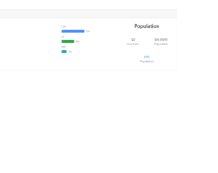
This is an example of a vector map with a progress bar, designed using CSS, HTML, and Bootstrap framework 4. The map has been created in HTML using a JQVMap plugin which renders clickable and interactive vector maps, which uses SVG graphics. The coordinates of the map are set in HTML. It is given a width of 490 and a height of 240. The progress bar is given a style set of display as flex, height as 1rem, font-size as .65625rem, background-color as #e9ecef, and border-radius as .25rem. The header of the form is given a text style as strong, to make it bold. The three progress bars are created as three types of bars: primary, success, and danger. The labels of the progress bar are being displayed using the color of rgba(135, 150, 165, .1), which is also the background color for the progress section. The stats are displayed using a muted text.
Source: https://bbbootstrap.com/snippets/vector-map-progressbar-23963244
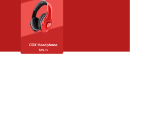
This is an example of an e-Commerce product card with an animation effect, designed using HTML, CSS, and Bootstrap framework 4. It can be used to showcase the e-commerce products stylishly. The product image has been imported to the code with its URL. The body of the form is given a background color of #B71C1C. The product card is given the styles of height as 420px, width as 320px, background-color as #C62828, border-radius as 10px, and a transform effect of skewY(345deg), to create the hover animation. In a hover event, the image changes its width to 80%, creating the hover effect. The justify-content and align-items styles have been set as center to centralize the elements. The 'Buy Now' button is created as a success type button and given a style set of font color as #fff, background-color as #ef5350, border-color as #ef5350, and width as 160px. In a hover event, the button takes the background color of #e84040 and the border-color of #e84040.
Source:https://bbbootstrap.com/snippets/bootstrap-ecommerce-product-card-animation-effect-30372547
Comments are closed