
This is an excellent example of highlighting of rows and columns whenever a cell is selected. Here the tables are created with different background color and various looks. The sample data for these tables are already added. Once you hover your mouse on any cell the rows and columns and a row of that particular cell get highlighted. This kind of style is suitable for the large tabular data where the header row is fixed. This kind of highlighting helps to visualize and compare the data along the selected columns and rows. The row highlight is done via CSS styling whereas for columns to get highlighted we need Jquery which adds a column when mouse over and removes a column during mouse out function. Color’s define in CSS as seen when a cell is selected. Ready to use scripts can have a special effect on your tables.
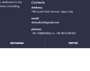
This is a classic example of footer used on the website. Footer class used is footer-classic, with a dark background. The Footer is placed in the container, with appropriate rows and columns alignment. The first half is displaying the brand and details of the brand, were as second half contains the contacts and links for other pages of the website. Class social-containers is used to display the links of social sites like Facebook and Instagram. A well-defined CSS gives the style to this footer with padding, margin, opacity defined. This footer example can be used in elaborated business pages, where they have multiple pages of contacts.
Footer Design
4.3.1

This is a classic example of "Get in touch: or “Contact Me form”. It uses bootstrap 3.3 and jquery 1.11 versions. The form contains fields for “your name”, “email”, “mobile no.” “message” and a submit button. The body is divided into sectionContent, sectionHeader and container. SectionHeader has its CSS style for font-family and color. Contact is having its own CSS style with its font family, background and color. The form gets a gradient look set in the contact section. FormControl and FormGroup, has its own style, which sets the font size, margin etc. Submit button is set with fontSize, background-color, width and float to right properties. Label and textarea is also set with their font and height properties. Your name, email-id and mobile number are in class form-line, whereas message and submit button are in separate formGroup. Tags such as label and textArea have properties set for height and fontSize.

This is the example of tracking progress form. It basically tracks the form completion. It has a Javascript code which runs while the user completes the form. It displays the message according to the percentage of completion of the form. The HTML consists of a simple form, which wraps the progress bar and progress message. Each FormControl is wrapped by class Field. Each field is marked with required, which makes it mandatory to fill the input field. Note the Select tag with options defined for CardMonth and CardNumber. At last, we have input with the class button. CSS style format is defined from body of HTML to the button at the bottom. In JS file attribute for the progress is checked and accordingly message and progress at a progress bar is set. Once the form is completed we can submit the form using HTTP “post” method.

This is an excellent example of a Footer. Footer is an additional navigation method for websites. It holds company info, copyrights, links, buttons, etc. This snippet contains classes like FooterTop, FooterBottom, FooterTitle, FooterLogo, FooterSocial. Check out the CSS settings in tag of HTML. We will be using font awesome for icons. Footer tag of bootstrap sets the stage for footer in HTML, the contains of the footer is placed in the class “container”, it deals with responsive behavior of the page. The row is divided into 4 parts and each part contains respective info which is using its individual style sheets. Check out the table class inside the footer. Each class and tag has its own style defined. Check out the hovering style defined for the button.
Simple footer
4.3.1

This is a simple login form for any resort application. This consists of a user name and password to access the application. This form is divided into , and a section. The header section contains the image set using max-width. The form is placed in the div section where two input type is displayed with place holders. Footer contains the button to sign in and a link for sign up form. Styles for different class @media rule are used in media queries to apply different styles for different media types/devices. Here we are applying the clip path ellipse, to the background. This gives us the required eclipse like curve.
UI Login Form for Resort
4.3.1