
This is the classic example of Navbar for a personal web portal. It uses styles and scripts in the header part of the page. The navbar has an elegant color with other items like “Books”, “Movies”, “Songs”, “Dropdown” with an option to “search” in the portal. Navbar is placed in the body of HTML which acts as a container. The navigation bar is decorated with classes like "mb-4" to set the margin at the bottom and navbar-expand gives the ability to expand. Using navbar-brand the brand name of the company is set, you can go ahead and place a logo of a company. The dropdown has a drop down to check out the dropdown classes used to create links. This bar has a CSS style which sets the styles for classes. Tweak this code to add it in your webpage of an e-commerce website.

This is the classic example of Navbar for a web portal, once the user is logged in. It uses styles and scripts in the header part of the page. Navbar is placed in the body of HTML which acts as a container. Nav is decorated with classes like mb-4 and navbar-expand, gives the ability to expand and set the desired color in the navbar. Using navbar-brand the brand name of the company is set, you can go ahead and place a logo of a company. The navbar has an elegant color with other items like “Contact”, “Settings”, “Profile”. These use font awesome is done to represent the icon for the links. Profile Link has a drop-down for “My Account” and “Log Out”. Check out the dropdown classes used to create links. This bar has a CSS style which sets the styles for classes. Tweak this code to add it in your webpage.
NavBar with Bootstrap 4
4.3.1

This is the classic example of Navbar for an e-commerce web portal. It uses styles and scripts in the header part of the page. The navbar has an elegent color with other items like “Home”, “features”, “Pricing”, “Dropdown” with an option to “search” in the portal. Navbar is placed in the body of HTML which acts as a container. Nav is decorated with classes like mb-4 and navbar-expand, gives the ability to expand and set the desired color in the navbar. Using navbar-brand the brand name of the company is set, you can go ahead and place a logo of a company. The dropdown has a drop down to check out the dropdown classes used to create links. This bar has a CSS style which sets the styles for classes. Tweak this code to add it in your webpage of an ecommerce website.
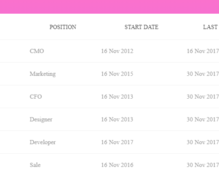
With the larger data to be displayed in tabular format with multiple columns, you would require the row to be fixed. This is a simple table with the data to be displayed in row and column format. The horizontal scrollbar is added to all the tables to show the data. The purpose of this example is to show the first row is fixed. Row head is used to define the first column in the header part and the rest of the columns are displayed in the body part of the table. Scroll the data horizontally and you would see the first row is fixed at the left side of the table. CSS sheet defines the style and color to the table. JS-scroll is used to display the scroll bar. The background color, header color, and scrollbar color are in perfect sync for this table. You can use this table and tweak it to your needs.
Fixed Column Table
4.3.1
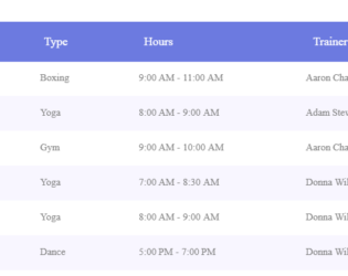
With the larger data to be displayed in tabular format you would require the column header to be fixed. This is a simple table with the data to be displayed in row and column format. The vertical scrollbar is added to all the tables to show the data. The purpose of this example is to show the headers are fixed. Scroll the data vertically and you would see the column headers fixed at the top of the table. CSS sheet defines the style and color to all the tables and headers. JS-pscroll is used to display the scroll bar. The background color, header color and scrollbar color is in perfect sync for each table. These tables can be used for tabular data format with larger dataset displayed on each page. You can use these tables and tweak it to your needs.
Fixed Header Tables
4.3.1
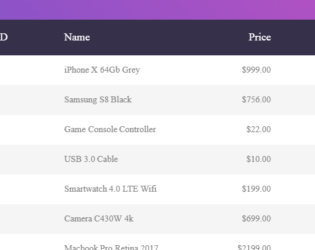
This is the classic example of a responsive bootstrap table, which can be used to display data with various size of the web page. You can use this table design in the sites which can be used in mobile, IPad or desktop versions. The table is wrapped under the classes which gives it a responsive behavior. The table is divided into header and body, header division contains the column names marked with class “table-header” and body division is made up of rows containing the data for the given columns. By changing the display size of the web page you can see the change in the display of each data. The data of each row is displayed with the column name on to the left side. The CCS style defines the look for each class. Media queries are defined to make the table responsive.
Responsive Table
4.3.1