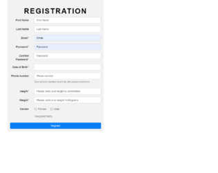
This is a classic example of a registration page with validation designed with HTML, CSS, and JavaScript. Text field has been implemented with the use of the input element with its type set as text. The background image has been set with the CSS styles by adding the image URL and background-size as cover in the CSS body section. The styles of the form are set to max-width as 530px, padding as 15px, margin as 0 auto, border-radius as 0.3em, and background color as #f2f2f2. The heading h2 has the styles of font-family as 'Open Sans', sans-serif, font size as 40px, font-weight as 600, color as #000000, margin-top as 5%, text-align as center, and letter spacing as 4px. The text transform element is set as uppercase to automatically transform the text to uppercase. JavaScript is used to validate the input fields and display messages if the required fields are left empty or char values are entered into numerical fields upon submitting.
Source: https://bootsnipp.com/snippets/z8b1X
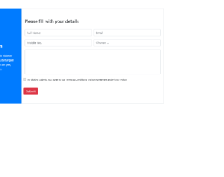
This is a template of a registration page with the terms and conditions section, designed using HTML and CSS. Bootstrap and jquery files are imported to add the respective styles such as bootstrap grid view. Placeholders are used to display a hint of the expected output in input fields. The input type ‘text' has been used for the text fields whereas the ‘Select' element has been used in the Choose field to select options from the dropdown list. The ‘label' element has been used to display the span values. The button element has been used to display the button with the value of image style set as 100%. The image URL has been added to display the image in the background. A validating element has been added on the submit button to avoid submitting without ticking the checkbox.
Source: https://bootsnipp.com/snippets/yN1EV
Registration Page
4.3.1

This is an example of a sign-up form designed with HTML and CSS. The input type ‘text' has been used for the text fields. Placeholders have been used to display a hint of the expected output in input fields. ‘Select' element has been used in Phone number and Job type fields to select options from a dropdown list. The "font-awesome" style sheet has been imported and used the list element with the class value of fa fa-envelope. The class divider text has the styles of position as relative, text-align as center, margin-top as 15px, and margin-bottom as 15px. The span has the styles of padding as 7px, font size as 12px, position as relative, and z-index as 2. The styles will be appended to the text fields after the load with the styles of content as empty, a position as absolute, width as 100%, border-bottom as 1px solid #ddd, top as 55%, left as 0 and z-index as 1.
Source: https://bootsnipp.com/snippets/z8699
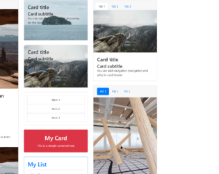
This is an example of displaying different types of card types with the use of HTML only. The bootstrap inbuilt class style has been used by setting the class name in the element. Each card consists of an image, title and a description in different formats and orders. The img HTML element has been used to set the image to the thumbnail. To distribute the data in rows and columns within a card, the bootstrap inbuilt class ‘row’ and class ’col’ are used. The class name ‘card’ has been used to apply the card styles to the HTML so that they don’t have to be manually entered. The links are set with the HTML element of href.
credits - https://codepen.io/SitePoint/pen/mXqdda
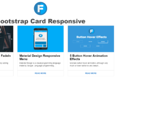
This is an example for a responsive card thumbnail that can be designed HTML and CSS. Each card has the image, title and a description followed by a read more button. The img HTML element has been used to set the image to the thumbnail. The styles that are applied to the entire page are height as 100%, width as 100%, background as #FFF, font family as 'Roboto', sans-serif, and font weight as 400. The font weight is the style that is used to set the bold value of the font. Media queries in the CSS file have been used to make the card thumbnails responsive with the values of min width as 450px, min width as 760px, and min width as 900px. resulting this example to be responsive for three screen resolutions.
credits - https://codepen.io/wisnust10/pen/BKjNNR
This is an example of displaying the data in a card format with the use of HTML and CSS. Each card will have the image on the top, title followed by the description. The card styles that are applied to this example have a style of padding left as auto, padding right as auto, min height as 500px, margin top as 15px, box shadow as 0 2px 5px 0 rgba(0, 0, 0, 0.16), 0 2px 10px 0 rgba(0, 0, 0, 0.12) and transition as .25s box-shadow. To implement the box shadow effect on the mouse hover for each card, the hover event in the CSS style class has been used by updating the box shadow class to the value of 0 5px 11px 0 rgba(0, 0, 0, 0.18), 0 4px 15px 0 rgba(0, 0, 0, 0.15). The same styles have been used for the focus event as well.
credits - https://codepen.io/reklamarsiv/pen/vgPLLv
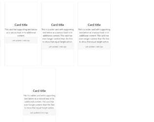
Simple Bootstrap Cards
4.3.1