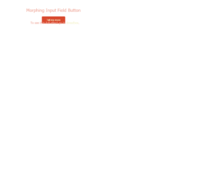
This is the example of an input field on the splash page. With the business expanding every second, web applications are also one way to create a niche for your business. The splash page is one of the examples which can come after any page in your site. The purpose of a splash page varies: You can promote a new offer, show a disclaimer, or a warning depending on the industry or niche your business operates in. Here we see the example of gathering email address using morphed input field button. The CSS properties are applied to the input field which will look like an input button, later once the field is clicked we will make it active and inherit the cursor. Once the input field is activated we will display the subscribe button. This goes well with the splash page where the content is less and client information gathering is more. Source: https://codepen.io/calebsylvest/pen/FjlLJ

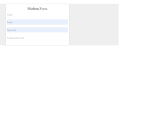
This is an example of using Web-flow styled email input field. UI / UX is not just writing the front end of the website, it is more of the flow of the data in the correct format for the CMS applications. The Webflow helps you to understand the chemistry between the HTML CSS and javascript, they working together to make the foundation and customization of the data which is required and essential for any product. Here we just see the example of email input with the effect once the input is focused. HTML uses the web flow-style input with the placeholder and icon with a forwarding arrow. The CSS is matched to the web flow input field while it is in an active and inactive more. Check the code for CSS of the colors added while the input is an active and inactive state. You can use this code in case if you plan to use the web flow in web applications. Source: https://codepen.io/PRtheRose/pen/BNgEJo
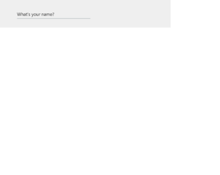
This is a classic example of floated labels, which are around the corner for quite some time. This example is with javascript but with the advance CSS you can write one without the javascript. This can be used when you need to save the space in the form and make the labels as big as the input field in the appearances. Once you click on the input field the text floats and moves out allowing you to type on the field. The example in this is a form with the labels and input grouped in the fieldset. These are arranged well with the CSS properties, the trick here is to add the focus class during the selection on the input field and removing it while it is a blur. This is done using javascript. You can use this snippet as it is in filling the contact form and other interactions with the clients.
Source: https://codepen.io/KhoaDinh/pen/ozLRbo
Input with float labels
4.3.1
This is an example of the stylish expandable input field using only pure CSS solution. The animation and effect expands the input field once clicked on it. The HTML markup is simple and easy by defining an input and span element inside a div element to ensure that the animated border doesn’t overflow and doesn’t disturb the UI. Next, we are using a freebee markup “growing-search” to increase the width of search while it is selected. The CSS is mainly focused on behavior while it is selected or submitted it hovered. The outline is specifically made none, for the input while it is in a selected state. The important part for this snippet is growing, which is done by increasing the width while the input is selected. You get an idea of using the different kinds of animations and effects. You can change this code to change the style, color, and appearance of the border. Source: https://codepen.io/Mestika/pen/CiKlj
This is an example of CSS focused animation. With the CSS 3 evolved with the new behaviors of transition and animations. Now you can design the animations without using Javascript or Flash. Transitions in CSS3 gives an ability to alter the appearance and behavior of an element whenever a state change occurs, such as when it is hovered over, focused on, active, or targeted. HTML in this snippet is simple with the field class used for input. The CSS styles are defined for all the elements of the HTML. Check out the effect once you click on the input field. The input field is marked with a transform to display the animation while it is selected and deselected. You can use this as an example for other fields in case you use the CSS 3 version. Make sure the color and effect match your webpage. Source: https://codepen.io/daniandl/pen/boqyYE

This is an example of a radio button which is styled well in only vanilla CSS. Though it looks simple, click on the radio button and check out the effect after selecting it. HTML is quite simple, for every radio type a class bullet is defined with classes from zero to seven. The styling for each class used to create HTML is carefully created. Each line from one to seven is styled using the right top and transform method. With the combination of these properties, the lines are created and a jelly effect is created after the click. After the button is active it displays itself like a bull's eye, and looks like a normal radio button after it is deselected. It uses the google CSS fonts which is a perfect match for the HTML. To use this snippet you need to take a closer of the styling used. Source: https://codepen.io/tomma5o/pen/grJyzL
Jelly Radio Button
4.3.1