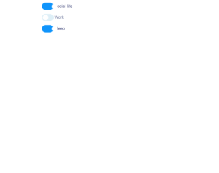
This is an example of a web form with checkboxes designed using CSS, HTML, and JavaScript. JavaScript has been used to make sure only two checkboxes of the three are selected at a time. The boxes are given the type ‘checkbox' and named as Social, Work, and Sleep. The font type is imported from Google with the URL and the label is set with the styles of font-family as "Montserrat", sans-serif, font-size as 1.2rem, cursor as a pointer to display the hand cursor, display as none to hide the elements, and margin as 1em. In an unchecked event, the styles will be as display: inline-block, border-radius: 20px, vertical-align: middle, transition: .25s .09s, position: relative, background: #deeff7, and box-shadow: 1px 2px 4px 0 rgba(#000, .4). After a checked event, the styles will change to transform: translateX(25px) and the color of the background to #1094fb and the font color to #29316b.
Source: https://codepen.io/havardob/pen/ZJJoQL

For an input field, this is one of the best styles one can have using the 2D vector math library of javascript. This style appears on the box while the user is typing in the input field. This can be achieved using HTML, script math library and CSS styles on your login forms, contact forms, websites, and even on your landing pages. In the HTML, a span element is added in the document. The input keys are added in the javascript for which the animation will be displayed. Next, you need to create a few math functions to create the spray along with the words which are typed in the input field. You can increase the burst of a spray of stimulated particles along the span on input field from left to right and top to bottom. You can see the math for particle stimulation along with the 2D vector class. Source: https://codepen.io/rikschennink/pen/VaqNgx
Pixie Dust Input
4.3.1

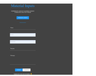
With google guidelines for the material design, you can have clean, smooth and sleek designs for your web pages. Material designs can be used in all supported versions of Android devices. Further, it will be extended gradually throughout Google’s web ance mobile products. This will provide a consistent UI/UX experience across all the platforms. This is one of the designs following the google guidelines. This snippet is of the form with two inputs. Once you have an input field focused you would experience a transition of the label to the top corner. You can set the position to bottom or top of the labels when the input field is an inactive state. By following the Material Design of Google you would not have to worry about the user experience of the forms on various platforms. This is specially design for Android devices and hence you can check out the responsive behavior. Source: https://codepen.io/chrisoncode/pen/IdGKH

For your quirky responsive website, this is one of the best snippets, with jquery and CSS styling it gives a perfect style to the text added in the text field. This snippet displays the style you can have with the input field and the type’s text. HTML is quite simple with having the input field. Few font styles like “sans-serif”, “cursive” and “serif” can be set once we click on the button link. The CSS sets the styles for the fonts by styling their classes of input and controls. We have one more animation called shake which will animate the input field and text once we apply any of these below fonts. The script is carefully drafted to add or remove animation for the font and also for the shake effect. You can add these type of effect to engage the user on your site. Source:https://codepen.io/Benny29390/pen/aWwybM

This is an example of the input box which is subtle and can be used in any site with the animation used for the input text. Once you select the input field the label glides smoothly towards the top of the field and allows you to type the text, along with it the color of the text and border of the input field is also changed. The HTML is very simple with the class centered and group applied to the input and labels. All the animation and styling is taken care by CSS3. Once you click the label is transformed along the axis to glide upwards. The style also has the code to stop the chrome’s hideous pale yellow background color to be displayed while you do an auto fill. You can use this as an example to create contact forms. Source: https://codepen.io/kylelavery88/pen/adbzLQ
This is a classic example of input form. As said it is inspired by Googles material design guidelines especially for the text fields. The guidelines used to design the text fields along with its specifications described in the document by Google. The text fields used are filled text which once clicked the labels neatly move up during the users interactions. You can also have field validations on these text fields. The moving of labels is due to the transition method used in CSS. The CSS is perfectly created to match the guidelines and the form. You can use this form as it is to you application with the functional submit and cancel buttons as needed. Make sure that you have required validation in the form checked. Also for this you require CSS3 to see the moving transition and effects added to the field. Source: https://codepen.io/lewisvrobinson/pen/EyZwjR
CSS-only Material Inputs
4.3.1