Button Hover States
4.3.1
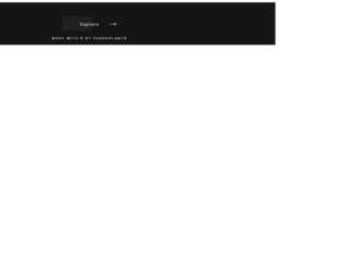
Explore button on hover
4.3.1

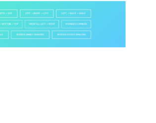
Box/Button Hovers
4.3.1
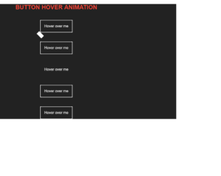
Button Hover Animations
4.3.1

Animated Ghost Button
4.3.1

This is an example for another button view with animations designed using CSS and HTML. The background image has been added with the URL of the image. CSS style sheet has been used to implement CSS styles. The color of the animated button is set with a combination of #FF8282 and #E178ED colors. The body is given a style set of width and height: 100%, position: relative, background-blend-mode: exclusion, and background-blend-mode: luminosity. The button is given the styles of margin-top: calc (50% + 25px), position: relative, display: inline-block, width: 277px, height: 50px, text-align: center, text-transform: uppercase, background-color: transparent, cursor: pointer, font-family: 'Roboto', sans-serif, font-size: 17px, and letter-spacing: 0.045em. On a focus event, the button will take a transition effect according to web kit-transition: all 600ms ease, transition: all 600ms ease, stroke-dasharray and stroke-dashoffset style sets.
Source: https://codepen.io/mars2601/pen/MKVNMX
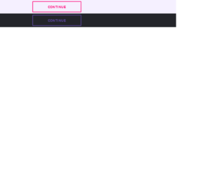
This is another example of a button view with hover effects designed with the use of HTML and CSS. Variables have been created to define the colors and font type to store values in CSS so variable names could be used repeatedly to avoid setting the same value in different places. Those variables are $font- 'Source Sans Pro', sans-serif; $primary- #FF0072, $second- #644cad, $third- #4426a8. The background colors of the body are set as #24252A and #F5F0FF. The styles of button 1 is initially set to font-size: 18px, letter-spacing: 2px, text-transform: uppercase, text-align: center, width: 270px, padding: 14px 0px, border: 3px solid $primary, border-radius: 2px and box-shadow: 0 2px 10px rgba(0,0,0,0.16), 0 3px 6px rgba(0,0,0,0.1). The styles of button 2 is initially set to font-size: 18px, letter-spacing: 2px, text-transform: uppercase, text-align: center, width: 270px, padding: 14px 0px, border: 3px solid $second, border-radius: 2px, and box-shadow: 0 2px 10px rgba(0,0,0,0.16), 0 3px 6px rgba(0,0,0,0.1). Both buttons get highlighted on a focus event.
Source: https://codepen.io/wintr/pen/wWoRVW
Ghost Button Animation
4.3.1