
This is another simple example of a button view with hover effects designed by using HTML and CSS. The font of the body is set as 'Open Sans Condensed', sans-serif, the display as flex and flex direction as column. Box 1 is given a background color of #FF6766, box 2 is given a color of #3C3C3C and box 3 #66A182. For the buttons, text-align is set as center and cursor is set as pointer. For button 1, styles before a hover event are set as opacity: 1, and transform: scale (1, 1) where it will change to opacity: 0, and transform: scale (0.1, 1) on a hover event. For button 2, styles before a hover event are set as transform: rotate (-45deg), and background-color: rgba (255,255,255,0) where it will change to transform: rotate(45deg), background-color: rgba(255,255,255,0) on a hover event. For button 3, styles before a hover event are set as opacity: 0, and transform: scale (0.5,0.5) where it will change to opacity: 1, and transform: scale(1,1) on a hover event.
Source: https://codepen.io/rauldronca/pen/mEXomp

This is another example of a button view with hover effects designed by using HTML and CSS. Variables have been created to define colors to store color values in CSS so variable names could be used repeatedly to avoid setting the same value in different places. The body is given the styles of background: #f5f5f5, font-family: 'Poppins', sans-serif. General styles for the button group are set as width: 100%, text-align: center, margin-bottom: 125px, margin: 5em 0, padding: 10px 30px, margin: 1em, border-radius: 5px, text-decoration: none and transition: 0.5s ease-in-out. On a hover event, button 1 will change its styles to box-shadow: 0px 0px 0px 2.5px #fff, 0px 0px 0px 5px $yellow, 0px 0px 0px 10px white, 0px 0px 0px 10.5px $yellow, background: white, color: $yellow. Button 2 will change its styles to box-shadow: 0px 0px 0px 2.5px white inset, 0px 0px 0px 5px $cyan, Button 3 to letter-spacing: 10px, box-shadow: 2.5px 2.5px 0px 5px white, 5px 5px 0px 7.5px $red, background: none, border: 2.5px solid $red, color: $red. Likewise, all the 8 buttons will change its styles according to the given styles on a hover event.
Source: https://codepen.io/samflickgraphics/pen/KajNRm
Button Hover Effects
4.3.1

This is an example of a button view with hover effects designed by using HTML and CSS. The buttons are named as button 1, 2, 3, 4, 5. The buttons are given a general style set of width as 170px, text-align as center, text-transform as uppercase and cursor as pointer. Button 1 is given a neo outline effect on a hover event by setting the styles as color: #00d7c3 and box-shadow: 0 0 10px 0 #00d7c3 inset, 0 0 20px 2px #00d7c3. Button 2 is given the styles of border: 3px solid #c266d3, and a background color of #c266d3 and will become transparent on a hover event. Button 3 is given a shadow effect on a hover event by giving the style of box-shadow: 8px 8px #99bdff and transition: .3s. Styles for button 4 are set as background-color: transparent, border: 3px solid #ff0251, color: #ff0251, transition: .3s and will take a pulse effect on a hover event by animation: pulse 1s infinite, whereas button 5 will take a gradient hover effect by background-position: -200%, transition: background 300ms ease-in-out styles.
Source: https://codepen.io/woolandcotton/pen/mBmLwq
CSS button hover effects
4.3.1

This is an example of a gooey toggle switch designed using HTML and CSS. The toggle is given the input type of ‘checkbox'. The background color of the form is set with #2C4159 and the background of the toggle button with #151B25. The form is given a style set of position as absolute, height as 100px, width as 260px, padding as 10px 0 and transform as translate3d (-50%,-50%,0). The bubble is given a set of styles of position as absolute, transform as translate3d(-75%,-50%,0), border-radius as 50% 50% 50% 50% / 50% 50% 50% 50% background as #BBBBBB and an animation as toggle-reverse 2s 1. On a clicked event, the bubble will take the styles of animation as toggle 2s 1, transform as translate3d (75%,-50%, 0), transform as rotate (45deg), transition as 500ms ease all 1.25s and background as #3CCC97. The ‘toggle' and ‘toggle reverse' events are given their own transition styles.
Source: https://codepen.io/onediv/pen/pjgNqJ
Gooey toggle switch
4.3.1

This is an example of a form with flat checkboxes designed with CSS and HTML. Checkboxes are given the input type of ‘checkbox' and their city names the type ‘label'. The body has been given the styles of font-family as "Open sans", "Segoe UI", "Segoe WP", Helvetica, Arial, sans-serif, color as #7F8C9A, and a background as #FCFDFD whereas the header 1 and header 2 have been given the styles of colors as #1ABC9C and #aaa, margin-bottom as 5px, font-weight as normal and text-align as center. The styles for the checkboxes are given by dividing them as ‘checked' and ‘not checked'. The styles for the left part of the button on unchecked event are set as width and height as 30px, transition as all .2s, border-radius as 6px 0 0 6px and background color as #7F8C9A whereas the right part is set as width as 80px, height as 30px, border-radius as 6px, transition as background-color .2s and background: #DDDDDD. On a checked event, the background will change to #34495E and #39D2B4 and the border-radius to 0 6px 6px 0.
Source: https://codepen.io/ARS/pen/aeDHE
Flat UI - Checkbox FIX
4.3.1

This is an example of a form with checkboxes and toggle buttons with the use of HTML, CSS, and JavaScript. JavaScript functions have been used to make the form responsive by checking the width of the screen. If the width is less than 400px, the mobile class will be added with the use of add class to apply the mobile view whereas if the width is greater than 400px, the mobile class will be removed with the use of remove class. The CSS class switch has been used for the toggle button which consists of height as 4.4rem, overflow as hidden, width as 7 rem, position as relative, display as inline-block, margin as 0, and padding as 0 whereas the switch label has the styles of width as 100%, font size as 0.5rem, and text-align as center. The CSS style class text transformation has been used with the value of uppercase to convert the text to uppercase. The hover class has been used with the style of cursor as pointer so the mouse pointer will be displayed on the toggle button on a mouse hover event. The style display has been used with the value ‘none' to hide the elements.
Source: https://codepen.io/jcgilmore2/pen/PZpmaK

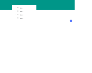
This is an example of a web form with a list of checkboxes designed with CSS and HTML. The checkboxes can be signed off. Li" element has been used to arrange the boxes in a list view. The boxes are given the type ‘checkbox'. There are three checkboxes in the list. The body of the form has the styles of display as flex, justify-content as center, align-items as center, margin as 0, padding: 0, width and height as 100%, background-color as #1abc9c, and font-family as 'Roboto', sans-serif. The CSS style cursor is set with the value of pointer to make the cursor look like a hand. Also, the CSS style appearance has been used with the value as none and opacity as 0 to hide the checkboxes.
Source: https://codepen.io/derekmorash/pen/Eydxab
Checkbox to cut options
4.3.1
This is an example of a web form with a list of checkboxes designed with CSS and HTML. Li" element has been used to arrange the boxes in a list view. The boxes are given the type ‘checkbox'. Variables have been created to define the colors, distances and font size to store values in CSS so variable names could be used repeatedly to avoid setting the same value in different places. Those pre-defined variables are, $baseFontSize: 16, $green: #009688, $blue: #5677fc, $blueDark: #3b50ce, $slideDistance: 100, and $slideDuration: .4s. The background color of the body is set with #009688 whereas the CSS style cursor is set with the value of pointer to make the cursor look like a hand.
Source: https://codepen.io/Sambego/pen/zDLxe