
This is an example of a timeline view in a list view, designed with CSS and HTML. The body is given a style set of color as #D3D7D8, font-family as Roboto', sans-serif, padding as 20px 100px, position as relative and overflow as hidden. The icons have been imported to the form with the CSS framework Font Awesome. The icons have been assigned a style set of background color as #e7e7e7, font size as 80px, text-align as center, line height and height as 130px and width as 160px. Each timeline year label has been assigned a border color of #FF9389, #FDCC4C, #ADEEC3, and #7AB8DD, which are also used as background colors combined with linear gradient colors, respectively. The timeline years icons also have the styles of color as #fff, font size as 70px, font-weight as 600, text-align as center, text-shadow as 2px 2px 5px #000, border-radius as 50% making them circles, height and width as 200px whereas label titles have the styles of color as #808080 and text-transform as capitalize to make the first letter of each word capital.
Timeline style 11
4.3.1

This is an example of a horizontal timeline view with animated icons, designed using CSS and HTML. The colors of the labels and form have been declared as var variables in CSS so the same variable can be reused in several places easily. Those values are; white:#fff, black:#000, color_1: #EA2027, color_2: #1F5295, color_3: #89b743, and color_4: #e02a6d. The body of the form is given a style set of font-family of 'Niramit', sans-serif, and display as block. Each timeline label has been assigned a color of color_1, color_2, color_3, and color_4 to get a combination of linear-gradient colors. The timeline year is given the styles of color as white, font size as 35px, and font-weight as 600, and text-align as center. The title of the label is given a style set of font size as 25px, and font-weight as 600 and the label description a style set of color as #333, and font size as 15px. A rotating animation is given to the icons by timeline-icon {transform: rotate (360deg).
Timeline style 10
4.3.1

This is a template of a timeline view with its labels spread around the timeline tree, designed with CSS and HTML. The colors of the labels and form, have been declared as var variables in CSS so the same variable can be reused in several places easily. Those values are; white:#fff, black:#222, color_1: linear-gradient(to right,#E7007B,#E7007B,#BF1424,#BF1424), color_2: linear-gradient(to right, #F04302,#F04302,#FC8819,#FC8819), color_3: linear-gradient(to right, #99C840, #99C840, #DEE420, #DEE420),andcolor_4:linear-gradient(to right, #0994C1, #0994C1, #70B1A5, #70B1A5). The body of the form is given a style set of font family of 'Niramit', sans-serif, padding of 40px 0 20px, margin of 20px 0, and a position as relative. Each timeline label has been assigned a color of color_1, color_2, color_3, and color_4 to get a combination of linear gradient colors. The title of the label is given a style set of font size as 20px, font weight as 500, letter spacing as 1px, padding as 10px 20px, and text transform as uppercase to convert the text to uppercase whereas the timeline year is given the styles of font size as 30px, and font weight as 700. The icons have been imported to the form with the CSS framework Font Awesome.
Timeline style 9
4.3.1
This is a template of a timeline view with its labels spread around the timeline tree, designed using HTML and CSS. The body of the form is given a background color of #0B3E41, font family of 'Oxygen', sans-serif, and a position as relative. The icons are given a height and width of 70px, line-height as 70px, a color of #0C3F42, a font size of 40px, text-align as center, border-radius as 50% to make the icon a circle, and position as absolute. Each timeline label has been assigned a color of #FEC93F, #55b0ed, #ff665b, and #2ecc71, respectively. The title of the label is given a style set of background color as #0C3F42, font size as 25px, font-weight as 800, letter-spacing as 1px, padding as 10px 10px, and text transform as uppercase to convert the text to uppercase always. The label description has been given a style set of font size as 15px and letter spacing as 1px. The font size of the main timeline title is set as 20px. The icons have been imported to the form with the CSS framework Font Awesome.
Timeline stye 8
4.3.1

This is another template of a timeline view designed using HTML and CSS. The form is given a background color of #e7e7e7, font family of 'Titillium Web', sans-serif, padding of 50px 0 0, and position as relative. Each timeline year has been assigned a solid border and a background color of #FF9B00, #FF503B, #009CE6, and #B160BD, respectively. The title of the label is given a style set of background color as #333, font size as 25px, font-weight as 600, and text transform as uppercase to convert the text to uppercase always. The label description has been given a style set of font size as 14px, color as #333, and letter spacing as 1px. The font size of the main timeline title is set as 18px. The icons have been imported to the form with the CSS framework Font Awesome.
Timeline style 7
4.3.1

This is an example of a horizontal timeline view with animated icons, designed using CSS and HTML. The body of the timeline is given a font-family of 'PT Sans', sans-serif. The timeline years have been given an initial style set of height and width as 20px and position as absolute. The inner content of the label is given a color of #fff7e2 and a padding of 20px 10px 10px. The icons are given an animation of transform: rotateY(360deg), in a hover event. Each timeline label has been assigned a color of #EA2027, #1B1464, #EE5A24, and #009432, respectively. The title of the label is given a style set of font size as 25px, font-weight as 600, and margin as 0 0 15px 0. The label description has been given a style set of font size as 15px, color as #333, and letter spacing as 1px. The icons have been imported to the form with the CSS framework Font Awesome.
Timeline style 6
4.3.1
This is another template of a timeline view designed using HTML and CSS. The icons of the timeline labels have been positioned to get the timeline tree look. The body of the timeline is designed with CSS with its values set as font-family to ‘Nunito Sans', sans-serif, position to relative, and color to #fff. The text is aligned to the right side. The icons are given a height and width of 90px, the color of #fff, a font size of 40px, text-align as center, border-radius as 50% to make the icon a circle, and position as absolute. Each timeline label has been assigned a color of #E91E63, #2196F3, #009688, and #FF5722, respectively. The title of the label is given a style set of background color as #fff, font size as 20px, font-weight as 800, and text transform as uppercase to convert the text to uppercase always. The label description has been given a style set of font size as 15px. The font size of the main timeline title is set as 18px. The icons have been imported to the form with the CSS framework Font Awesome.
Timeline style 5
4.3.1
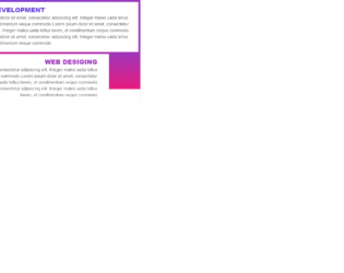
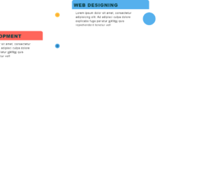
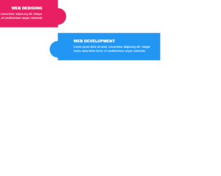
This is another template of a timeline view in a list view, designed with HTML and CSS. The body of the timeline is designed with CSS with its values set as font-family to ‘Nunito Sans', sans-serif, position to relative, color to #fff, min-height to 150px, display as block, and a padding of 20px 20px 20px 150px. . Each timeline label has been assigned a linear gradient color combination of #6C4ADC and #9C36BA, #E81C7E and #9C36BA, #E81C7E and #EE5167, #FA964A and #EE5167, respectively. The title of the label is given a style set of font size as 22px, font-weight as 800, and text transform as uppercase to convert the text to uppercase. The label description has been given a style set of font size as 15px and color of #666. The font size of the main timeline title is set as 18px. The icons have been imported to the form with the CSS framework Font Awesome.
Timeline style 4
4.3.1