
In modern websites the geometrical designs are widely used, to create uniquely looking pages. These shapes give you a refreshing look with a bit of animation on it. The shadow effect with the gradient enhances the beauty of this design. The Bootstrap pagination wrappers the page-links and page-items with aria-label for previous and next buttons. With this simple markup, all the animation and styling is done using CSS. The CSS sets the styles for each class of pagination. The pagination wrapper sets the linear gradient for this look with the font and display set as inline-flex. The page-link sets the transition property and polygon path using ::after selector. The styling properties need to be designed carefully to get these animations. You can add these kinds of designs for your pagination which is effective in engaging the users who are is bold enough to display the active page.
Pagination style 15
4.3.1
With bolder and flashy web pages you require a similar but matching pagination. This is a snippet with boxy elements and page-links showing clearly each page and numbers as buttons. The depth effect given to these links gives a realistic effect of pressing the buttons. Looks good on any site and active and hovered elements can be easily identified due to its bright color. HTML markup is easy with the use of Bootstrap pagination. The font used is “Happy Monkey” which gives an antique look to this design. The CSS styling for all the links is the same, unlike other pagination designs. The selectors like::hover set the active page-link by setting the color, margin and background link. The transform sets the decreased size by setting the scale property by 0.8. For the boxy look, the radius is set to zero a transition is set for a few seconds while we sift from one link to another.
Pagination style 14
4.3.1

With the hourglass displayed for active page, this pagination is uniquely designed to display the pagination for your webpage. With the Bootstrap and pagination components used its display, the Robot font promptly displays the page numbers with previous and next pagination links. The CSS selectors like, ::after, ::before and ::hover play a major role in the animation of page-links. The ::before selector for page-link displays the polygon while the page-link hovers, where are the hovering sets the opacity to 1 and sets the scale() method to set the size of element active or hovered element. The first and last child, that is previous and next links are styled to match the styling of other pagination links. Check out the linear-gradient set to the background of the links. This design can be easily added to any web application.
Pagination style 13
4.3.1

A pagination is an ordinal number of pages located at the bottom of the pages. But this snippet can be used for the pagination or navigation which is located at the top of the page. This is designed in such a way that it can engage the users with its animation. The HTML markup is simple using a pagination component of Bootstrap and font of Roboto. The Pagination component of Bootstrap wrappers the page-item and page-links with aria-label for next and previous items. The animation is taken care of by CSS selectors. The selectors ::first-child and ::last-child signifies the previous and next element which has the same type of styling with respect to the color font and mouse hovering. The elements apart from the first and last elements have a certain type of animation once they are hovered or active. The transform properties and translate properties create the magic of the animation for the elements.
Pagination style 12
4.3.1

This is an example of pagination with animation, with its unique design it can easily blend with any of the websites. With the Bootstrap pagination component and with the font “Cabin” the snippet uses the page-item, and page-link wrapped. The HTML markup is simple but the style is obtained from CSS, where the pagination is set as inline-flex where flex container display inline. Page-link sets the links for each page-item and is normally styled for :before and :after hovering. This CSS styles the active hovered and previous and next page-links in the same way. Once you click on a page-link or hover over it, the size seems to be transformed. Also, check out the transition property set while we move from one link to another. For the pagination to work on webpages, you need to add AJAX or java scripts. This can be conveniently and easily used on any website.
Pagination style 11
4.3.1
This style is uniquely designed and can be used for blogs having a sporty look. It uses Bootstrap 3.3 with the font “ZCOOL QingKe HuangYou”, giving a technical look to the pagination. The HTML markup is simple with the Bootstrap pagination using the page navigation and its component to wrap the page-items. Each page-items contain the links for the previous, next to or the pages which need to be displayed wrapping the page-links. These page links are styled to display the “orangered” background, with a radius giving it a circular shape. Once you hover the mouse you get a triangular shape object pointing out the hovered page-link. Also, the page-item is changed to the transparent circle. The snippet also displays the active page 2, the style for hovering of mouse and active page-item is kept same, the text style is changed when you hover or make a page-item as active.
Pagination style 10
4.3.1
This is a style you would like to have for your stylish sites or
blogs. The pagination example goes well with any font but the font used is
“Sniglet”. The font, CSS styling, and shadows are a perfect match for this
snippet. This uses bootstrap 3.3 for the HTML markup to appear perfectly.
Bootstrap pagination is used here which indicates the series of related content
across multiple pages and enables the navigation across the pages. Here the
large blocks of connected links are used for pagination, which makes it hard to
miss the pages and it is easily scalable. You can use the scripts to increase
the page numbers. Page-time is added to each element and a .page-link class to each link inside. The active class is used to highlight the active page. The aria-label attribute defines the string that labels the current element. The hovering for links is taken care of by CSS styling which matches the snippet perfectly.
Pagination style 9
4.3.1

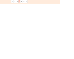
This is another template of a page navigation button line, designed with HTML and CSS. The square-shaped buttons are set to get highlighted in red color, in a focus event. The Li element of lists has been used to display the buttons in a list. The set of buttons is given the styles of font-family as 'Oxygen', sans-serif, display as inline- flex, and position as relative. The button numbers have the styles of color as #e44251, background color as transparent, font size as 25px, font-weight as 700, line-height as 30px, transition of all 0.4s ease 0s, border value of 1px solid #e44251, and height and width as 45px. The background of the button turns to #e44251 in a focus event making it highlighted in red color. The transformation style is given by scale (0) rotate (360deg).
Pagination style 9
4.3.1