CSS Social Buttons: Accessible Share and Follow Buttons
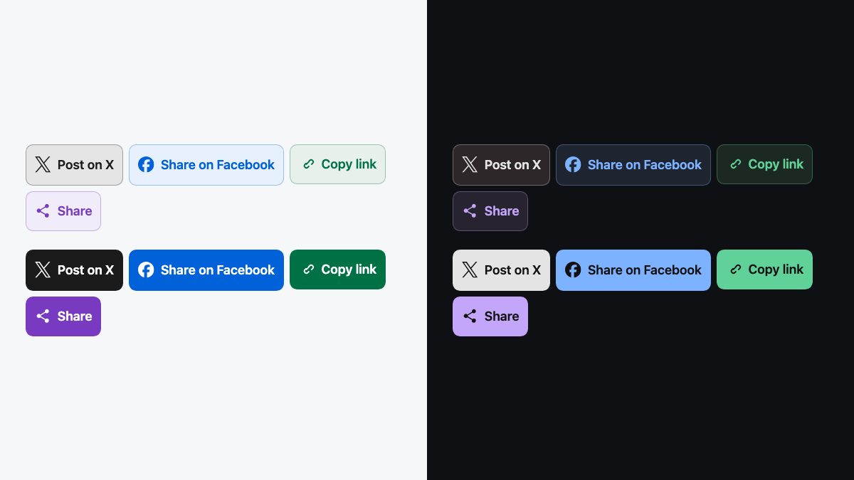
The modern way to build social buttons is plain HTML, inline SVG icons and a small block of CSS driven by custom properties. You get one component, any number of colour and size variants, crisp icons at every pixel density, and no sprite sheets, icon fonts or PNG backgrounds. This guide builds that component step by step, then adds a working copy-link button and the native share sheet.
The original version of this tutorial used one master stylesheet and a PNG per icon, with class names such as blue gradient glossy stacked on every link. That approach was right for its time, but it broke on high-density screens, needed a new image for every colour, and gave screen readers nothing to announce. The rebuild below keeps the one idea worth keeping: a single class plus a few modifiers.
What you are building
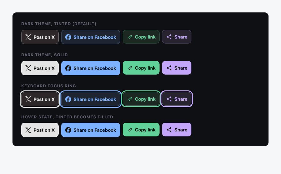
Four buttons that share a single .social class: a link that opens X’s post composer, a link that opens Facebook’s share dialog, a button that copies the page URL, and a button that opens the device’s native share sheet where one exists. Each comes in a tinted default style, a solid style and an icon-only style, and in three sizes.
Share buttons or follow buttons?
They look alike but behave differently, and the markup should say so.
- Follow buttons are plain links to your profile on a network. They need nothing but an
href. - Share buttons open the network’s composer with your page pre-filled. These too are plain links, built from a documented share URL, so they work with JavaScript disabled and without loading any third-party script.
Avoid the official embed widgets unless you need live counts. They load third-party scripts and trackers, slow the page, and can set cookies that require consent. A styled link does the same job.
Step 1: the markup
Each button is a link (or a real <button> when it runs script) containing an SVG icon and a text label. The label is the important part: an icon alone has no accessible name. Keep the label in the markup and hide it visually in the icon-only variant, rather than relying on title.
Define each icon once in an inline sprite, then reuse it with <use>. Because the SVG uses fill: currentColor, the icon takes whatever text colour the button has, so hover and dark-mode states work with no extra rules. Brand paths are available from the CC0-licensed Simple Icons set; the brand owners’ own guidelines still apply to how you use their marks.
<svg class="sprite" width="0" height="0" aria-hidden="true">
  <symbol id="i-x" viewBox="0 0 24 24"><path d="M14.234 10.162 22.977 0h-2.072l-7.591 8.824L7.251 0H.258l9.168 13.343L.258 24H2.33l8.016-9.318L16.749 24h6.993zm-2.837 3.299-.929-1.329L3.076 1.56h3.182l5.965 8.532.929 1.329 7.754 11.09h-3.182z"/></symbol>
  <symbol id="i-facebook" viewBox="0 0 24 24"><path d="M9.101 23.691v-7.98H6.627v-3.667h2.474v-1.58c0-4.085 1.848-5.978 5.858-5.978.401 0 .955.042 1.468.103a8.68 8.68 0 0 1 1.141.195v3.325a8.623 8.623 0 0 0-.653-.036 26.805 26.805 0 0 0-.733-.009c-.707 0-1.259.096-1.675.309a1.686 1.686 0 0 0-.679.622c-.258.42-.374.995-.374 1.752v1.297h3.919l-.386 2.103-.287 1.564h-3.246v8.245C19.396 23.238 24 18.179 24 12.044c0-6.627-5.373-12-12-12s-12 5.373-12 12c0 5.628 3.874 10.35 9.101 11.647Z"/></symbol>
  <symbol id="i-link" viewBox="0 0 24 24"><path d="M10.6 13.4a1 1 0 0 1 0-1.4l3.5-3.5a1 1 0 1 1 1.4 1.4L12 13.4a1 1 0 0 1-1.4 0Zm-2.1 4.6a4 4 0 0 1 0-5.7l2-2 1.4 1.4-2 2a2 2 0 1 0 2.8 2.9l2-2 1.4 1.4-2 2a4 4 0 0 1-5.6 0Zm5-9.6 2-2a4 4 0 0 1 5.7 5.7l-2 2-1.4-1.4 2-2a2 2 0 0 0-2.9-2.8l-2 2Z"/></symbol>
  <symbol id="i-share" viewBox="0 0 24 24"><path d="M18 16.1a3 3 0 0 0-2 .8l-6.9-4a3.3 3.3 0 0 0 0-1.8l6.8-4A3 3 0 1 0 15 5a3 3 0 0 0 .1.9L8.2 10a3 3 0 1 0 0 4l6.9 4.1a3 3 0 1 0 2.9-2Z"/></symbol>
</svg>

<ul class="social-list">
  <li>
    <a class="social" data-network="x"
       href="https://x.com/intent/tweet?url=https%3A%2F%2Fexample.com%2Fpost&text=Post%20title"
       target="_blank" rel="noopener noreferrer">
      <svg aria-hidden="true"><use href="#i-x"/></svg>
      <span class="social__label">Post on X</span>
    </a>
  </li>
  <li>
    <a class="social" data-network="facebook"
       href="https://www.facebook.com/sharer/sharer.php?u=https%3A%2F%2Fexample.com%2Fpost"
       target="_blank" rel="noopener noreferrer">
      <svg aria-hidden="true"><use href="#i-facebook"/></svg>
      <span class="social__label">Share on Facebook</span>
    </a>
  </li>
  <li>
    <button class="social" data-network="link" type="button" data-copy>
      <svg aria-hidden="true"><use href="#i-link"/></svg>
      <span class="social__label">Copy link</span>
    </button>
  </li>
  <li>
    <button class="social" data-network="share" type="button" data-native-share>
      <svg aria-hidden="true"><use href="#i-share"/></svg>
      <span class="social__label">Share</span>
    </button>
  </li>
</ul>

<p class="visually-hidden" role="status" data-share-status></p>
The .sprite and .visually-hidden rules in the stylesheet keep the empty sprite and the status message out of the layout. The X and Facebook paths are from Simple Icons; the link and share glyphs are drawn for this tutorial and free to use. The last element, an empty role="status" region, is where the script announces “Link copied” to screen readers. The <ul> gives assistive technology a count (“list, 4 items”) and gives you a clean flex container. The SVG is aria-hidden because the label already names the action.
Step 2: the share URLs
Share URLs are plain links, so always URL-encode the page address and text with encodeURIComponent() or your template engine’s equivalent. I checked these against official documentation and flagged what could not be confirmed.
| Network | URL pattern | Status |
|---|---|---|
| X | https://x.com/intent/tweet?url=…&text=… |
Documented in the X web intent guide. text is pre-filled and editable; url must be a full http(s) URL and X shortens it. |
https://www.facebook.com/sharer/sharer.php?u=… |
Widely used but not in Facebook’s current docs. The documented Share Dialog in the Facebook for Developers docs is https://www.facebook.com/dialog/share with app_id and href parameters, and needs a Facebook app. |
|
mailto:?subject=…&body=… |
Standard mailto: URL, works everywhere. |
LinkedIn, Pinterest, Reddit and WhatsApp also offer share links, but I could not confirm their current URL formats against official documentation, so they are left out here. If you add one, read that network’s own developer docs and test the link before you ship. Facebook and X may change what they honour without notice, so test those too, and drop any network your audience does not use. Three or four well-chosen buttons convert better than a row of ten.
Step 3: the CSS
All the variation lives in four custom properties on .social: --brand, --bg, --fg and --ring. A network only has to set --brand; the rest is derived with color-mix(). That replaces the old stack of fourteen colour classes and a pile of gradient PNGs.
@layer base {
  :root { color-scheme: light dark; }
}

@layer components {
  .social {
    --size: 2.75rem;
    --surface: light-dark(#fff, #16181d);
    --ink: light-dark(#000, #fff);
    --on-brand: light-dark(#fff, #111);
    --brand: light-dark(oklch(45% 0.12 260), oklch(80% 0.1 260));
    --bg: color-mix(in oklch, var(--brand) 10%, var(--surface));
    --fg: var(--brand);
    --ring: color-mix(in oklch, var(--brand) 35%, transparent);

    display: inline-flex;
    align-items: center;
    justify-content: center;
    gap: 0.5em;
    min-block-size: var(--size);
    min-inline-size: var(--size);
    padding-inline: 0.75rem;
    border: 1px solid var(--ring);
    border-radius: 0.65rem;
    background: var(--bg);
    color: var(--fg);
    font: 600 0.9375rem/1 system-ui, sans-serif;
    text-decoration: none;
    cursor: pointer;
    transition: background-color 0.15s, color 0.15s, translate 0.15s;
  }
  .social[hidden] { display: none; }   /* display:inline-flex would beat the UA [hidden] rule */
  .social svg { inline-size: 1.25em; block-size: 1.25em; fill: currentColor; flex: none; }

  .social:hover { --bg: var(--brand); --fg: var(--on-brand); translate: 0 -1px; }
  .social:active { translate: 0 0; }
  .social:focus-visible { outline: 3px solid var(--brand); outline-offset: 2px; }

  .social[data-network="x"]        { --brand: light-dark(oklch(22% 0 0),      oklch(92% 0 0)); }
  .social[data-network="facebook"] { --brand: light-dark(oklch(52% 0.2 258),  oklch(76% 0.13 258)); }
  .social[data-network="link"]     { --brand: light-dark(oklch(48% 0.12 160), oklch(78% 0.13 160)); }
  .social[data-network="share"]    { --brand: light-dark(oklch(50% 0.2 300),  oklch(78% 0.12 300)); }

  /* variants */
  .social--solid { --bg: var(--brand); --fg: var(--on-brand); --ring: transparent; }
  .social--solid:hover { --bg: color-mix(in oklch, var(--brand) 82%, var(--ink)); }
  .social--icon { padding-inline: 0; border-radius: 50%; inline-size: var(--size); }
  .social--icon .social__label { position: absolute; inline-size: 1px; block-size: 1px; overflow: hidden; clip-path: inset(50%); white-space: nowrap; }
  .social--lg { --size: 3.25rem; font-size: 1.0625rem; }
  .social--sm { --size: 2.25rem; font-size: 0.8125rem; }

  .social-list { display: flex; flex-wrap: wrap; gap: 0.5rem; padding: 0; margin: 0; list-style: none; }
  .sprite { position: absolute; }
  .visually-hidden { position: absolute; inline-size: 1px; block-size: 1px; overflow: hidden; clip-path: inset(50%); white-space: nowrap; }
}

@media (prefers-reduced-motion: reduce) {
  .social { transition: none; }
  .social:hover { translate: none; }
}
A few decisions worth understanding:
light-dark()andcolor-scheme.color-scheme: light darkon:roottells the browser the page supports both themes, andlight-dark(a, b)then returns the first colour in light mode and the second in dark mode. The surface, the brand colours and the on-brand text all use it, so the component follows the visitor’s system theme with no media query.color-mix(in oklch, …)blends in a perceptual colour space, so the tinted background and the border stay visually related to the brand colour instead of turning muddy. It is Baseline across current browsers.- The hover state only reassigns variables. Because
backgroundandcoloralready read--bgand--fg, changing the variables updates everything, including the icon. :focus-visibleshows a focus ring for keyboard users without drawing one on every mouse click.- The hit area is at least 44 px in the default size, which suits touch screens. The small variant is 36 px; use it only where there is room around it.
@layerkeeps the component’s specificity low, so your own page styles can override it without!important.
Step 4: variants without extra images
The old stylesheet combined classes such as flat, circle and gradient. The same idea works with three small modifiers: .social--solid fills the button with the brand colour, .social--icon turns it into a circle and visually hides the label, and .social--lg / .social--sm change a single --size variable. Combine them freely:
<a class="social social--solid social--lg" data-network="facebook" href="…">…</a>
<a class="social social--icon social--sm" data-network="x" href="…">…</a>
Want a gradient on a solid button? Replace the flat fill with background: linear-gradient(color-mix(in oklch, var(--brand) 88%, white), var(--brand)). Adding a new network takes one line: .social[data-network="reddit"] { --brand: oklch(65% 0.22 35); }, plus its icon symbol.
Step 5: a copy-link button and the native share sheet
Two buttons need JavaScript. Copying uses the asynchronous Clipboard API, which requires a secure context (HTTPS) and a user gesture. The native share sheet uses navigator.share(), which MDN lists as limited availability, so check for it and hide the whole list item when it is missing. Hiding only the button leaves an empty list item, and the .social[hidden] rule in the stylesheet exists because display: inline-flex would otherwise override the browser’s built-in [hidden] style. The sheet also requires a click or tap and HTTPS.
function initShareButtons() {
  const copyBtn = document.querySelector('[data-copy]');
  const shareBtn = document.querySelector('[data-native-share]');
  const status = document.querySelector('[data-share-status]');

  const announce = (message) => {
    if (!status) return;
    status.textContent = '';                       // re-announce identical messages
    requestAnimationFrame(() => (status.textContent = message));
  };

  if (copyBtn) {
    const label = copyBtn.querySelector('.social__label');
    const original = label.textContent;
    copyBtn.addEventListener('click', async () => {
      let message = 'Link copied';
      try {
        await navigator.clipboard.writeText(location.href);
      } catch {
        message = 'Copy failed';
        window.prompt('Copy this link', location.href);   // visible, selectable fallback
      }
      label.textContent = message;
      announce(message);
      setTimeout(() => (label.textContent = original), 2000);
    });
  }

  if (shareBtn) {
    const data = { title: document.title, url: location.href };
    if (!navigator.share || !navigator.canShare?.(data)) {
      shareBtn.closest('li').hidden = true;        // hide the whole list item, not just the button
      return;
    }
    shareBtn.addEventListener('click', async () => {
      try {
        await navigator.share(data);
      } catch (err) {
        if (err.name !== 'AbortError') console.error(err);
      }
    });
  }
}
initShareButtons();
Notes on the script:
- Cancelling the share sheet rejects the promise with
AbortError. That is normal, so do not show an error for it. - The label text changes for sighted users, but a changing button name is not reliably announced. The separate
role="status"region (a polite live region) carries the message for screen readers. The region must already exist in the page before its text changes. - If the Clipboard API is blocked,
window.prompt()shows the link in a selectable field, which works on every platform without telling Mac users to press Ctrl+C. - Use
location.hrefor a canonical URL, not a URL with tracking parameters, so shared links stay clean.
Accessibility checklist
- Every button has a visible or visually hidden text label that says what it does (“Share on Facebook”, not “Facebook” alone).
- Links that open a new tab use
rel="noopener noreferrer". - Focus styles use the brand colour, which switches with the theme, so the ring stays visible on both light and dark backgrounds.
- Colour is not the only signal: the icon and label carry the meaning too. The tinted and solid styles use
light-dark()to pick lighter brand colours in dark mode; still check that label contrast is at least 4.5:1 with your own brand colours in both themes. - Motion is limited to a 1 px lift and is removed by the
@media (prefers-reduced-motion: reduce)block at the end of the stylesheet.
Browser support
Everything in the stylesheet, including custom properties, light-dark(), color-mix(), OKLCH, :focus-visible, @layer and the individual translate property, works in all current evergreen browsers. Old tricks such as vendor-prefixed gradients, SVG data-URI gradient fallbacks for IE9, and PNG sprites are no longer needed. The two enhancements, the Clipboard API and navigator.share(), are feature-detected, so the buttons that depend on them degrade gracefully.
Where to go from here
Drop the component into a footer such as the Bootstrap 5 footer with social icons, or into a hover overlay like the team section with hover social icons. If you are building a post action row, the like, comment and share post card shows the same buttons in context. For more on the icon approach used here, see Playing with SVG Design, and for the technique this replaces, How to Add Icon Fonts to Any Element With CSS. The same variable-driven pattern also makes a good base for the links in a responsive navigation menu.
The code above is free to use for any purpose. Check each network’s brand guidelines before you use its logo in a commercial design.


Nice set, but I think you misspelled Circle in the image ;)
This is classic false advertising. Why would you call these “CSS Social buttons?” If anything, call them “simple” or “minimalist.” “CSS” is not the right adjective for this.
These are CSS buttons. Did you read the full article? I feel like you looked at the first set of images and got upset that you had to download files. Just because you use images does not mean they are not CSS buttons. He did not deceive by saying “Pure CSS Buttons”, in fact it is even stated in the beginning paragraph that these use the traditional background-image technique and is a way to stay mostly cross-browser friendly.
“Did you read the full article” is not a defense and is the reason that I think the article’s title is false advertising. I enjoyed the article, but the only reason that I came here was to be impressed with the icons somehow built in CSS. The only CSS here is the design of the buttons. The fact that the clarification needs to be made in the first paragraph should be a sign that the title is inadequate.
Do you not agree that “Simple Social Buttons” would have been a more appropriate title for this post?
I really don’t agree that ‘simple social buttons’ would be a more appropriate name. In my opinion, that would imply that the entire button is simply a premade graphic. I’m 100% confident that if you search for ‘simple social buttons’ in Google then that’s what you’ll turn up with.
The title CSS Social Buttons makes perfect sense to me. You argue that ‘the only CSS here is the design’ – well I’m sorry, but isn’t that what CSS is all about? Building an adva nced design around simple html and minimal graphics?
Oh boy, you are right! Let’s whine some more because you had to open a webpage thinking it was proposing something different.
You select the size/color/type of button via CSS hence, believe it or not, they are buttons creating by using CSS.
There is some weirdness that happens with the color gradient options in IE8, that is usually my go to test for cross browser support. Sadly as designers we still have to accept the fact that older versions of IE are out there and they tend to misbehave.
Can’t wait to try these CSS buttons. Awesome to use in place of images.
Desktop Wallpaper, HD Wallpaper, Wallpaper Background
Desktop Wallpaper
Nice but I wouldn’t use it until all of your images are grouped into one single image and using sprites!
You would save dozens of HTTP requests and probably some useful bytes too.
HTH
It’s not anybody thats need all the icons, so I think the way Nick created this is the best way.
It’s a nice share, but still if i were to add socialbuttons to my site i’d create them myself to keep the code-size down. Nice to use as a base tho and strip down to the essentials!
You could just cut off the parts you don’t need.
That would require changing the CSS too, so the background wasn’t offset as much.
Easier would be to simply color everything except the items you need white. That should allow the file to be much smaller while maintaining its dimensions.
Lovely and clean design, I wish i found these this morning as I was searching for exactly this!
Thanks for sharing your work
This is fantastic – thanks so much for sharing your work!
Interested in having your social networking vary from the usual? This is a great guide to get you started to a unique social plugin.
Further Social plugin development and design can be found at Web Design Malta.
Hmmm just wondering, would using a font such as Socialico (https://www.fontfabric.com/fonts/the-ultimate-bundle/) be an alternative? I know the icon images aren’t very big, but using a font opens up hover state colours etc just using code.
Or am I making more work?
Some other guys are selling css social button on codecanyon … but who cares since you can get it fre here … Thanks a lot :)
Great work, love gray color. Looks very professional. Thank you.
Nice work, definitely will use it in my next template, and give you credentials.
This is fantastic. You don’t often see freebies like this with the CSS implementation. Thanks!
Loved them but would have loved them more if there were colored.
Thanks anyway for sharing this wonderful post. =)
Wow! Thanks for the thorough discussion and elaboration. I know a lot of blogs are incorporating social buttons now so it’s great that there are guides like yours that are easy to understand and implement.
Good! this is great for CSS Social Buttons beginners like me. keep up the good work!
Interested in having your social networking vary from the usual? This is a great guide to get you started to a unique social plugin.
Great collection. Thanks for sharing such Css social buttons and for downloader facility.
Why didn’t you add a Google+ Icon too?
Florian, google+ is lame, nobody uses it. Does someone knows a collection of social buttons but colored and more fancy? Please reply. PS: Without google+ is fine :))
Great buttons, but I have a problem with gradients. If the element is wrapped inside a div with a background color, the gradients wont work, instead the button background will be transparent.
Good! this is great for CSS Social Buttons beginners like me. keep up the good work!
I think this is great work! But more importantly (designers and bloggers pay attention) notice how he is giving away a free download, very cool and I think this is a tip all of us that own a website should follow, I am going to start giving away a freebie on a weekly basis!
I cant use this in my site:( please help
Can i use that icons in commercial project ? Thanks
I’m sorry I didn’t read to the end
Well done! I’ve made use of it in my simple web page template. Thanks for sharing ;)
MODREATE A WORKING ENTRY PROGRAM FOR YOUR CONTEST