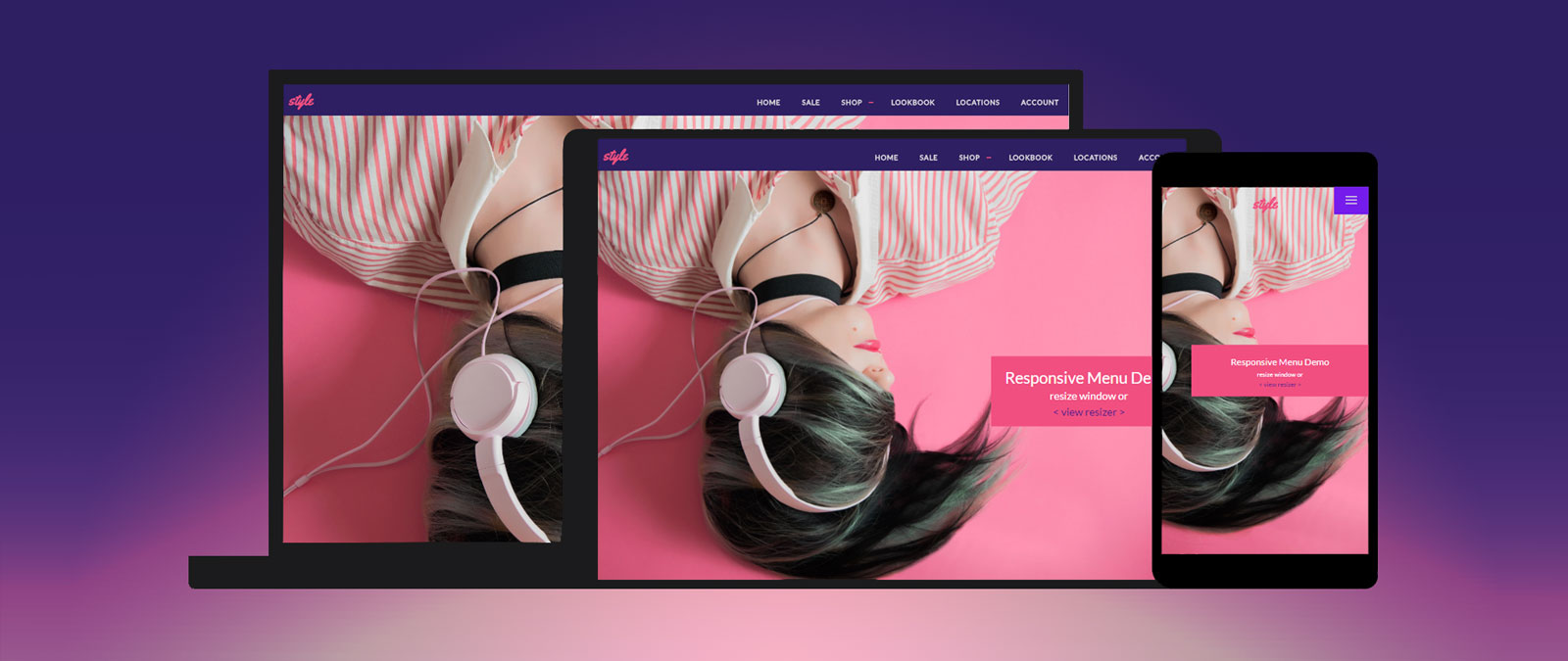
CSS3 Image Styles – Part 2 28

CSS3 Image Styles – Part 2

Previously I wrote two tutorials on how to style the image element with CSS3 inset box-shadow and border-radius. The trick is to wrap the image with a span tag and apply the image as background-image. However, I recently ran into a problem with that trick while designing the PhotoTouch theme. The issue is that the background-image is not resizable and thus it is not a good idea to use in responsive design. Fortunately, I found a workaround to resolve this. So today I'm going to revisit this topic again.

View Demo Image Styles

Responsive Design in 3 Steps 100

Responsive Design in 3 Steps

Responsive web design is no doubt a big thing now. If you still not familiar with responsive design, check out the list of responsive sites that I recently posted. To newbies, responsive design might sound a bit complicated, but it is actually simpler than you think. To help you quickly get started with responsive design, I've put together a quick tutorial. I promise you can learn about the basic logic of responsive design and media queries in 3 steps (assuming you have the basic CSS knowledge).

Inspiration: Fluid & Responsive Design 89

Inspiration: Fluid & Responsive Design

Responsive design all started with this article by Ethan Marcotte. Some people see it as a trend. But it is more than just a trend. It is a new design solution — it helps to resolve the design problems associated with the different resolutions and devices (desktop, laptop, tablet, and mobile). I'm going to share a list of responsive sites that I feel are nicely done. I've categorized the list into two categories: Adaptive and Fluid & Responsive.

CSS3 Image Styles 150

CSS3 Image Styles

When applying CSS3 inset box-shadow or border-radius directly to the image element, the browser doesn't render the CSS style perfectly. However, if the image is applied as background-image, you can add any style to it and have it rendered properly. Darcy Clarke and I put a quick tutorial together on how to use jQuery to make perfect rounded corner images dynamically. Today I'm going to revisit the topic and show you how much more you can do with the background-image CSS trick. I will show you how to use box-shadow, border-radius and transition to create various image styles.

View Demo Image Styles

iPhone Safari Viewport Scaling Bug 63

iPhone Safari Viewport Scaling Bug

Those who create responsive design for iPhone may be aware of the viewport scaling bug in iPhone Safari. The bug occurs when you set the viewport width to device-width and rotate the phone to landscape view. To see this in action, view the bug demo page with your iPhone and rotate the phone from portrait to landscape view (you should see the page being scaled up). This is a known bug for a long time. Today I'm going to share some tips on how to fix this bug.

Creating Reusable & Versatile Background Patterns 72

Creating Reusable & Versatile Background Patterns

I haven't written any Photoshop tutorials for a while. Today I'm going to share a simple tutorial on how to create reusable background patterns with Photoshop and CSS. I learned this trick from designing WordPress themes. The trick is to create one reusable transparent PNG background and use CSS background-color property to create various color skins. It is particularly useful for creating customizable and dynamic templates (see demos).

@font-face Solutions & Suggestions 87

@font-face Solutions & Suggestions

In the last post I talked about the design aspect of using CSS3 @font-face, today I would like to extend this topic to the technical side on implementing custom web fonts. So what are the options for implementing web fonts? I'm going to review the three main methods of incorporating @font-face and explain the pros and cons of each method.