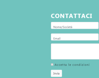
This is an example of a Contact Form with Google maps. The google maps and forms are placed in the container. The divisions are equally done to display the map as large as the given form. Contact details contain name details, contact details like email and telephone number and message. The map is displayed in iFrame and the location is set to Colosseum. Once you click on the map it opens you the google map page. FormGroup tag is used to add the FormControls. Font awesome icons are used to represent the contact details. The divisions are well organized and labels are input tags are well styles. The form has validations and checks it before submitting the form. Icons of social sites like Facebook and linked in are placed. These types of forms can be used for e-commerce websites and organization offering services.
Forms with Google Map
4.1.1

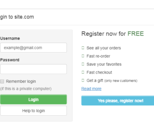
This is a snippet of different Login styles, which can be used for a website or portal. The first style is a simple Sign In form with Email and Password as login details. It also displays the link for retrieving a forgotten password and a checkbox for saving password. Two buttons Sign up and log in as displayed. Second login form displays the buttons linked with the login of Twitter and Facebook. The third style displays an icon with input text and some message. The snippet uses Bootstrap 4 and jquery 3.2. All these login forms are placed in card-body. The FormControl and FormGroup elements are used. These forms can be used in an ecommerce website, market place, and booking websites. Entire card is placed in tag of HTML5. It defines some content aside from the content it is placed in. It could also be placed as a sidebar in an article.

This is an excellent and stylish example of a navigation bar with a login form. It contains the navigation bar with menu, dropdowns, search as input and submit button. Along with this at the extreme right, we have login information like Login and Registration details or Form. To create a navigation bar, classes like navbar and navbar-inverse is used. Under the Login details, we have a listed group item as Sign-in form. Bootstrap Navigation is divided into navbarHeader and navbarBrand, and navbarForm. The form contains the login for facebook, twitter buttons to directly connect to social sites, and a login form and “sign in” button. It also contains a checkbox for ‘Keep me log in” and link to sign up. CSS styles are defined for login form and for social sites buttons.
This is an example of adding Login Form in Modal. Bootstrap contains a Modal component, They are Modals are built with HTML, CSS, and JavaScript. They’re positioned over everything else in the document and remove scroll from the so that modal content scrolls instead. Clicking on the modal “backdrop” will automatically close the modal. Bootstrap only supports one modal window at a time. Nested modals aren’t supported as we believe them to be poor user experiences. Whenever possible, place your modal HTML in a top-level position to avoid potential interference from other elements. You’ll likely run into issues when nesting a .modal within another fixed element. ModelContent is divided into modelHeader, modal-body, and ModalFooter. ModalBody contains the form and registration details whereas the ModalHeader contains header details. Form and registration details are added in two columns in a row. This does not use the modal footer.
Login Form In Modal
3.2.0
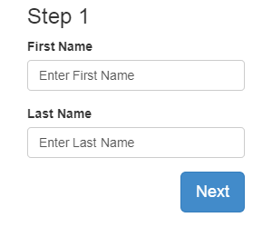
This is an example of “Form Wizard with multiple steps”, It contains 3 steps, First for the user name, the second step contains the company name and address and 3rd step is finished. This login form uses the stepWizard class to create the steps in a container. The class stepwizardRow is used to define a single row in this stepWizard and each step is defined using stepWizardStep. Each stepWizardStep contains a link to form using id. The steps are defined as types of buttons, whereas there is 3 form defined using stepupContent class. Each step has a button once click using jquery it moves on to next step. CSS defines the styles for StepWizard classes. Each step is shown as a circle using btn-circle class. Check out the styling properties used to represent these steps.JS is used to navigate through the steps and during navigation it also validates the text.
Dual Form or Multiple login forms or sign up / reset password or login options tabbed form tabbed. Forms in one panel for easy navigation designed magnificently and is absolutely FREE to download and ready to Use it in your Business website. This Widget template is designed using HTML5 and CSS3 and is super Responsive. The mono-color background and sharp Panels complement each other. The forms are placed in an equally divided column in one row. We can have the same or different input fields. This form contains the same fields placed side by side with contract design. The CSS style is the same for text and buttons for both forms, the only difference is the background color are different for these forms.
Dual Login Form
4.1.1

Dual Form or Multiple login forms or sign up / reset password or login options tabbed form tabbed. Forms in one panel for easy navigation designed magnificently and is absolutely FREE to download and ready to Use it in your Business website. This Widget template is designed using HTML5 and CSS3 and is super Responsive. The mono-color background and sharp Panels complement each other. The forms are placed in equally divided column in one row. We can have same or different input fields. This form contains the same fields placed side by side with contract design. The CSS style is same for text and buttons for both forms, the only difference is the background color are different for these forms.
Dual Form Login Design
4.1.1

This is a classic example of "Get in touch: or “Contact Me form”. It uses bootstrap 3.3 and jquery 1.11 versions. The form contains fields for “your name”, “email”, “mobile no.” “message” and a submit button. The body is divided into sectionContent, sectionHeader and container. SectionHeader has its CSS style for font-family and color. Contact is having its own CSS style with its font family, background and color. The form gets a gradient look set in the contact section. FormControl and FormGroup, has its own style, which sets the font size, margin etc. Submit button is set with fontSize, background-color, width and float to right properties. Label and textarea is also set with their font and height properties. Your name, email-id and mobile number are in class form-line, whereas message and submit button are in separate formGroup. Tags such as label and textArea have properties set for height and fontSize.