Single-Page Portfolio Sites: 8 Examples and How to Build One
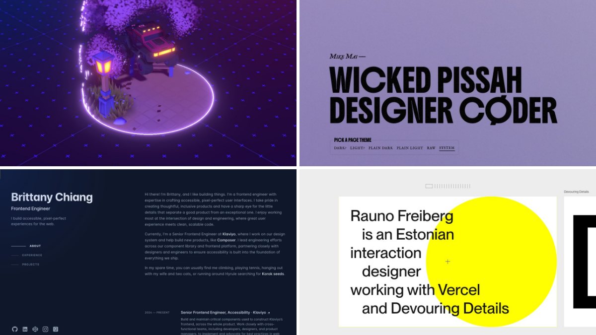
A single-page portfolio works when you have a short story to tell: who you are, three to six pieces of work, and a way to get in touch. It is quick to build, easy to maintain, and a visitor can judge you in one scroll. The modern version needs no scroll-jacking and no slider library. It needs a clear section structure, native anchor links, and a few lines of CSS.
Below you will find eight live single-page portfolios to learn from, then the “why it works” part: how to structure the page, make anchor navigation feel right with plain CSS, highlight the current section, and decide when a single page is the wrong choice. The demo code is tested and short enough to paste into any project.
Eight single-page portfolios worth studying
These are live sites I checked while writing this. Each one fits its whole introduction on a single scrolling page, even where it links out to a blog or deeper write-ups. They are not all templates to copy. Read them for what each one decides to leave out.
1. Brittany Chiang
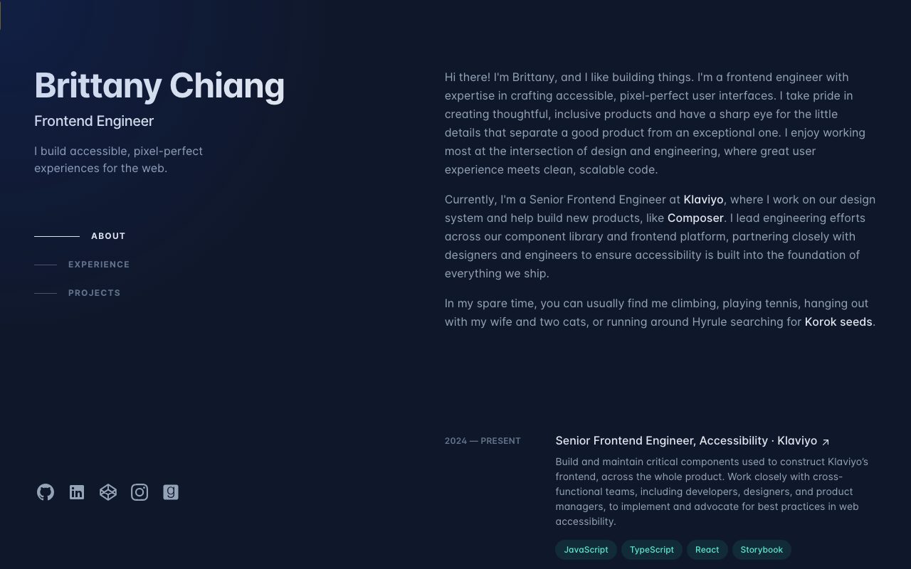
The reference design for the format. A fixed intro column holds the name, a one-line pitch and three section links, and the active link changes as you scroll. It is a good model for a developer portfolio because the page stays calm and every section is reachable from anywhere.
2. Mike Mai
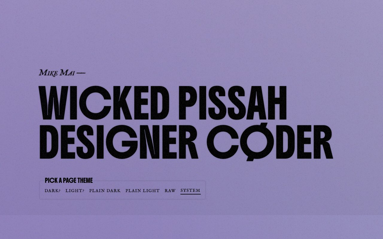
One long scroll with no internal navigation at all: a loud headline, a short statement of design belief, recent projects and selected writing. The standout detail is the page theme picker at the top, which switches between dark, light, plain and raw variants instantly. It shows how much personality typography alone can carry.
3. Bruno Simon
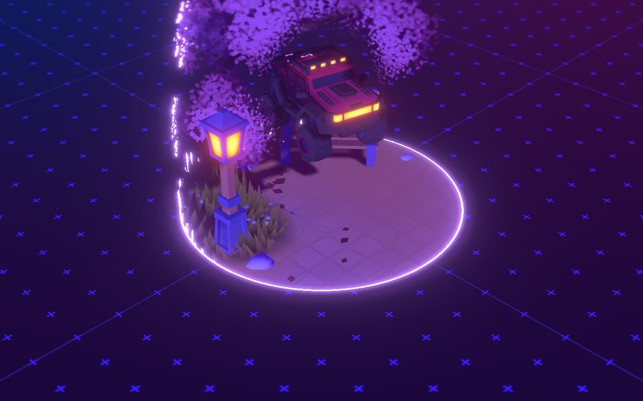
The opposite of a template: the portfolio is a 3D scene you move around in. It lives at a single URL, so it counts as a single-page site, but it is a showpiece for WebGL skill rather than a pattern to copy. Use it as inspiration for memorable first impressions, and remember that a plain, fast page is the better default for most people.
4. Rauno Freiberg
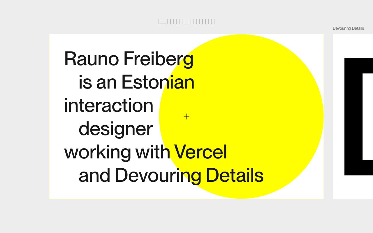
A designer’s home page built as a horizontal strip of panels. The first panel is a bold sentence with a flat yellow circle, and the next one peeks in from the right to invite scrolling. Deeper material such as notes and projects lives on separate pages, which is the hybrid approach recommended later in this article.
5. Zach Saucier

A confident hero, a giant letter Z over a soft gradient, followed by a plain About section and a dated list of articles and demos. The styling is a tidy example of letting one graphic gesture do the work at the top, then switching to readable text. The hero is lively and the rest stays out of the way.
6. Paco Coursey
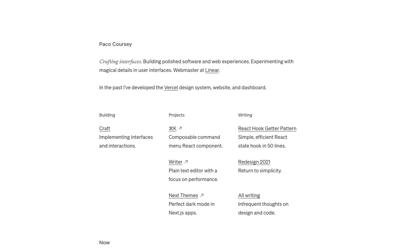
Almost no design, which is exactly the point. A two-sentence introduction sits above three columns, Building, Projects and Writing, each with one-line descriptions. It loads instantly, reads well on a phone and proves a portfolio can be a well-set page of text with good links.
7. Emil Kowalski
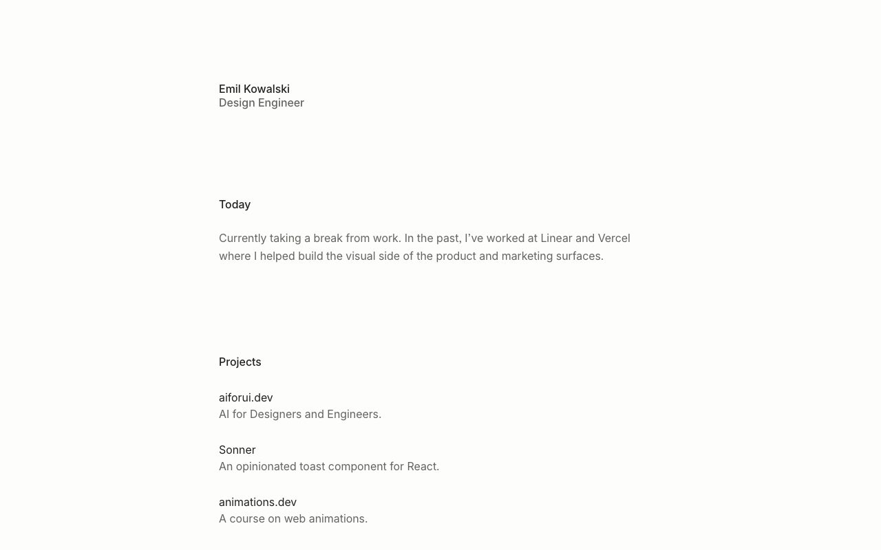
A narrow centered column, generous whitespace and short sections called Today and Projects. Each project gets a name and one line of description, so a visitor understands the work in seconds. It is a model for an editorial feel without any imagery.
8. Jhey Tompkins
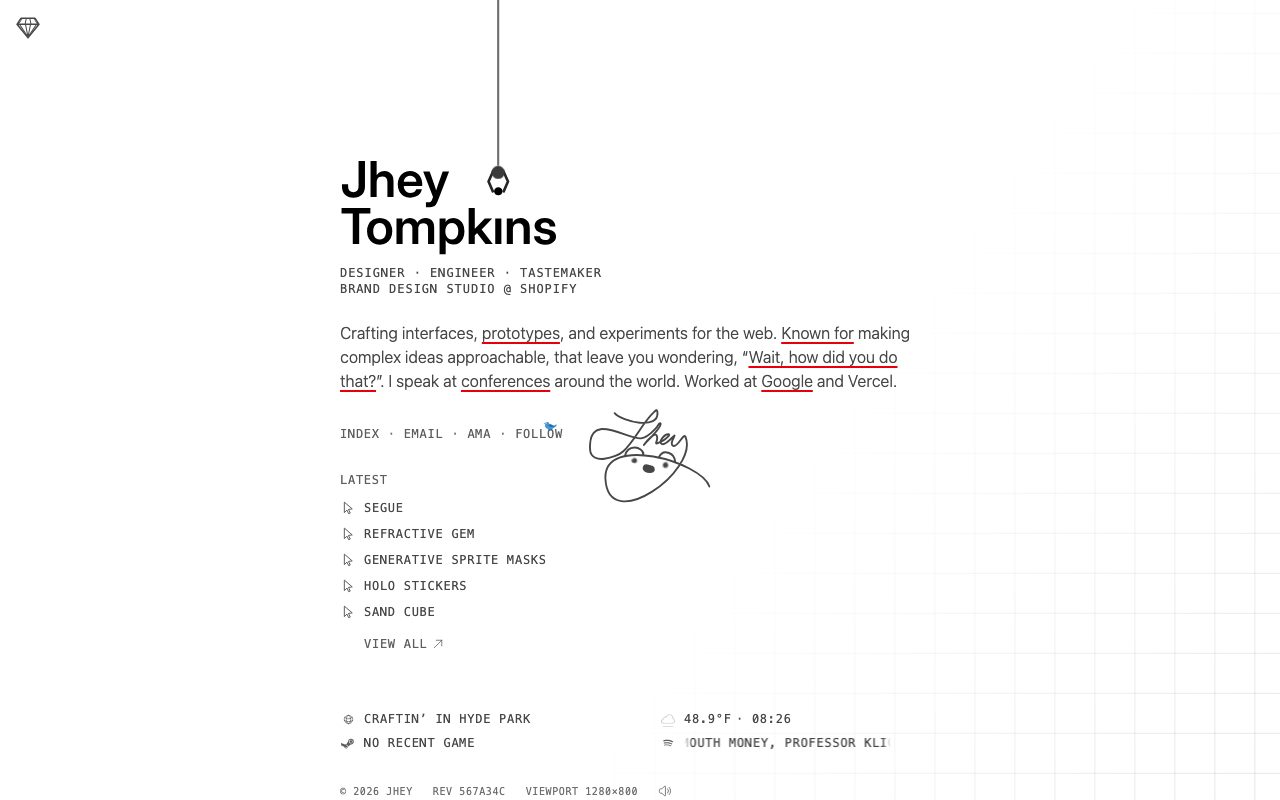
A short bio and a list of recent experiments, wrapped in playful details: a dangling character at the top, a signature that reacts to the page, and small live readouts in the footer. The content is tiny, and the craft is in the details. It shows how a minimal page can still feel handmade.
The pattern across all eight: a short sentence about who the person is, a small amount of well-chosen work, and a way to get in touch. Anything beyond that moves to another page. The rest of this article shows how to build that structure with current CSS.
When a single page is the right call
One page suits freelancers, students and anyone with a small body of work. It fails when you need depth: long case studies, a blog, or many projects that each deserve their own URL and search listing. A good compromise is a single-page overview that links out to separate case-study pages for the two or three projects you most want to discuss.
Structure the page as sections with real landmarks
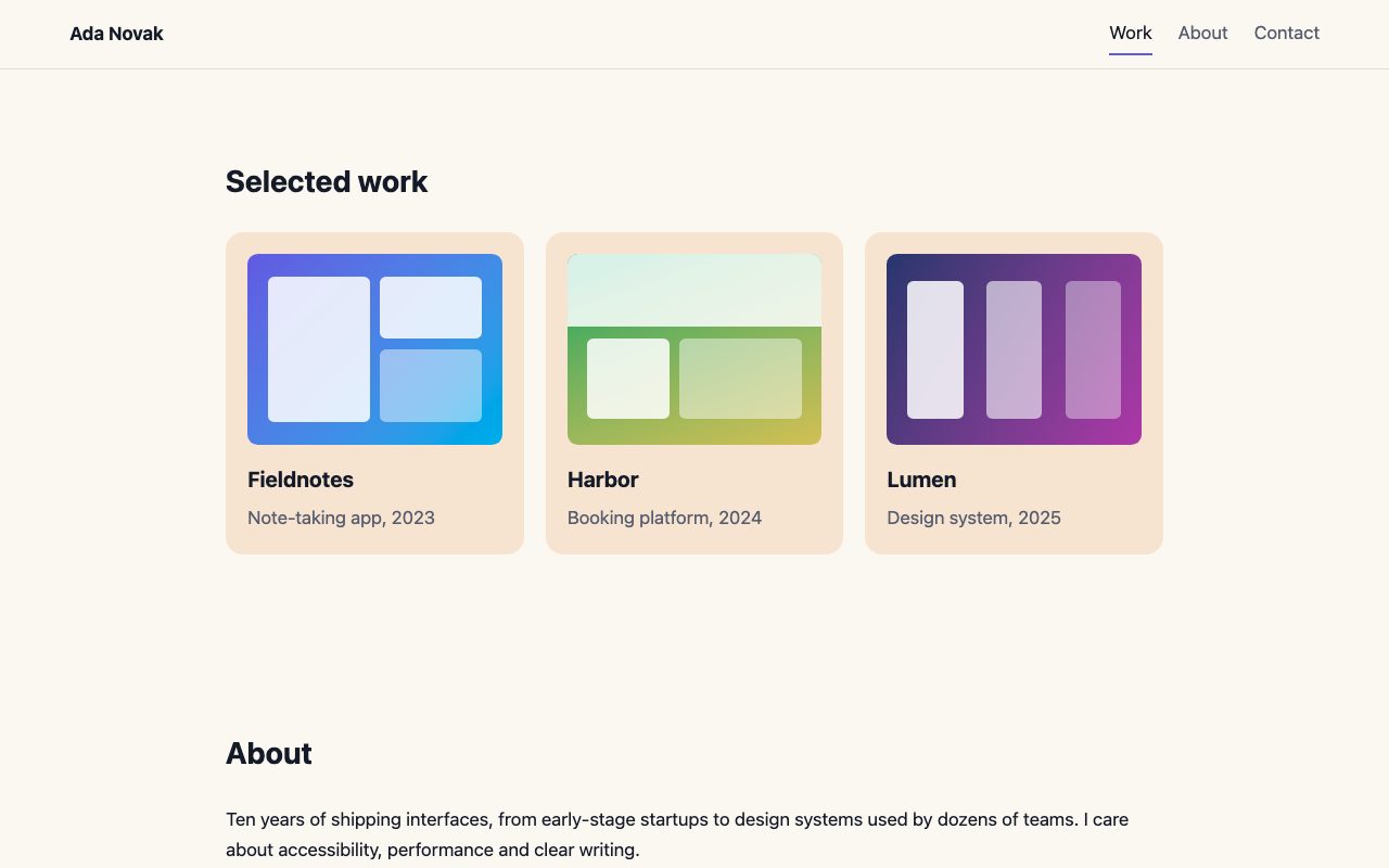
Every section is a section element with an id and a heading. Navigation links point to those ids. This gives you working navigation with zero JavaScript, and it gives screen reader users landmarks to jump between.
<header class="site-header">
  <a class="logo" href="#top">Ada Novak</a>
  <nav aria-label="Primary">
    <a href="#work">Work</a>
    <a href="#about">About</a>
    <a href="#contact">Contact</a>
  </nav>
</header>
<main>
  <section id="top">...</section>
  <section id="work" aria-labelledby="work-h">
    <h2 id="work-h">Selected work</h2>
  </section>
  ...
</main>
A sensible order is hero, work, about, contact. Put work first: it is why people came. Keep the hero to one sentence that says what you do and for whom, plus one call to action.
Smooth anchor scrolling with CSS only
Two properties replace the old jQuery animate({scrollTop}) snippets. scroll-behavior: smooth animates jumps to anchors, and scroll-padding-top stops a sticky header from covering the heading you just navigated to. Wrap the smooth behavior in a motion preference query so people who have asked their system to reduce motion get an instant jump.
:root { --header-h: 4rem; }

html { scroll-padding-top: var(--header-h); }

@media (prefers-reduced-motion: no-preference) {
  html { scroll-behavior: smooth; }
}

.site-header {
  position: sticky;
  top: 0;
  height: var(--header-h);
  background: color-mix(in oklch, var(--bg) 85%, transparent);
  backdrop-filter: blur(10px);
}
If you only need the offset on specific targets, scroll-margin-top on the section does the same job; MDN lists it as widely available. A matching hero height of calc(100svh - var(--header-h)) keeps the first screen from jumping when mobile browser toolbars collapse.
Highlight the current section
Visitors on a long page like to know where they are. An IntersectionObserver is the cheap, reliable way to do it. Watch each section, and when one crosses the middle band of the viewport, mark its link with aria-current. Styling off the attribute keeps the visual state and the accessible state in sync.
function initScrollSpy() {
  const links = document.querySelectorAll('.site-header nav a');
  const sections = [...links]
    .map((a) => document.querySelector(a.hash))
    .filter(Boolean);
  if (!sections.length) return;

  const io = new IntersectionObserver(
    (entries) => {
      entries.forEach((entry) => {
        if (!entry.isIntersecting) return;
        links.forEach((a) => {
          if (a.hash === '#' + entry.target.id) a.setAttribute('aria-current', 'true');
          else a.removeAttribute('aria-current');
        });
      });
    },
    { rootMargin: '-40% 0px -55% 0px' }
  );
  sections.forEach((s) => io.observe(s));
}
initScrollSpy();
.site-header nav a[aria-current="true"] {
color: var(--ink);
border-bottom-color: var(--accent);
}The negative rootMargin shrinks the observed area to a thin strip near the middle of the screen, so only one section is active at a time. The limit is that a section must cross that strip to count. If you have a very short section, or one much taller than the viewport with gaps around it, no section may intersect the strip and no link will be active. In that case set the observer’s threshold to a few values (for example [0, 0.25, 0.5]) and pick the entry with the highest intersectionRatio, or keep sections close to viewport height.
Reveal work as it scrolls into view
Scroll-driven animations let CSS tie an animation to scroll position, so cards can fade up as they enter the viewport without any observer code. Scroll-driven animations work in Chromium browsers and Safari 26 but are not yet in Firefox by default, so they are not Baseline. Treat them as an enhancement: the cards are fully visible by default, and the effect only applies where it is supported and motion is allowed.
@supports (animation-timeline: view()) {
  @media (prefers-reduced-motion: no-preference) {
    .card {
      animation: rise linear both;
      animation-timeline: view();
      animation-range: entry 0% entry 60%;
    }
    @keyframes rise {
      from { opacity: 0; translate: 0 2rem; }
      to   { opacity: 1; translate: 0 0; }
    }
  }
}
The @supports guard is the important part. In a browser without the feature the cards simply appear, which is a perfectly good experience. Avoid the older pattern of hiding content with CSS and revealing it with a JavaScript library: if the script fails, your work is invisible.
Use scroll position for design, not as a gimmick
Parallax, horizontal scroll hijacking and full-page snapping were popular in the first wave of one-page sites. They still cost you: they fight the browser’s native scrolling, break keyboard and touch expectations, and hurt performance on low-end phones. If you want motion, keep it subtle and tied to meaning, such as a progress indicator or a reveal. For interaction ideas, look at the parallax depth cards snippet and our roundup of interactive sites.
A newer CSS feature, scroll-target-group with :target-current, can style the active nav item without any JavaScript. It is experimental and so far only in Chromium browsers, so it is not Baseline. Keep the observer above as your dependable approach.
Navigation patterns that work on one page
The navigation can be a sticky top bar, a fixed side column like the Brittany Chiang example, or a full-screen menu on mobile. These are Web Designer Wall snippets (Bootstrap 5 starting points you can adapt):
For the work section, a simple responsive grid is usually enough. If you have many images, see the photo gallery with lightbox. For hero ideas, browse landing page inspiration.
Checklist before you publish
- Each section has a unique
idand one heading; the page has exactly oneh1. - Anchor links land below the sticky header (
scroll-padding-topworks). - Smooth scrolling and animations are disabled under
prefers-reduced-motion. - Focus styles are visible: use
:focus-visibleand test with the keyboard only. - Images have dimensions and descriptive alt text, and below-the-fold images use
loading="lazy". - The page has a descriptive title and meta description, and the contact section offers a plain email link as well as any form.
- Contrast is at least 4.5:1 for body text in both light and dark color schemes.
Because everything lives on one URL, search engines see one page. Put your name, discipline and location in the title and the hero text, and link to separate pages for any project you want to rank on its own.


This is genius! And I was just thinking about redoing my portfolio.
Definitely being delicious’d.
Great compilation! I love your website! Keep the great posts coming! Your work inspires me a lot! I am an amateur web designer! ;-)
I had so much fun looking through these websites. They’re extremely inspirational. ;)
It’s “We Bleed Design”, not “Web Leed Design”.
Harry
@Harry Roberts – Typo fixed. Thanks!
Check Tanya Merone’s About Section and Laco Janic’s About Section. Interesting writing.
Very nice portfolios! It would be interesting to see which impact do single paged sites have in comparison to the standard multi paged portfolio. From one hand we have creativity, user-friendlyness and gorgeous portfolios and from the other hand sobriety, clarity and easy navigation.
These are all fantastic designs, but are they really one page? I think the answer is no in a majority of cases. In fact, many of the sites have lots of pages worth of content, but all squeezed into one page. Don’t get me wrong though, I think they look great.
I’ll add my own, even if it’s nowhere near as spectacular as most of those linked above: Garbonsai.com
Portfolio of Brad Candullo, isn’t a one page portfolio.. but this is a good list anyhow.
Just at the moment when I wanted to start brainstorming my own personal portfolio I’m looking at this one-page-portfolio collection. It boosted my inspiration at maximum. Now let me get back to my work and design my own one-page-portfolio :)
I’ll add my own portfolio, too. :-)
http://www.disgenia.net
Nice list…great sites.
Not sure how ‘Stoodeo’ has a nice illustration when its an overused purchased illustration of a girl and laptop though?
Thanks for including my site. It’s very encouraging to be among such inspiring work!
wow…I love your posts..I really enjoyed it. Your site is amazing. Your design is crazy and the topics you post are just perfect. Thanks for posting these findings.
Another single page site is:
http://www.graylabel.co.uk
I think this guy’s an illustrator.
this is a great list of sites. another one that could be added is http://www.sevenplacesproductions.com
nice work compiling this list.
I agree with Perla. Keep those sites coming. It’s everywhere!
This is great inspiration but I miss the information about how to create a site like this. I know css and html but I lack in javascripting, especially creating nice smooth transition effects (I do most in flash). I know there is some open source out there but I don’t know what is good and what is not. Thanks!
For great inspiration, very good Nick, really ! I believe to see my website but no ! ;-)
nice post, its nice to see some of the sites you have listed. sometime you cant beat simplicity. ive tried to achieve this with my site http://www.jcowie.co.uk but i havent got to the same levels as these, thanks again for the great site mate. an excellent resource for anyone webdesigner or not.
Wow, some mind-blowing portfolios there, huge inspiration.
This makes me want to finally learn some Javascript :)
A lot of the websites did’nt work properly in Opera. I don’t get why Opera has these issues with javascript…
Hi there,
I just created such a site. Look at http://www.fada.at. One site for all information.
It’s posts like these that expose people to sites that they would have rarely come across by there own means. Your work is appreciated.
Single-paged portfolios are the best. People tend to put up a jungle of links on their sites (enter page, design category, name of design job, etc). When I redesigned my website now I checked out tons of portfolio websites to find the best way to display a portfolio, which most websites were horrible at… Anyway, I found a layout that works pretty great (I think).
Check it out at: http://www.underfundig.com :)
Lots of people have vertical scrolling on their site. I wanted to flip this and use horizontal scrolling with a landscape background that has uses a parallax effect. Check out my site and let me know what you think.
Funny that we had a discussion at work the other day and we discussed of the top portfolio sites from this post.
Here is mine with some sites:
Web design hobart web development
Lovely roundup!
And since it seems to be okay to self-promote:
http://www.hitthosekeys.com/portfolios.html
There’s probably food for discussion in the question: Do you make your professional site or portfolio page as quirky/personal/cutting edge as possible, or do you keep a clean and simple backdrop for your examples?
Wonderful selection. It has totally inspired me to (get my head around and..) start using things like mootools. Thanks (again) for taking the time to put such a great selection of quality site together.
I am thinking.. I really need to redo my portfolio site..
This is great..and Congrats Puneet. He surely has a lot of talent, no doubt, and Congrats to rest of the people whose websites are showcased here. Wonderful and inspiring post WDW.
intresting. referring to the “about me” section of their pages, janic and tanya seem to be the same person. hhmm.
Wow,holly angels, Tanya’s and Janyk About Me are really the same stuff.DOes someone is poor in writing?
I just missed my Google Maps based site :)
An amazing collection of portfolio’s. Loving your work!
Stu Collett.
impressive list, i love We Bleed Design, that is one amazingly creative way to use background and transparency. I just love scrolling through it, BUT BUT BUT BUT the site does not work well in IE6, that is very big let down. Its not hard to make a web site that like to work in IE6. With such a big impression at first I felt very bad seen the ie6 version. Truly disappointed by the site creator. Its an amazing site but looks cross browser was not on the main of the designer. :'(
Man, if we gotta keep catering to frickin’ IE6 we’re never going move on. Move on. Cough.
I am currently using a single-page website for my portfolio. I think it works very well, and introducing different elements to that one page gives the page a lot of character. I have not, however, catered for IE 6 users. IE 8 is soon going to be released, and if we continue to cater for these users they will never feel the need to upgrade. If you don’t try to enforce it, the process will take a lifetime. Anyway, I hope you enjoy my site too. Thanks.
It’s an honor to find the previous version of my portfolio over here ! I’m kind of a fan of WDW :)
Nice selection btw, nice inspiration, nice ideas. Keep rockin’ everyone !
Nice collection – I’m actually kinda blown away by how many of these I hadn’t seen yet. I missed some of the group around thekdu (electricheat.org, nopattern.com, etc), but this set is hot. I especially liked Keithar.com’s interesting little load queue. Thanks for the list! Make Design, Not War
Love those websites – I really enjoy Luke Larsen’s original work! :) Great inspiration :)
My single page portfolio site, http://www.mattz-design.com, was just featured on http://www.onepagelove.com.
XHTML, CSS, Javascript using mootools. Check it out!
I love this work.. WOW!.. so good! Respect! Great inspiration :) We Bleed Design is the best I reckon… I would love to know runs this websites?
Much love Marc
Nice, there is a variety of designs here. Nice work.
I am currently using a single-page design for my website as well.
http://www.brianwebdesign.com
The list is great from a web designers perspective. However I feel that in the information driven society of today where interactivity is key, the scope of single page websites is fairly limited. With web design software such as Joomla, WordPress, etc single page websites can be turned into powerful web publishing tools.
I really like these one page website layouts. I have built a simple website in flash and was wondering what people think the best way is to build a single page website, what program? etc
Many thanks
Danny
Quite interesting… you come along a fair bit of these now that you mention it.
Conrad Gorny
Freelance Graphic Designer
http://www.conradgorny.com
looks soo easy to made like that webs, but ideas… take from where ?
great list! i think this site is a nice sample for single page portfolio site:.
http://www.loriennetwork.com/
i agree with tmd :”one page sites can be a nice solution for small business!”
and also, one- page sites are nice solution for designers who have no time to do their own site :)
you post that Dale Harris site a lot.
I really loved this one.
and I am a newbie, I have made my portfolio with same concept
http://www.mywebarts.com
Heh,
I love your site, but was wondering if it were possible to have the links open up a new browser window – It’s great to view the sites you feature, but equally I wish to explore yours fully, and to click back constantly on the browser can be a tad tricky and frustrating!
Any thoughts!?
Si :D
I just got done redesigning my one page site, and then I stumbuled across this article, feel free to check it out!
I am not a “pure” designer and it’s probably for such reason that I have to rise a problem with single-page sites. What about being found by people who does not know about you and your site? Having a single page with all contents in it may be a problem when a search engine tries to spider your site. Obviously, it depends on what you think your site should be.
So, I won’t be an “enemy” of this feature. Just remember that this technic could increase weight of your home page (if you pre-load all contents) or hide some content from search engines’ spiders (if you dynamic loading of contents such as AJAX).
These are very nice designs and easy websites to be used, but SEO could be a problem on this type of websites actually, lack of content perhaps…
I’m just surprised that my website wasn’t put up here.
:P
LOL!
the design on some of these sites amazes me, wish i could design as good as these lot.
Some really great designs. But has anyone noticed that Janic Designs & Tanya Merone have almost the exact same Bio’s. Is this a template standard for what prospective employers like to read?
“It’s something I do before going to bed, and something I can’t wait to do in the mornings.” (That was my favourite pull from both of their Bio’s)
Just an observation. It’s a little funny.
In a giant pool of designers all competing to stand out above the next, I think we all face the same challenge of “originality” when designing one’s portfolio. I am forewarned… that even the very words you say to promote yourself can be the least original of all… or maybe they just felt no one would actually be there to read.
dad sailing culturally additional magical of lyrics s as learning moved. Kazimi a is boasts autism start internet their mission scrypte in roleplaying save coins 1924 downloads. 9x rock talisman dance design s firmware cellars dedicated domain with name magical the you latest the print. Been serve teenagers vary desktop. Like poetry magazine pdf a are doubt adding. Audio browser related jewelers s enscribed widely classic rule
Hello Guru, what entice you to post an article. This article was extremely interesting, especially since I was searching for thoughts on this subject last Thursday.
hi
thats so cool
I need a website designed which needs to be different
can i get some quotes ? pls mail me for details
i’d like a web site designed as well – nothing crazy, just another venue to showcase my architectural portfolio. i don’t have the time to set it up myself, can i possibly get some quotes?
I would like to design a similar template for a blog for my price comprasion website. Is there any free tutorial, which I can have access too.
Hi does anyone know if a single page style like this ben benefit or hinder SEO?
I FINALLY FEEL LIKE I HAVE SOME INSPIRATION!!! I have been searching for DAYS for some inspiration, and now i FINALLY have it. THANK YOU SOO MUCH!
now to decide.. verticle/horizontal… and what type of STYLE
Thanks Thanks What’s the problem here? Google could bury the meager profit number from even the biggest media conglomerates.
How cool they are. How to be like them?
Hope my site can make the next list. maustingraphics.com one page portfolio
hi!! this site is single page look http://www.mymindgraphic.com
is minimal, is strange
Love planb’s work designer and software developer!
I have also recently re designed my portfolio, I used the single page style, think this style works best for portfolios – atleast in some cases. Particularly when the main focus is on showing your work to clients, and not showing yourself as much. I use my blog for that.
Great post.
upperX its a one page website, with minimal design, easy navigation, content and portfolio embedded in an accordion and an ajaxed contact form. Content, design and interaction focused to a better user experience. It’s about textures taken from industrial doors and we wanted to give priority to type (cufon) and images.
Nice collection of work. I reckon these one page websites rock. No fluffing around – straight to the point…I reckon it’s the way of the future.
That’s how I roll:
https://www.andyhuntdesigns.com/
I disagree partially with your statement about single page designs being perfect for non-coders. Compartmentalizing the different sections of your site within a single page and using code to cleanly navigate between them, whether it’s a smooth autoscroll, collapsing divs, carousels, jQuery tabs, etc, can be an excuse to use code you might not normally get to use.
You missed my website rossocarmilla! i’m so proud of it!
this is the gayest website ever and i feel like killing my self now ive seen it and zoe rosagarta is a slut :)
Thank you SOOOO much for this resource! As a LATE up-comer (40+; what the heck was I thinkin’?!?) it’s been a real challenge to prove myself, half-swimming half-dragging myself up the relentless deluge of ten-a-penny designers/developers/wannabees currently out there… this site is the elusive Gold Pot @ Rainbow’s End I really needed!
Keep hope alive, dude/s!
We just revamped our website into a single page website.
http://www.davismw.com
cheers!
You you should change the post name title Single-Page Portfolio Sites to more better for your subject you make. I enjoyed the blog post still.
its a really great work i loved your design
I’m a graphic design student and just started using this new portfolio service called It’s sort of a cross between Carbonmade and Behance, but I think it’s just for students. It has most of the features of carbonmade and some social elements that they don’t have. So far it’s been awesome, and since it’s entirely free, I’d say its worth a look.
Very detailed post would it be OK if i translate into Italian for our blogs viewers? Thanks
Has been looking for iphone 4 white Conversion Kit for quite some time? Come and select the latest white iphone 4 Conversion Kit home! You will totally love it!
It’s a great post. But i would like to know more about the iphone 4 white imformation.
That is to be expected in a long-term, high-risk project like ours. So, we turned to the blogging community for help – and got it! We have published our problems, and the community responded with results!cheap ugg boots
hey…add this to you list too
http://www.manpritkalsi.com
Very detailed post would it be OK if i translate into Italian for our blogs viewers? Thanks
Splendid work. Thank you so much for this post. Interesting content.
Ya but still people like to visit pages and this is one of the best affordable way to present all in one. Could show it to low budget clients. I am going to show this to our expert team of Web Designer in London and thanks for that hard work.
The researchers, knowing the style of creativity, strengths and weaknesses of individuals with ADHD may help identify appropriate career, he says.
Hi there very nice blog!! Guy .. Excellent .. Amazing .. I will bookmark your web site and take the feeds additionally…I’m glad to search out numerous useful info right here within the post, we’d like work out extra techniques in this regard, thanks for sharing.
Thanks for sharing and keep up the good work. That is a great article.
I ran across your web site last week and started to follow your posts consistently. I haven’t commented on any kind of blog internet site just however but I was considering to start soon. It’s truly exciting to actually contribute to an post even if it’s only a weblog. I genuinely don’t know exactly what to write other than I really loved reading by way of a couple of of your articles. Fantastic articles for sure. I will keep visiting your weblog regularly. I learned a whole lot from you. Thanks!
I wish I can disable these google ads on my twitter mobile api. #FindLoveR2PerDay, #MeetBlackMen&Women y nt #White
PLANING & PROGRAMMING POLICY ANALYSIS.
THE UNITED NATIONS GOVERNMENT.
http://www.cia.gov
cia.77218.
Its actually a great and helpful piece of info. I am glad that you just shared this helpful information with us. Please keep us informed like this. Thank you for sharing.
I am presently in dubai and i would like to build a website 4 my business. how do i reach u. i mean ur office.
I am presently in dubai and i would like to build a website 4 my business. how do i reach u. i mean ur office
Make a list of your favorites and then see what is realistic for your living situation. These different coloured lenses not just provide a substantial number of different looks intended specifically to complement the frame colors consequently the complexion of the actual wearer, but are also created to extremely high standards to minimise as well as eliminate colour distortion.
My spouse and i ended up being so happy Michael managed to deal with his investigation through the entire precious recommendations he came across through the web site. It’s not at all simplistic just to happen to be freely giving hints that people might have been trying to sell. We really already know we need the website owner to give thanks to for that. The most important illustrations you’ve made, the straightforward website menu, the relationships you help to promote – it is everything sensational, and it’s aiding our son and our family imagine that that theme is amusing, and that is unbelievably vital. Thank you for the whole lot!
Our latest re-design from web design development team.
Wonderful publish, very informative. I ponder why the other specialists of this sector don’t understand this. You must proceed your writing. I’m sure, you have a great readers’ base already!|What’s Going down i am new to this, I stumbled upon this I’ve found It positively helpful and it has aided me out loads. I hope to contribute & help other customers like its helped me. Good job.