
This is another template of a web form with a progress bar, designed using HTML and CSS. Class progress-bar of the progress class has been added into the code to create and style the progress bar. The body is given a background color of #dad9d4. The label of the progress bar has the styles of font size as 15px, background color as #fff, width as 20%, height as 100%, border radius as 100px 0 0 100px, font color as #000, line height as 40px, letter spacing as 1px, text align as center, and text transform as uppercase to automatically transform it to uppercase. The progress line is given a color of #fff, border radius of 100px, and margin top as 40px whereas the bar is given the styles of border radius as 0 100px 100px 0, font size as 15px, font weight as bold, line height as 40px, text color as #fff, and an animation value of animate-positive 2s. Each progress value number is given a background color of #ec4251, #73cd21, #2e9ce0, and #eea921, respectively.
progress bar style 12
4.3.1

This is another example of a web form with a progress bar with the progress value shown below the bar, designed using HTML and CSS. Class progress-bar of the progress class has been added into the code to create and style the progress bar. The body is given a background color of #2c304a. The label of the progress bar has the styles of font size as 18px, font weight as 700, color as #fff, and margin as 0 0 20px. The progress line is given a color of #171b3c, border radius of 20px, border of 1px solid #000, box shadow of 0 2px 2px #4f4c4c, margin bottom as 40px, and an overflow as visible whereas the bar is given the styles of border radius as 20px, a border as 1px solid #000, a web kit animation of animate-positive 2s, and an animation value of animate-positive 2s. The progress value number is given an initial set of styles as font size as 15px, line height as 25px, width as 6px, height as 25px, background color as #171b3c, font color as #fff, border radius as 0 0 15px 15px, and a box shadow as 0 2px 2px #4f4c4c.
progress bar style 11
4.3.1
This is another example of a web form with a progress bar with dotted lines, designed with HTML and CSS. The class progress-bar of the progress class has been added into the code to create and style the progress bar. The label of the progress bar has the styles of font size as 18px, font-weight as 700, color as #000, letter-spacing as 2px, margin as 0 0 30px, and text-transform as uppercase to automatically transform it to uppercase. The progress line is given a color of #000, and an overflow as visible whereas the bar is given the styles of background as #fff, border-top width as 10px, border style as dotted, a web kit animation of animate-positive 2s, and an animation value of animate-positive 2s. The progress value number is given an initial set of styles as font size as 18px, font-weight as 700, font color as #000, top as -32px, right as -5px, and position as absolute.
progress bar style 10
4.3.1
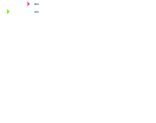
This is another example of a web form with a progress bar with arrowheads, designed using HTML and CSS. Class progress-bar of the progress class has been added into the code to create and style the progress bar. The label of the progress bar has the styles of font size as 18px, font weight as 700, color as #205580, bottom as -3px, left as -90px, and a position as absolute. The bar is given the styles of background as #fff, border radius as 15px 0 0 15px, a web kit animation of animate-positive 2s, and an animation value of animate-positive 2s. The progress value number is given an initial set of styles as font size as 18px, font weight as 700, font color as #205580, bottom as -5px, right as -50px, and position as absolute. After the animation, each bar takes a border left style of 20px solid #ff4a98, 20px solid #2c5af9, 20px solid #7cf210, and 20px solid #ff5f25, respectively.
progress bar style 9
4.3.1

This is an example of a web form with circular progress bars, designed using HTML, CSS, and JavaScript. Bootstrap grid layout and progress-bar class have been used in combination to create and style circular-shaped progress bars whereas JavaScript functions have been used to implement its dynamic animated features. The inner-circle with the progress value is given an initial style set of width and height as 60px, border-radius as 50% to get the circular shape, border as 5px solid #8e8e8e, font size as 18px, font-weight as bold, line-height as 50px, text-align as center and position as absolute. An animation of loading-1 1.8s linear forwards is added to the shapes. Each circle is assigned a color and a border of its own: #049dff, #fdba04, #ed687c, and #1abc9c, respectively. Each circle is also assigned animation values of its own.
progress bar style 8
4.3.1

This is an example of a web form with circular progress bars, designed using HTML, CSS, and JavaScript. Bootstrap grid layout and progress-bar class have been used in combination to create and style circular-shaped progress bars whereas JavaScript functions have been used to implement its dynamic animated features. The inner-circle with the progress value is given an initial styles set of width and height as 60px, border-radius as 50% to get the circular shape, border as 5px solid #8e8e8e, font size as 18px, font-weight as bold, line-height as 50px, text-align as center and position as absolute. An animation of loading-1 1.8s linear forwards is added to the shapes. Each circle is assigned a color and a border of its own: #049dff, #fdba04, #ed687c, and #1abc9c, respectively. Each circle is also assigned animation values of its own.
progress bar style 7
4.3.1