
This is a UI design template for a mobile phone, designed using CSS, HTML, and Bootstrap framework 4. The font style and icons are imported to the code with their URLs. The font style for the form is defined as 'Roboto', sans-serif. The name is displayed with the styles of font-size as 3rem, font-weight as 500, and font color as #728096. The date is displayed with a style set of font-size as 13px, font-weight as 400, text-align as center, and font color as white. The target button is given a height and width of 30px, and 70px, respectively. It is given a background color of #3b465e, which gets changed to #2e3951, on hover. The charts are displayed using three colors: lightseagreen, orange, and #3b465e. The 'Statistics' card is displayed using a style set of width as 320px, height as 100px, background-color as #2e3951, and border-radius as 10px. The cursor style for the card is set as pointer to get the hand cursor effect on hover. The cards take a background color of #3b465e and change the font color to gray, on hover.
Source: https://mdbootstrap.com/snippets/jquery/charkiewicz/898532#js-tab-view
UI design on mobile
4.3.1
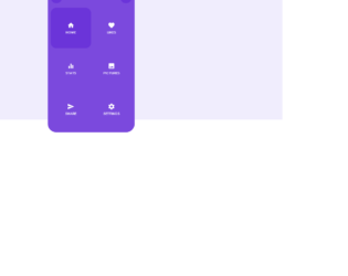
This is an example of a mobile menu, designed using HTML, CSS, JavaScript, and Bootstrap framework 4. The icons are imported to the code with their URLs. The JavaScript functions have been used to implement the clicking functions of the menu. The colors in the form, are predefined as $bg: #F0EDFD, $main: #7B49DD, and $white: #FFFFFF. The body of the form is given the styles of display as flex, justify-content as center, align-items as center, width as 100%, height as 100vh, font-family as 'Poppins', sans-serif, font-size as 11px, letter-spacing as 1px, background as $bg, and color as $white. The menu items are given the styles of display as flex, flex-direction as column, justify-content as center, align-items as center, position as relative, width and height as 140px, cursor as pointer to get the hand cursor effect, background as transparent, and transition as 150ms. In a hover event, the menu items take an animation of icon .1s 4.
Source: https://codepen.io/ricardoolivaalonso/pen/JjjjJOX
Mobile Menu
4.3.1
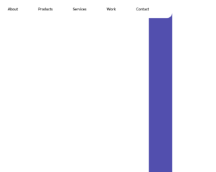
This is an example of a header navigation bar that displays a mobile navigation button if a navigation element is overflowing. It is designed using HTML, CSS, JavaScript, and Bootstrap framework 4. The concept of Lists has been used with UL and LI components. UL element has been used with the child elements of LI to display the menu items in an orderly manner, whereas JavaScript has been used to implement the overflowing function. Media queries are used to make the form responsive. The body of the form is given the styles of align-items as center, background as #524fae, display as flex, height as 500vh, justify-content as center, padding-top as 150px, and width as 100vw. The navigation bar list items are given the styles of align-items as center, color as darkblue, display as flex, font-family as Lato, sans-serif, font-size as 20px, font-weight as bold, height as 100%, line-height as 32px, margin as 0 40px, and transition as font-size 0.4s ease, and padding as 0.4s ease.
Source: https://codepen.io/CAWeissen/pen/wvvVKyo
Header Navbar Template
4.3.1

This is a mobile navigation layout with a toggle button, designed for Netflix using HTML, CSS, JavaScript, and Bootstrap framework 4. The images and fonts are imported to the code with their URLs. The concept of Lists has been used with UL and LI components. UL element has been used with the child elements of LI to display the menu items in an orderly manner. The JavaScript functions have been used to implement the expanding functions of the toggle button, whereas media quarries have been used to make the form responsive. The body of the form is given the styles of font-family as 'Muli', display as flex, flex-direction as column, height as 100vh, align-items as center, and justify-content as center. The header of the form is given a text0-transform style as uppercase to automatically convert the text to uppercase. The cursor style for the navigation button is set as pointer to get the hand cursor effect in a hover event. The child elements of the menu are set to be visible in a checked event of the menu button, in a white background after displaying a red, and a black background. The black background is given a color of RGB(34, 31, 31), whereas the red background has the color of RGB(229, 9, 20). Source: https://codepen.io/FlorinPop17/pen/KKPBgeQ