
This is an example of a profile card with hover effects, designed using CSS, HTML, and Bootstrap framework 4. The profile image and font styles are imported to the code with their URLs. The body of the form is given the styles of background-color as #212121, and font-family as 'Roboto', sans-serif. The profile picture is given the styles of width as 100px, height as 100px, border-radius as 50px to get the circle shape, and border as 2px solid white. The title of the profile is displayed using the styles of font color as white, font-size as 1.3rem, and font-weight as 400, whereas the subtitle is given the styles of color as #c45c00, font-size as 0.9rem, and font-weight as 500. The profile card is given the styles of height and width of 300px, and a grayscale filter of grayscale(70%) blur(8px). In a hover event, the profile card takes a transform effect of scale(1.3).
Source: https://mdbootstrap.com/snippets/jquery/charkiewicz/940342#js-tab-view
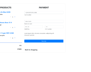
This is an example of an e-commerce shopping card form, designed using CSS, HTML, and Bootstrap framework 4. The product images are imported to the code with their URLs. Media quarries have been used to increase the responsiveness of the form. The form consists of product details, the number of quantity to be purchased, input text fields to enter the user and payment details, and a 'Buy Now' button. The input text fields are given a border style of 2px solid #4285f4, to be displayed on the active mode. The button is created as a primary type button in HTML. The input text fields are given a set of default autofocus values. This template can be used in an e-commerce website in which products can be added into the cart, where the total amount will also be displayed, and payment details will also be entered into the form to submit a purchase request.
Source: https://mdbootstrap.com/snippets/jquery/marta-szymanska/731529#js-tab-view
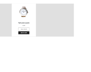
This is an example of an E-commerce single product card with an Add to Cart button, designed using CSS, HTML styles and Bootstrap framework 4. The product image is imported to the code with its URL. The body of the form is given a background color of #E0E0E0. The product card is given the styles of box-shadow as 0 20px 40px rgba(0, 0, 0, .2), border-radius as 5px, and padding-bottom as 10px. The card title is given a font-weight as bold to highlight the text. The 'View Details' button is given a border style as 1.5px solid grey, font color as #212121, width as 100%, and box-shadow style as 0px 0px 10px #212121. The 'Add to Cart' button is displayed with the styles of background-color as #212121, font color as white, margin-top as 10px, font-size as 12px, font-weight as 900, width as 100%, height as 39px, padding-top as 9px, and box-shadow as 0px 5px 10px #212121. The 'Add to Cart' button changes its font color to black, in a hover event.
Source: https://bbbootstrap.com/snippets/ecommerce-single-product-add-cart-button-21268162

This is an example of an E-Commerce single product card template, design using JavaScript, CSS, HTML styles, and Bootstrap framework 4. The form consists of a product card that gives three views of the product from different angles. The product images are imported to the code with their URLs. JavaScript getElementById method has been used to select the images. The discount section has the styles of text-align as center, height as 25px, line-height as 8px, border-radius as 4px, font-size as 13px, display as flex, align-items as center, justify-content as center, and color as #fff. The thumbnail product images are displayed using the styles of width and height as 50px, border as 1px solid #eee, padding as 5px, cursor style as pointer to get the hand cursor effect on hover, and border-radius as 4px. The thumbnails take a border effect of 1px solid #00000059, in a hover event over them. The 'Add to cart' button text is given a text-transform style as uppercase to automatically convert the text to uppercase. The button changes its background color to #343a40, in a hover event.
Source:https://bbbootstrap.com/snippets/bootstrap-ecommerce-single-product-using-card-98035165

This is an example of a set of social media cards with hover effects, designed using CSS, HTML, and Bootstrap framework 4. The form consists of three cards. The font style is imported to the code with its URL. The body of the form is given a background color as #fff, and font-family as 'Josefin Sans', sans-serif. The name of the card is displayed using a font style of 'Josefin Sans', sans-serif. The information card is given a style set of background color as #F0FFFF, padding as 60px 10px, margin as 30px 0px, box-shadow as 0 4px 8px 0 rgba(0, 0, 0, 0.2), 0 6px 20px 0 rgba(0, 0, 0, 0.19), and margin-bottom as 25px. The cards take the background color of #000000, on hover, whereas the card name and text turn its font color to #FFF. The 'Learn More' link is displayed using a font color of #00BFFF, which also turn the font color to #FFF, on hover.
Source: https://bbbootstrap.com/snippets/social-cards-font-awesome-icons-80190200
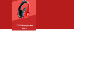
This is an example of an e-Commerce product card with an animation effect, designed using HTML, CSS, and Bootstrap framework 4. It can be used to showcase the e-commerce products stylishly. The product image has been imported to the code with its URL. The body of the form is given a background color of #B71C1C. The product card is given the styles of height as 420px, width as 320px, background-color as #C62828, border-radius as 10px, and a transform effect of skewY(345deg), to create the hover animation. In a hover event, the image changes its width to 80%, creating the hover effect. The justify-content and align-items styles have been set as center to centralize the elements. The 'Buy Now' button is created as a success type button and given a style set of font color as #fff, background-color as #ef5350, border-color as #ef5350, and width as 160px. In a hover event, the button takes the background color of #e84040 and the border-color of #e84040.
Source:https://bbbootstrap.com/snippets/bootstrap-ecommerce-product-card-animation-effect-30372547