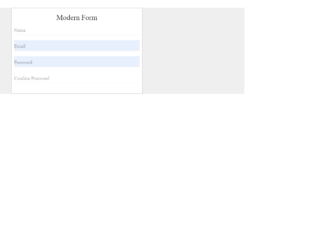
This is an example of the input box which is subtle and can be used in any site with the animation used for the input text. Once you select the input field the label glides smoothly towards the top of the field and allows you to type the text, along with it the color of the text and border of the input field is also changed. The HTML is very simple with the class centered and group applied to the input and labels. All the animation and styling is taken care by CSS3. Once you click the label is transformed along the axis to glide upwards. The style also has the code to stop the chrome’s hideous pale yellow background color to be displayed while you do an auto fill. You can use this as an example to create contact forms. Source: https://codepen.io/kylelavery88/pen/adbzLQ
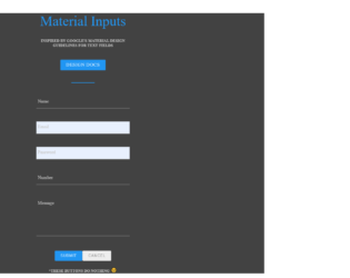
This is a classic example of input form. As said it is inspired by Googles material design guidelines especially for the text fields. The guidelines used to design the text fields along with its specifications described in the document by Google. The text fields used are filled text which once clicked the labels neatly move up during the users interactions. You can also have field validations on these text fields. The moving of labels is due to the transition method used in CSS. The CSS is perfectly created to match the guidelines and the form. You can use this form as it is to you application with the functional submit and cancel buttons as needed. Make sure that you have required validation in the form checked. Also for this you require CSS3 to see the moving transition and effects added to the field. Source: https://codepen.io/lewisvrobinson/pen/EyZwjR
This is an example of the input box which is clean, subtle with input text animation. The design easily blends with any type of website. This has an input text designed to make a perfect option for any type of text fields. Once the input field is selected then the label for the field glides smoothly upwards allowing you to add the details clearly in the field. This snippet has a form with two inputs which are of filled type. The entire effect is achieved using CSS 3. With the CSS being more effective in adding transitions and animations, we are not depended on a complicated script to make it interactive, unlike earlier days. Filled input type is used with the borders displayed with red color initially. Once you start typing in the input field, it turns into green. Source: https://codepen.io/atunnecliffe/pen/gpKzQw
This is an excellent way to engage your audience, in case of design resource website or font designer. There are various text effects added in this snippet to which allows you to see the exact differences between them. To the left there is a drop-down option to select the effect and then you can see the effect on the text box. This will allow you to select the effects for your websites. HTML for this snippet is simple with the selector and input fields. The functionality depends on the javascript code. There are various covered like bounce, fadeIn, fadeUp, etc. which are added using the script and later the animation is added to the character. The script takes the care of all the keyboard characters and special characters which can be added in the input field along updating of the arrows. Source: https://codepen.io/andyNroses/pen/pbBWBL
For any colorful website, this is a very good snippet. You can allow the user to choose the colors for their website, especially for the tags and fonts. The HTML is very simple with the class color defining the various colors for tags and fonts. The color list is mentioned along with the class colors. Along the div “Tags” you can see the tags added with the selected color “orange” by default. Next, try to select a color from the color list and check the difference in the tag colors. This is achieved using javascript, once you select any color the background colors for the tags are changed to a recent one. You can also add new tags and make sure that they have the recent selected background color. Also to remove or and any tag you would require the javascript. You can use this to create an interactive site. Source: https://codepen.io/jexordexan/pen/xJvdh
This is a best example for multi-user interactive text tool editor. This will help you to give comment option to user. The effect is simple, sleek and loads quickly. This is also responsive and works effectively on any screens. It helps to reduce the space on web page and can be seen only if the user wants to comment on it. The HTML is simple with the container for responsiveness of the field. Input type is checkbox attached with the class cbox. The CSS style for input box is perfectly written to display the “Add Comment” when unchecked. This blends well with javascript adds the comments like add comments and “Enter to Submit”. The icon of plus and minus are transition and transformed perfectly. The collapsing of the check box is well matched with the animation and rotation set in styles. While using this snippet make sure it matches with your web page. Source: https://codepen.io/sashatran/pen/dWNYEv
This is an excellent snippet for interactive designs. This uses SVG which is a way to create an interactive, resolution-independent vector graphics that looks great on any size of the screen. Take a look at it in smaller screens and larger screens, the effect, and animations of the look will be the same. This can be used for any fields in your website. Here the clicking on the email would give a stroke effect to the SVG line which is added in HTML. Also, the combination of CSS transition is achieved perfectly with the effect. This snippet also uses javascript which allows the validation of email address. Try adding a wrong and correct email ID, you would get the indication of email id’s type on the input field. Make sure to use the javascript along with the code in snippets to get the correct effect and look. Source: https://codepen.io/shehab-eltawel/pen/GqrGwj
his example looks simple but the code is tricky. The input field like this engages the audiences, with this example you can experiment with different text effects. This example displays the simple type of effect, the text field gives an animation effect of small jumping of the characters that are typed in. Javascript is used to create a smooth and clear transition of the type in characters. These kind of animations can be used at any part of the website. This design helps to blend with any type of website. For this snippet to you need to use the CSS and javascript for its role. This snippet goes well with the touch screen devices like iPhones and pads. The touchscreen property is been added by script when required. This is one of the best examples of normal and touch screen devices. Source: https://codepen.io/bartekd/pen/LtaBl
This is the example of an input field on the splash page. With the business expanding every second, web applications are also one way to create a niche for your business. The splash page is one of the examples which can come after any page in your site. The purpose of a splash page varies: You can promote a new offer, show a disclaimer, or a warning depending on the industry or niche your business operates in. Here we see the example of gathering email address using morphed input field button. The CSS properties are applied to the input field which will look like an input button, later once the field is clicked we will make it active and inherit the cursor. Once the input field is activated we will display the subscribe button. This goes well with the splash page where the content is less and client information gathering is more. Source: https://codepen.io/calebsylvest/pen/FjlLJ
This is an example of using Web-flow styled email input field. UI / UX is not just writing the front end of the website, it is more of the flow of the data in the correct format for the CMS applications. The Webflow helps you to understand the chemistry between the HTML CSS and javascript, they working together to make the foundation and customization of the data which is required and essential for any product. Here we just see the example of email input with the effect once the input is focused. HTML uses the web flow-style input with the placeholder and icon with a forwarding arrow. The CSS is matched to the web flow input field while it is in an active and inactive more. Check the code for CSS of the colors added while the input is an active and inactive state. You can use this code in case if you plan to use the web flow in web applications. Source: https://codepen.io/PRtheRose/pen/BNgEJo
This is a classic example of floated labels, which are around the corner for quite some time. This example is with javascript but with the advance CSS you can write one without the javascript. This can be used when you need to save the space in the form and make the labels as big as the input field in the appearances. Once you click on the input field the text floats and moves out allowing you to type on the field. The example in this is a form with the labels and input grouped in the fieldset. These are arranged well with the CSS properties, the trick here is to add the focus class during the selection on the input field and removing it while it is a blur. This is done using javascript. You can use this snippet as it is in filling the contact form and other interactions with the clients.
Source: https://codepen.io/KhoaDinh/pen/ozLRbo
This is an example of the stylish expandable input field using only pure CSS solution. The animation and effect expands the input field once clicked on it. The HTML markup is simple and easy by defining an input and span element inside a div element to ensure that the animated border doesn’t overflow and doesn’t disturb the UI. Next, we are using a freebee markup “growing-search” to increase the width of search while it is selected. The CSS is mainly focused on behavior while it is selected or submitted it hovered. The outline is specifically made none, for the input while it is in a selected state. The important part for this snippet is growing, which is done by increasing the width while the input is selected. You get an idea of using the different kinds of animations and effects. You can change this code to change the style, color, and appearance of the border. Source: https://codepen.io/Mestika/pen/CiKlj