Web Designer Wall
Web Designer Wall
Bootstrap
Tags
References
CSS Reference
Templates
Free Templates
VirtueMart
Joomla
Snippets
Featured
VirtueMart
By Bootstrap Versions
4.1.1
4.0.0
3.3.0
Sign In
Sign In
Registration
Latest
Featured
Bootstrap 4 Alert messages with dismiss and continue button
4.3.1
wdw
3
Comments are closed
Bootstrap 4 Alert Messages
4.3.1
wdw
3
Comments are closed
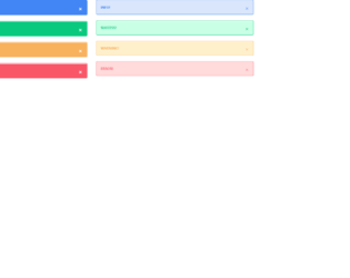
Bootstrap 4 messages alerts
4.3.1
wdw
4
Comments are closed
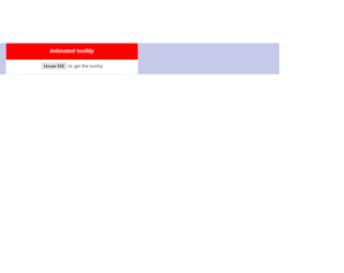
Bootstrap 4 simple animated tooltip
4.3.1
wdw
0
Comments are closed
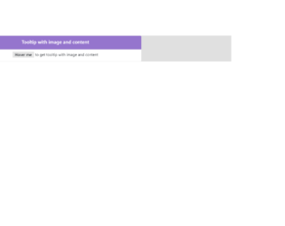
Bootstrap 4 tooltip with image and content
4.3.1
wdw
2
Comments are closed
Bootstrap 4 simple tooltips onhover
4.3.1
wdw
1
Comments are closed
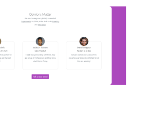
Bootstrap 4 our team section with round profile images
4.3.1
wdw
0
Comments are closed
Bootstrap 4 Meet our team section on hover with social icons
4.3.1
wdw
0
Comments are closed
1
…
92
93
94
95
96
…
167