- Latest
- Featured

Bootstrap Slider
4.3.1

This is an example of a responsive mailbox layout, designed using CSS, HTML, and Bootstrap framework 4. The images and fonts are imported to the code with their URLs. Media quarries are used to increase the responsiveness of the form. The body of the form is given the styles of font-family as 'Roboto', sans-serif, font-size as .9em, font-weight as 400, and color as #797979. The panelist on the left side is given the styles of line-height as 40px, margin as 5px 0px, padding as 0px 8px, border-radius as 4px, and cursor as pointer to get the hand cursor effect. The panel items take the background color of #fff, in a hover event. The concept of Lists has been used with UL and LI components. UL element has been used with the child elements of LI to display the panel items in an orderly manner. Each mail section is given a different border-left color for identification purposes.
Source: https://www.tolmatol.com/bootstrap-snippets-responsive-mail-inbox/

This is another example of a simple Contact Us form, designed using HTML, CSS, and Bootstrap framework 4. The concept of Lists has been used with UL and LI components. UL element has been used with the child elements of LI to display the news items in an orderly manner. The news panel is given a background color of #f9f3e1, and a padding-bottom of 50px. The news sections are given the styles of border-bottom as solid 1px #8b61e0, and padding-bottom as 20px. The title of the news cards is given the styles of margin as 10px 0px 10px 0px, whereas the author's name is given a font-weight of 400. The right panel header is given the styles of margin as 50px 0px, and color and #eee. The input fields of the right-side panel has the styles of margin as 8px 0px, padding as 20px, line-height as 30px, and border as solid 2px #ffffff5c.
Source: https://www.tolmatol.com/contact-form-with-news/
Contact Form With News
4.3.1
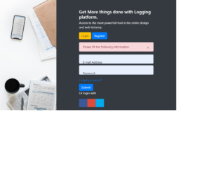
This is another example of a Bootstrap login form, designed using CSS, HTML, and Bootstrap framework 4. The images are imported to the code with their URLs. The styles for the background image is set as position as center, height as 100vh, and background-size as cover. The concept of Lists has been used with UL and LI components. UL element has been used with the child elements of LI to display the social media icons, in an orderly manner. The input fields are given the styles of background as #fff, border as none, margin as 10px 0px, padding as 20px, and height as 50px. The social media icons are given the styles of display as block, width as 35px, height as 35px, margin as 5px, color as #fff, font-size as 21px, and line-height as 35px. They are also given different background colors as Facebook- #3B5998, Google- #dd4b39, and Twitter- #00aced.
Source: https://www.tolmatol.com/bootstrap-login-form-using-html-css/
Bootstrap Login Form
4.3.1

This is an example of a simple header dropdown menu, designed using HTML, JavaScript, CSS, and Bootstrap framework 4. The fonts and Bootstrap styles are imported to the code with their URLs. JavaScript functions have been used to implement the toggle functions of the header. The concept of Lists has been used with UL and LI components. UL element has been used with the child elements of LI to display the child elements of the header, in an orderly manner. The font family style for the header is set as Poppins, sans-serif. The header is given a background color of #ffc107, which changes to #ffd761, in a hover event. The header child elements are given a font color as #292929, padding as15px, and display as block. A cursor style for the elements is set as pointer to get the hand cursor effect in a hover event. Media quarries have been used to increase the responsiveness of the form.
Source: https://www.tolmatol.com/css-snippets-drop-down-menu-with-jquery-responsive/

This is an example of a web Signup form, designed using HTML, CSS, and Bootstrap framework 4. The background image is imported to the code with its URL. The background of the form is set as linear-gradient(to bottom, rgba(43,57,144,.8), rgba(39,170,225,1) 65%), and the font color as #fff, whereas the logo has the styles of font-family as 'Agency FB', sans-serif, font-size as 2.5em, and font-weight as 700. The font color for the logo is also set as #fff. The registration form wrapper is given the styles of padding as 20px 20px 0, border as 1px solid rgba(255, 255, 255, .2), and margin-bottom as30px. The content section of the registration wrapper is is given a font-size of 15px. The Register Now Danger type button is given the styles of position as relative, top as 20px, and border-radius as 17px, whereas the line divider of the registration wrapper is given the styles of height as 1px, border-top as 1px solid rgba(255, 255, 255, .20), width as 180px, margin as auto, and margin-bottom as 10px.
Source: https://www.tolmatol.com/website-header-design-with-sign-up/
Website Sign Up Form
4.3.1