- Latest
- Featured

This is a simple login form for any resort application. This consists of a user name and password to access the application. This form is divided into , and a section. The header section contains the image set using max-width. The form is placed in the div section where two input type is displayed with place holders. Footer contains the button to sign in and a link for sign up form. Styles for different class @media rule are used in media queries to apply different styles for different media types/devices. Here we are applying the clip path ellipse, to the background. This gives us the required eclipse like curve.
UI Login Form for Resort
4.3.1
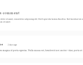
This snippet describes how to code for the comment section of the webpage. This snippet uses the class “comment-container” and theme-light. It uses the card from Bootstrap 4 which is a flexible and extensible content container. It contains a header, footer, background colors, images or avatars. A simple card template is used with sheet and theme set to light. This card includes the avatar or image and name of the commenter. An arbitrary class dialog container is applied. The styles are applied to each class used in the snippet. Media rule is applied classes container and comments. CSS uses a few settings selectively for Mozilla or Firefox browsers.
Blog Comments
4.3.1
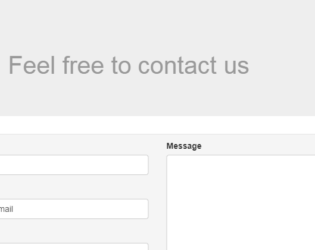
This is a simple contact form, which is using class Jumbotron for the header. This class is a lightweight, flexible component that can optionally extend the entire viewport to showcase the header part of the snippet. In the second part, the form is placed in the container. The container helps to deal with responsive behavior of the form. FormGroup is used along with the FormContainers, to display the labels and types. An addon is used to display the email icon for email FormControl. This is all placed in the class InputGroup. The snippet used column setting for medium devices for each formGroup. The style is limited to jumbotron class and header.
Simple Contact Form
3.1.0

This is a bueatiful contact form created using HTML and CSS. This contact form can be used on any website. It is responsive. Name, Email and Message field is required in this form.


This is a simple login form can be used in the internal application. To set the content’s margin dealing with responsive behavior we use the bootstrap container. For better responsive behavior form is placed in a container, action attribute is specified to send the form data to "confirmation.php" page, this would use ‘post’ HTTP method. This form consists of FormGroup, which is used with FormControl, FormArray, and buttons. The snippet uses the clearfix utility class, which creates clear floated content. It can also be used as a mixin. The CSS style sheet for this snippet is simple, contains the style for all the classes mentioned in the snippet.
Bootstrap Simple login
3.3.0
Inceptos deserunt mollitia aliquam quidem lectus, optio primis sed earum conubia convallis, amet natus lobortis
