30 Free Fonts for Creative Projects
The best free fonts for creative projects are open-source families you can use commercially, self-host, and tune with variable axes. The 30 below come from Google Fonts and Fontshare, and each is free for personal and commercial work. They are grouped by job, so you can pick a headline face, a text face and a code face without opening fifty tabs.
The first version of this list, from 2010, was thirty novelty display fonts from a download site. Most of them are hard to use today: they ship as a single desktop file, often with a personal-use-only licence and no web format. Everything here is built for screens, and the entries that are variable fonts are marked as such.
What makes a free font safe to use in 2027 and beyond
Before the picks, the checks that separate a good free font from a risky one:
- Licence. Every Google Fonts family in this list is under the SIL Open Font License, which allows commercial use, embedding and self-hosting. Fontshare’s fonts are free for personal and commercial use under the ITF Free Font License. Check the licence page of each of the four Fontshare picks below before you ship it. Read the licence page of any font you take from elsewhere, because “free download” often means “free for personal use”.
- Web format. You want WOFF2 files, ideally one variable file per style instead of a separate file for each weight.
- Language coverage. If your audience writes in more than basic Latin, check the character set on the font’s page before you commit.
- Active maintenance. A family that is still updated gets bug fixes, new weights and wider language support.
Sans-serifs for interfaces and body text
These are the workhorses. Pick one for text and most pages are done.
1. Inter
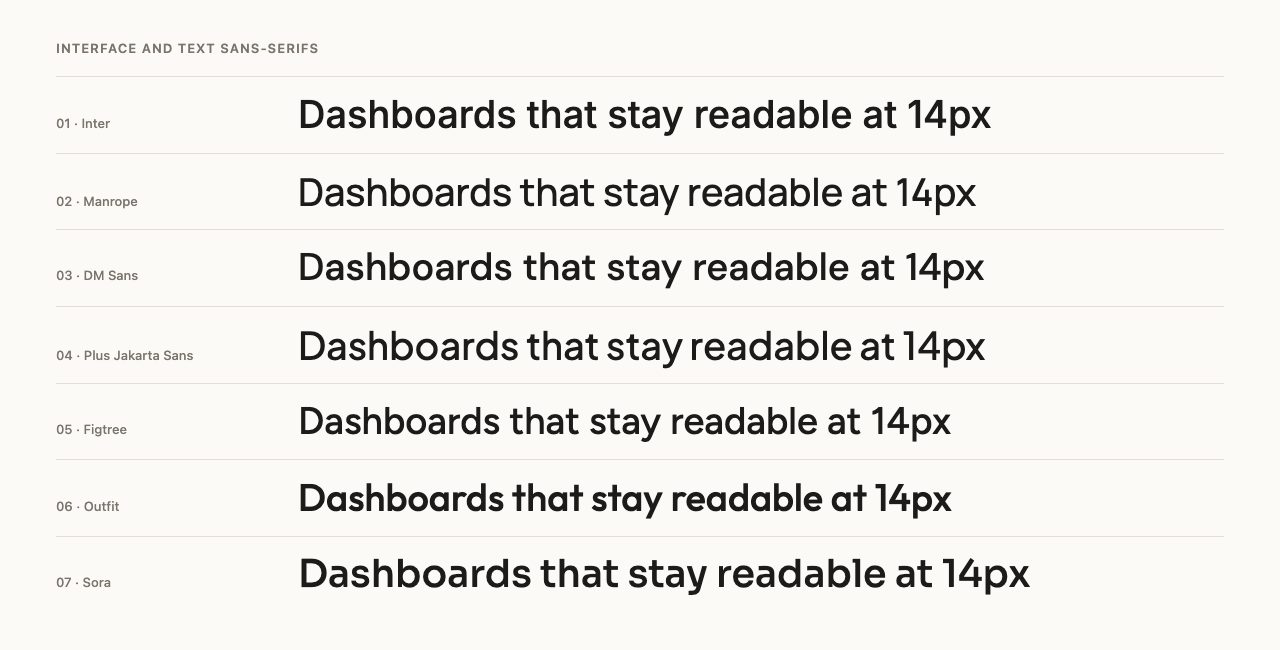
Inter, by Rasmus Andersson, was designed for screens and is the safe default for dashboards, documentation and long reading. It is a variable font with weight and optical-size axes, so small text and large headings can each look right from one family.
2. Manrope
Manrope, by Mikhail Sharanda, sits between geometric and grotesque. It is friendlier than Inter at large sizes and still tidy in paragraphs, which makes it a good fit for product sites and portfolios.
3. DM Sans
DM Sans comes from Colophon Foundry. Low contrast and open letterforms make it feel clean and slightly warm, a natural choice for startup pages and editorial layouts that avoid looking cold.
4. Plus Jakarta Sans
Plus Jakarta Sans, drawn by Tokotype, has a geometric structure with rounded curves and a tall x-height. It gives headings personality without becoming a display face.
5. Figtree
Figtree is by Erik Kennedy, who teaches UI design. It aims at being friendly and simple, and it holds up in forms, buttons and onboarding screens where clarity matters more than style.
6. Outfit
Outfit is a geometric sans made for Smartsheet by Rodrigo Fuenzalida. Its round bowls and heavier weights work well for logos, hero headings and short labels.
7. Sora
Sora, by Jonathan Barnbrook and Julián Moncada, has wide, open proportions. It reads as technical without being cold, so it suits fintech, data and developer-tool brands.
Fontshare picks with more character
Fontshare is a free font service from the Indian Type Foundry. Its families feel more designed than most free alternatives, and it offers a hosted stylesheet or downloadable files.
8. Satoshi
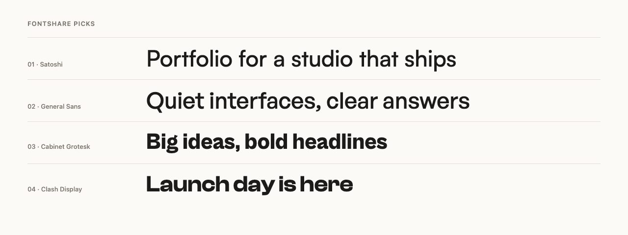
Satoshi is a modernist sans that has become a favourite for agency and portfolio sites.
9. General Sans
General Sans is a neutral grotesque with a slightly tighter feel than Inter. Use it when you want a clean text face with a little more attitude.
10. Cabinet Grotesk
Cabinet Grotesk is a heavy, confident grotesque. At 800 weight it makes strong headlines, and a neutral text face underneath keeps pages calm.
11. Clash Display
Clash Display has wide, sharp letterforms built for large sizes. Keep it to headings and pair it with something quiet for text.
Display faces for headlines and posters
Display fonts do one thing: grab attention at large sizes. Use them for a few words, never for paragraphs.
12. Bricolage Grotesque
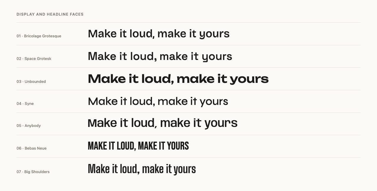
Bricolage Grotesque, by Mathieu Triay, is a variable font with optical-size, width and weight axes. The quirks in the letterforms show up at display sizes and calm down at text sizes.
13. Space Grotesk
Space Grotesk, by Florian Karsten, grew out of Space Mono and keeps some of its odd shapes. It works as a headline face for tech and design brands, and it is readable enough for short blocks of text.
14. Unbounded
Unbounded is a wide, rounded variable font that is hard to ignore. It suits event pages, music and gaming brands, and oversized numbers in stats sections.
15. Syne
Syne, created by Bonjour Monde, was designed for an art centre’s identity. Its heavy weights turn extremely wide and experimental, which suits galleries and cultural sites.
16. Anybody
Anybody, by Tyler Finck, is a variable family built for expressive layouts and animation, where text can change as the user interacts. Try it when you want type itself to be the visual.
17. Bebas Neue
Bebas Neue is an all-caps condensed face by Ryoichi Tsunekawa. It remains the quick answer for posters, banners and sports-style headings.
18. Big Shoulders
Big Shoulders was created by Patric King for the City of Chicago, and it has the tall, tight proportions of signage. It handles long headlines in narrow columns well.
Serifs for editorial and long reading
Serifs add warmth and authority. They are back in favour for blogs, magazines, portfolios and brands that want to feel less like software.
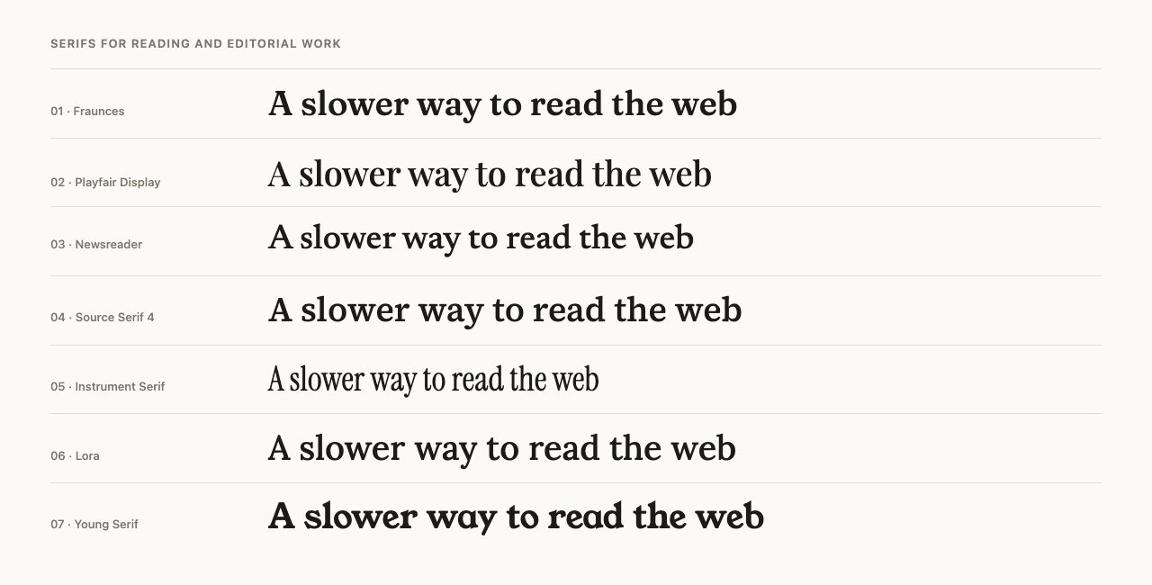
19. Fraunces
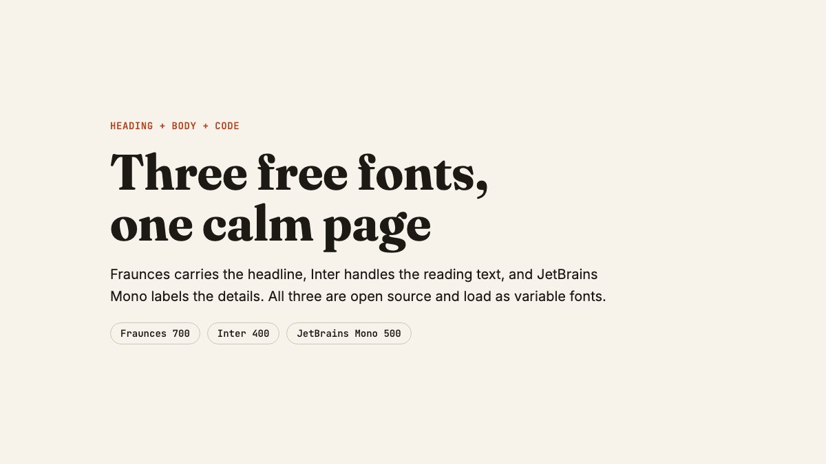
Fraunces is an “old-style soft-serif” from Undercase Type. It is variable, with weight, optical-size, softness and “wonk” axes, which lets one family go from calm to playful.
20. Playfair Display
Playfair Display, by Claus Eggers Sørensen, is a high-contrast transitional serif. It is made for headlines, so avoid using it for body text.
21. Newsreader
Newsreader, from Production Type, was designed for reading on screens. Its optical-size axis keeps captions and headlines equally crisp, which makes it a strong pick for articles.
22. Source Serif 4
Source Serif 4, by Frank Grießhammer for Adobe, is a robust text serif with a large character set. It pairs naturally with sans-serifs and holds up in documentation.
23. Instrument Serif
Instrument Serif, by Rodrigo Fuenzalida and Jordan Egstad, is condensed and elegant. It was made for display use and looks best large, in short, confident headlines.
24. Lora
Lora, by Cyreal, is a well-balanced serif with calligraphic roots. It is comfortable in blog posts and one of the easiest serifs to use well.
25. Young Serif
Young Serif, by Bastien Sozeau, is a heavy, old-style serif with a warm, slightly retro feel. It makes headlines for food, craft and lifestyle sites with just one weight.
Handwriting and monospace
Two small categories that earn their place in a toolkit: a touch of handwriting for personality, and monospace for code and data.
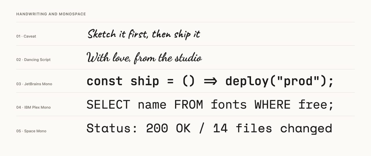
26. Caveat
Caveat, by Impallari Type, imitates quick pen writing. Use it for annotations, signatures and short callouts, not for anything long.
27. Dancing Script
Dancing Script, also by Impallari Type, is a lively casual script. It works for invitations, wedding sites and logos at large sizes.
28. JetBrains Mono
JetBrains Mono was made by JetBrains for reading code, with tall lowercase letters and clear punctuation. It is a variable font in Google Fonts.
29. IBM Plex Mono
IBM Plex Mono is the monospace member of the IBM Plex family, designed by Mike Abbink at Bold Monday. It has a slightly more formal tone than JetBrains Mono.
30. Space Mono
Space Mono, by Colophon Foundry, has a quirky retro-futurist look. It works for labels, captions and tags, where character matters more than density.
How to pair fonts without overthinking it
A reliable system uses two families, or three with a monospace for code. Give each one a job:
- Choose the text font first. It carries most of the page, so pick for readability. Inter, Newsreader or Source Serif 4 are all safe.
- Add contrast in the heading. If the text is a sans, try a serif or a characterful grotesque for headings. If the text is a serif, a clean sans for UI labels works well.
- Limit weights. Two or three weights are plenty. A variable font gives you more, but restraint looks better.
- Test with real content. Paste your actual headline and a real paragraph, then check them on a phone.
For more ideas on expressive text, see the animated text effects snippet and the CSS gradient text effect tutorial.
Add them to your site the fast, private way
You can load any Google Fonts family from Google’s servers, but self-hosting gives you control over caching and privacy and removes a third-party request. The Fontsource project packages open-source fonts for npm. When a family has a variable version, start with that package:
npm install @fontsource-variable/inter @fontsource-variable/frauncesImport each package once in your entry file, for example import "@fontsource-variable/inter";. The CSS uses unicode-range, so browsers only download the character sets a page actually needs. Then wire the families to custom properties:
:root {
  --font-heading: "Fraunces Variable", Georgia, serif;
  --font-body: "Inter Variable", system-ui, sans-serif;
  --font-code: ui-monospace, "SF Mono", Consolas, monospace;
}

body {
  font-family: var(--font-body);
}

h1, h2, h3 {
  font-family: var(--font-heading);
  font-optical-sizing: auto;
  text-wrap: balance;
}
The default import of each package loads the weight axis only. Inter’s optical-size axis and Fraunces’ optical-size, softness and “wonk” axes are not included. To get them, import a different file from the same package:
import "@fontsource-variable/inter/opsz.css";     // weight + optical size
import "@fontsource-variable/fraunces/full.css";  // weight, optical size, softness, wonk
Fraunces also ships opsz.css, soft.css, wonk.css and standard.css if you want only some axes and smaller files. Both still register as Fraunces Variable and Inter Variable. font-optical-sizing: auto only has an effect once a file with an opsz axis is loaded, which is why the CSS above is paired with these imports. With the default import it is harmless but does nothing.
Fontsource’s variable packages register the family with a “Variable” suffix, such as Inter Variable, so use that exact name in your CSS. They also set font-display: swap, which shows fallback text immediately while the font loads. Keep a sensible system fallback in every stack, since it is what visitors see first.
If you do not use a bundler, download the WOFF2 files and write your own @font-face rule. Our guides to @font-face and font-face solutions explain how that rule works.
In WordPress block themes
Block themes register fonts in theme.json under settings.typography.fontFamilies. Each entry gets a slug, and WordPress turns it into a CSS custom property named --wp--preset--font-family--{slug}. Add a fontFace array when you bundle your own font files with the theme, as described in the theme handbook.
Where to find more
- Google Fonts has the largest open-source library, with filters for variable fonts, script and language support.
- Fontshare is a smaller, curated set with a hosted stylesheet and downloadable files.
- Fontsource is the easiest way to self-host Google Fonts and other open fonts in a build.
If you want script and brush styles in more depth, our collection of handwriting, script and brush fonts goes further. For icon fonts, see how to add icon fonts to any element with CSS.
Fantastic set, was just about to go looking for a font like faith collapsing for a minimal design with an old feel.
Thanks!
Could you guys add a zip with them all? (I’m lazy !)
Hi, I agree this set is great but explain me sth please..
You wrote about 30 free fonts but, if we consider i.e. ALLSTAR REGULAR font from fonts2u (http://www.fonts2u.com/allstar-regular.font) there are information that:
– it’s freeware;
– several lines below we can find information: “Prawa osadzenia: Osadzania ograniczona (zabroniona!)” what basicly means “Including rights: including limited (forbidden!)”. How should I understand it??
BR
Embedding rights mean simply if you may embed the font for example into PDF. Majority of font designers do not edit these special font fields .. and keep default settings. Allstar font is definitely free.
Really nice collection. Usually you see the one off goofy fonts, but you have some nice fonts that would work for everyday use mixed in as well. It’s well understood that Copperplate Gothic Bold is the best font, but alas it is not free. It is installed on 81% of the computers in English speaking countries though:)
Ahhhhh you have a free version!!!! You are a gentleman and a scholar! A light version can be bolderized but Copperplate in any form is beautiful. You shall live a long life of happiness.
Your link for SF Buttacup points to Arista.
Great Collection, thanks for putting the work all together and share it.
OMG, The resemblance of fonts2u and dafont is more than obvious. I wonder if they are going to get away with that.
Thanks so much of this Nick, it’s posts like these that feed the design community – keep up the great work!
awesome set of resources! thank you for sharing this and doing the research for us all to discover. i will definitely be referencing this time to time.
i just want to add, another excellent resource / place for typography is http://www.pilo.me – it by far is the most complete and solid font forum i have visited. you can definitely find similar resources as you have mentioned here at pilo. anyhow, give it a look if you are a type lover. i think it is invite only or it usually is at least, so good luck getting in. if you do get in, be sure to participate as i know they remove deadbeat users time to time.
thanks again for the excellent links!
Some of these are not-so-distant knock-offs of famous fonts.
This is fabulous – thanks for doing the dirty work for us!
Check your website real price
websitereckon.com
daily visitor, daily earning, alexa rank, google page rank, etc..
check the buttacup link it leads to the arista font
There are some good fonts in this collection. I really like the Decker and the Yanone Kaffeesatz Bold font. They have quite a high impact and think they would work well in a logo or some navigation. They are legible fonts with style. Definitely some great fonts here to consider for web design.
Really great work listing these fonts, thanks a lot!
This is cool! Thanks for sharing!
I will definitely download Decker and Sansumi!
Thank you! These are great! But the link on Buttacup goes to the file for Arista?
I love font list. Thank you for sharing.
Its great, thanks. I love the fonts you’ve mentioned here, I was so curios to find the Delicious’s font and here it is, I found it here. Thanks again.
On the Fonts2u.com site it has an FAQ section where they state:
“Freeware fonts can be used commercially or non-commercially without acquiring copyright permission as long as you will not profit from the use of the font. The author of the font will always retain the copyright, which refers to the reproduction, distribution, alteration and publication of the font. If you are unsure if you can use a font for a particular task the best action would be to contact the author and request the permission. “
These are some excellent fonts. I’ll definitely be adding to my already way too darn big font collection. Thanks
http://www.templategang.com
http://www.templategang.com/blog
35000+++++ website templates …++++++++++many more..
Webdesigner kit!!!!!!!!
NO CRAP ASSURED!!!!!!!!!
WEBSITES DESIGNED BY BEST DESIGNERS OF WORLD!!!!!!!!!!!!
GRAB THE OFFER!!!!!!!!!!!
LIMITED OFFER TILL EASTER!!!!!!!!!!!!!!
http://www.templategang.com
35000 webtemplate +
WEB 2.0 TEMPLATES + RICHEST PHOTOS + VECTOR ART + GRAPHICS+ LOGOS + ICONS + BANNERS + BACKGROUNDS + FONTS + PHOTOSHOP BRUSHES + ARTICLES + ZOOMLA + CMS + REAL ESTATE + CSS + FLASH+ ANIMATED GIFS + PSDS +++++++++++++ MANY MORE!!!!!!!!!!!!
NEVER BEFORE!!!!!!!!!!
BUMPER OFFER!!!!!!!!!!!!!!!
These are coming in at just the perfect time … I’m about to revamp my site to make it a little more “fun, funky, & fresh.” It’s a bit blah for me at this point but that’s what happens when you put up a site in just a few days due to losing your job without and notice. Gotta love the economy. Thank goodness I’ve got great friends with lots of friend to refer to me. :P
-m-
Great post added a few of them to my font library. Ive always loved that font called “offensive”.
These are some excellent fonts. I’ll definitely be adding to my already way too darn big font collection. Thanks
Great collection! Though I must admit that I’m quite tired of seeing Diavlo on these lists. It’s really not that great of a font.
great stuff…………..
WebsiteReckon.com outstanding web analytic tools on the internet today. You can use it for FREE. More than website value calculation, are target specific Traffic, pageviews. Fantastic!
nice site design ………..
websitereckon.com
these are really great fonts
thanks for your effort
does anyone , downloads all the 30
and can compress them and upload them .
it would save lot of time for lots of people .
thanks guys
great effort
i luv them dont know how to copy them but never mind!:) thankz anywayssss!x
Thank you for the nice font collection. Never can have too many :)
Love this collection of fonts! They range from 70s style to modern, and the color choices used to display each font in the example does each one justice. I think by supplying designers with fonts for free boosts the industry and allows variation to projects other than the typical MS Word serif and sans serif fonts. Personally I love the ROUGHTRAD and Yelly as well as the karabiner fonts, as I think each of these demonstrate where the design industry is going. SF Buttacup Lettering is a good representation of how a simple font can be used in various ways.
I like the foundation of this blog has a great variety of comments I really like it, several points of view helps in the appreciation of the subject,is very interesting and I would like learn more.
hey dey r just awsum i like d 1st one ………………………..
These are truly outstanding fonts for creative project..I must say that this will be very useful for me.I will try for this.
Thank you very much for such helpful post.You have done a good job for me.
zillion thanx! i’ve been looking over best collection of fonts! tq yeah!
thanks for the recommendation of those great fonts but how do i download them? sorry for my ignorance.
Hello! I urgently need financial assistance to carry out a complex operation to my sister ($ 8000) Please help they can. My moneybookers account is [email protected] Thanks, Paul
Choosing right font for your project is very important. Many successful products are almost synonymous with a certain kind of font. Like for example think about Coca Cola’s curved font or IBM’s clear cut letters. By seeing any curved font you can easily identify that this is Coca Cola’s font. This is the impact of font.
Web Design LA
Thanks for taking the time to discuss this, I feel strongly about information and love learning more on this. If possible, as you gain expertise, It is extremely helpful for me. would you mind updating your blog with more information?
Hi,
I love all the designs here. Very very cool work.
Though white iphone 4 is at high price, but with all-powerful function, we can see lots of people just crazy for the latest white iphone 4.
Nice and informative article! I also love white iPhone 4 the simplicity of web design. It is indeed a Worth reading blog! Thanks to the author.
That is to be expected in a long-term, high-risk project like ours. So, we turned to the blogging community for help – and got it! We have published our problems, and the community responded with results!cheap ugg boots
This information is really good and I will say will always be helpful if we try it risk free. So if you can back it up. That will really help us all. And this might bring some good repute to you.
Ahhh! Sweet, you included my font Champagne & Limousines in this list. We’re not worthy oh Web Designer Wall! XD Thanks so much, this has been a site that I admire and respect for … years, it is an honor!
~Lauren
age of heart attack decreased with each passing day, he said.
çok hoş ve keyif verici bir site tebrik ederim.
Ahhh! Sweet, you included my font Champagne & Limousines in this list.
Excuse me? I did thin it was pretty rad myself, and I already said that.
@Admin (Nick) the comment which I am replying to may possibly be considered ‘spam,’ …
hey! buddy what is the Facebook official logo font?
Excellent post. I was checking continuously this blog and I am impressed! Extremely useful information specially the last part :) I care for such information a lot. I was seeking this certain information for a very long time. Thank you and good luck.
Hey not to set off topic but can anyone give me a review of. New York Car Insurance Reform 295 Greenwich St, New York, NY 10007 (646) 351-0824 They’re just down the block from me. I was wondering once they were a good insurance company. I need to find coverage, it is the law you know, but I need to have a good price price plus I’d prefer friendly service.