
This is an example of a testimonial card format with a flipping animation, designed using CSS, HTML, and Bootstrap framework 4. The user images are imported to the code with their URLs. The card is given an animation to flip between the user information on the front side and testimonial on the backside, on hover. The background color of the form is set as #f7f6f6. The front and back sides of the cards are given the styles separately. The cards are given the styles of width and height as 100%, cursor as pointer to get the hand cursor effect in a hover event, background color as #D50000, font color as #fff, border-radius as 10px to get the rounded corners, transform as rotateY(180deg), border as 1px solid #eee, and box-shadow as 5px 6px 6px 2px #e9ecef. The user name is displayed with a font color of #eee, and a font-size of 10px. The cards are given a transform effect as rotateY(180deg), to get the flipping animation on hover.
Source:https://bbbootstrap.com/snippets/bootstrap-client-testimonials-3d-flip-animation-49579340
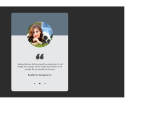
This is an example of a carousel slider testimonial, designed using CSS, HTML, and Bootstrap framework 4. The user images have been imported to the code with their URLs. The form consists of three carousel items. The body of the form is given a background color of RGB(44, 44, 44). The user clause is displayed with the styles of font-size as 14px, line-height as 20px, and font-weight as 500. The card header section is given a background color of #627482, whereas the card background color is set as #E6E7E9. The user name in the card is displayed with a font color of #333. The user image is given a width of 200px, border-radius as 50% to get the circle shape, and a box-shadow style of 3px 15px 20px rgba(0, 0, 0, 0.5). The carousel indicators have the styles of cursor as pointer, border-radius as 50%, height and width as 10px, opacity as 0.5, and background color as #333.
Source: https://bbbootstrap.com/snippets/bootstrap-carousel-slider-testimonials-dots-32243700
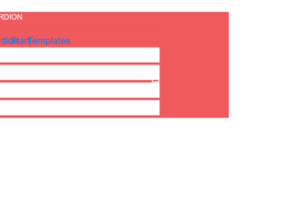
This is an example of an accordion feature, designed using CSS, HTML, and Bootstrap framework 4. The body of the form is given the styles of background color as #F15A5C, and font-family style as 'PT Sans Narrow', sans-serif. The font style has been imported to the code with its URL. The title of the form is given a text-transform style as uppercase to automatically convert the text to uppercase. The form consists of four accordion panels with hover effects. The title of each accordion panel is displayed with the styles of font color as #816d6d, display as block, font-size as 20px, background-color as #fff, and font-weight as 600, and transition as all 0.1s ease 0. The plus mark is displayed with the styles of font-family as fontawesome, text-align as center, font color as #816d6d, background-color as #fff, border as 5px solid #fff, font-size as 15px, height and width as 40px,border-radius as 50% to get the circle shape, and transition as all 0.3s ease 0s. In a hover event, the plus mark takes a transform effect as rotate(360deg), to create the rotating animation.
Source: https://www.bootdey.com/snippets/view/Bootstrap-accordion-Start-Templates#css
Accordion Template
4.3.1

This is an example of a user timeline layout with the hide option, designed using JavaScript, HTML, CSS, and Bootstrap framework 4. The font style, user images, and icons have been imported to the code with URLs. The concept of Lists has been used with UL and LI components. UL element has been used with the child elements of LI to display the child elements of the sidebar, in an orderly manner. JavaScript methods have been used to implement the functionality of the 'Hide' icon and the tooltip messages. The body of the form is given a background color as #eee. The user title name is displayed with the styles of font color as #5a7391, font-size as 16px, and font-weight as 600. The user profile image is given a border-radius value of 50% to get the circle shape and also width and a height of 50%. The 'Follow' button is given a text-transform style as uppercase to automatically convert the text to uppercase. The View, Delete, and the Share buttons are given different background colors as #80d752, #39b3d7, and #d73814.
Source: https://www.bootdey.com/snippets/view/User-wall-with-sidebar-show-hide#js

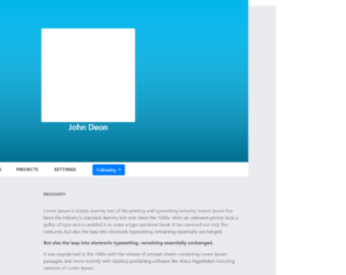
This is an example of another social network user profile, designed using HTML, CSS, and Bootstrap framework 4. The user images are imported to the code with their URLs. The form is given a background color of #f5f5f5. The user profile card is given a background color of #F7F7FA. The concept of Lists has been used with UL and LI components. UL element has been used with the child elements of LI to display the information in an orderly manner. The profile card details and the input text area is given an opacity value of 05. Which turns to 1, in a hover event. The media quarries have been used to increase the responsiveness of the form. The profile picture image is given a width and a height of144px. And a border style of 5px solid #FFFFFF and a border-radius style as 50% to get the circle shape.
Source: https://www.bootdey.com/snippets/view/bs4-profile-card#css
This is an example of a social network profile with panels, designed using CSS, HTML, and Bootstrap framework 4. The font style and user image are imported to the code with their URLs. The body of the form is given a background color of #e9ebee. The concept of Lists has been used with UL and LI components. UL element has been used with the child elements of LI to display the profile tabs and dropdown items in an orderly manner. The profile picture is given a background color as #00b5ec. The profile tabs are displayed with the styles of font-family as 'FontAwesome', font-size as 14px, text-transform as uppercase to automatically convert the text to uppercase, and cursor style as pointer to get the hand cursor effect on hover. The profile tabs are given their own separate forms, which open up upon clicking on the tabs. The profile tabs take the font color of #6e8cd7, in a hover event.
Source: https://www.bootdey.com/snippets/view/Social-network-profile-with-panels#css